This post suggests some strategies for teaching vectors to 14-16 olds. In part 1 we looked at the idea of combining two vectors into one; that is to say, finding the resultant vector. In this part, we’re going to look at the inverse operation: splitting a single vector into two component vectors.
We’re going to use scale drawing rather than trigonometry since (a) this often leads to a more secure understanding; and (b) it is the expected method in the UK curriculum for 14-16 year olds.
What is a component vector?
A component vector is one of at least two vectors that will combine to give one single original vector. The component vectors are chosen so that they are mutually perpendicular. Because of this, they cannot affect each other’s magnitude and direction and so can be dealt with separately and independently; that is to say, we can choose to consider what effect the vertical component will have on its own without having to worry about what effect the horizontal component will have.
Introducing components as ‘the vector less travelled by’
Two roads diverged in a wood, and I—
I took the one less traveled by,
And that has made all the difference.

Robert Frost, 'The Road Less Travelled'
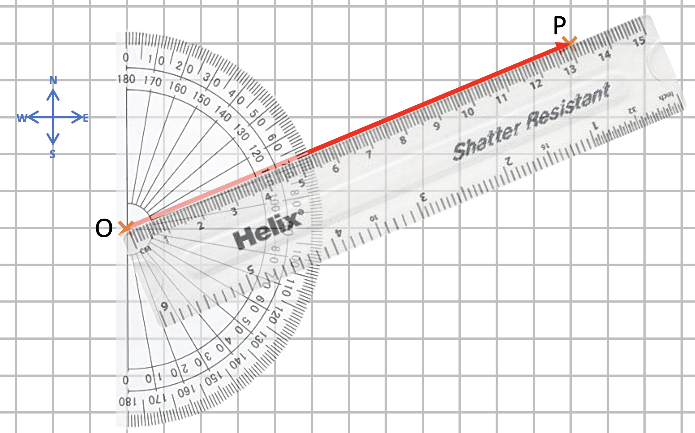
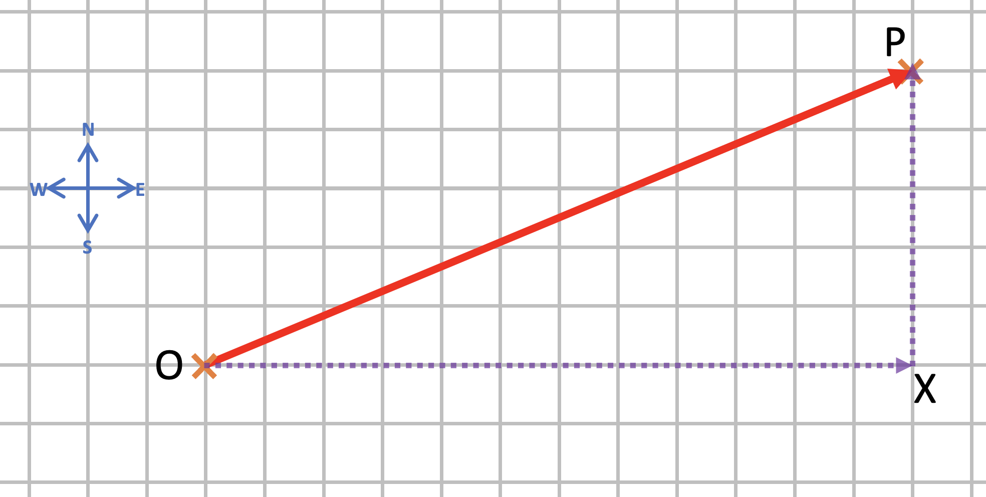
Let’s say we travelled a distance of 13 m from point O to point P on a compass bearing of 067 degrees (bear with me, I’m working with a slightly less familiar Pythagorean 3:4:5 triple here). This could be drawn as a scale diagram as shown below.
Could we analyse the displacement OP in terms of an eastward displacement and a northward displacement?
We can — as shown below.
The dotted line OX is the eastward (horizontal on our diagram) component of the displacement OP. It is drawn as a dotted line because it is (literally) the ‘road less travelled’. We did not walk along that road — and that’s why it is drawn as a dotted line — but we could have done.
But let’s say that we had, and that we had stopped when we reached the point marked X. And then we look around, and strike out northwards and walk the (vertical) ‘road less travelled called XP — and we end up at P.
So walking one road less travelled might, indeed, make ‘all the difference’ — but walking two roads less travelled does not.
To rewrite Robert Frost: We took the two roads less travelled by / And that has made NO difference.
But why should we wish to go the ‘long way around’, even if we still end up at P? Because it would allow us to work out the change in longitude and latitude. By moving from O to P we change our longitude by 12 metres and our latitude by 5 metres. (Don’t believe me? Count the squares on the diagram!)
We have resolved the 13 metre distance into two components: one eastward (horizontal) component of 12 metres and one northward component of 5 metres.
Using resolving a vector into components to solve problems
The surface of Mars imaged by NASA’s Curiosity rover in 2013
April 20, 2112: The sky is flat, the land is flat, and they meet in a circle at infinity. No star shows but the big one, a little bigger than it shows through most of the [asteroid] Belt, but dimmed to red, like the sky. It’s the bottom of a hole, and I must have been crazy to risk it. […] The stars are gone, and the land around me makes no sense. Now I know why they call planet dwellers ‘flatlanders’. I feel like a gnat on a table. I’m sitting here shaking, afraid to step outside. […] I’M AT THE BOTTOM OF A LOUSY HOLE!
Larry Niven, ‘At The Bottom of a Hole’ (1966)
Redish and Kuo (2015: 586) suggest that tapping into our students’ innate physical intuitions can be a very productive teaching strategy. For example, Redish observed some physics instructors teaching non-physics majors how to interpret a potential energy U against the separation r between particles graph (diagram 8(a) below).
From Redish and Kuo (2015)
The students were finding it difficult to answer the question of whether the particles would attract or repel each other when they had energy E and were at a separation of C. Redish noted that the instructors advised the students to consider the derivative of the curve at C (diagram 8(b) above) and, since it had a positive gradient, to surmise that the force between the particles would therefore be attractive since F=-dU/dr. Redish suggested:
A more effective approach for this population might be to begin with an embodied analogy and implicitly supporting epistemologies valuing physical intuition. Start with treating a potential energy curve as a track or hill and, using the analogy of gravitational potential energy, then place a ball on the hill as shown in Fig. 8c.
Redish and Kuo (2015)
Which way would the ball roll in 8(c) roll? Redish said that the students had no problem deducing that the particles would exert an attractive force on each other at C (and a repulsive force when their energy is E at the smaller value of r) after using this analogy.
Using students’ physical intuitions to help understand gravitational potential
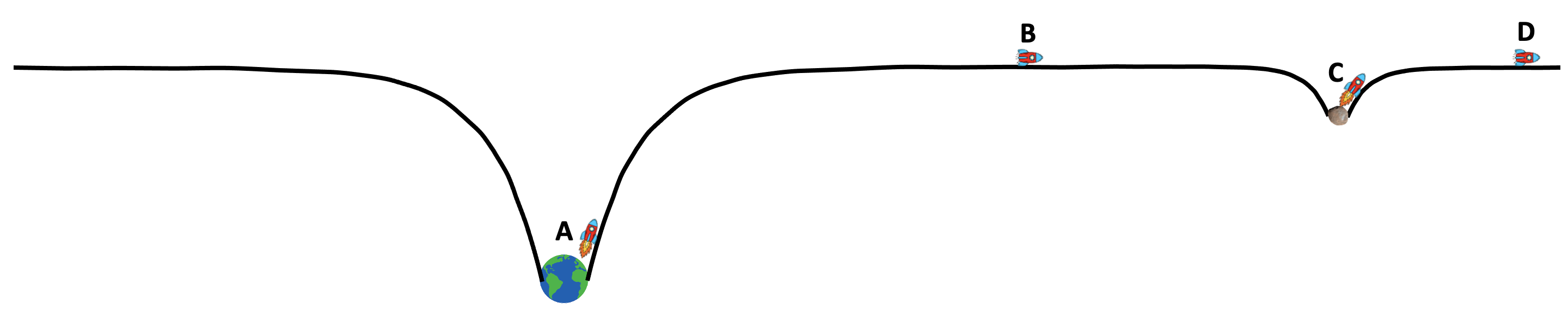
The episode outlined above reminded me of a science fiction story by Larry Niven that I had read many years ago. In ‘At the Bottom of a Hole’, Niven imagined what landing on a planet would feel like to a ‘Belter’; that is to say, to a human being who had spent their entire life navigating between the small worlds of the asteroid Belt: small planetoid-sized worlds whose shallow gravitational fields required only a low-intensity burn for a spaceship to slip free of their influence forever. An extract from the story is quoted as an introduction to this post: in essence, the ‘Belter’ who has lived his life voyaging between the low mass and low gravity worldlets of the asteroid belt finds it emotionally and psychologically disturbing to find himself at the bottom of a deep gravitational hole.
Gravitational Fields are always ‘holes’
Gravitational fields are always holes (unlike electric fields, of course, which can be either ‘holes’ or ‘mountains’; this may well form the basis of a later post).
The mass of the Earth produces a much deeper gravitational hole than the much smaller mass of an asteroid.
As a consequence, a spaceship near the Earth’s surface (A) needs to burn a lot more fuel (i.e. do a lot more work) to completely escape the gravitational influence of the Earth (B) then a spaceship near to the surface of an asteroid. The spaceship closer to the asteroid (C) needs a much smaller burn to completely escape its gravitational influence (D).
To a mature space-faring civilisation, living on the surface of a planet could well be likened (and seem as eccentric) as living at the bottom of a spectacularly deep hole.
Gravitational potential
The gravitational potential of an object of mass M is given by:
where G is the Gravitational Constant and r is the displacement from the centre of mass of the object. The units of V would be joules per kilogram J/kg.
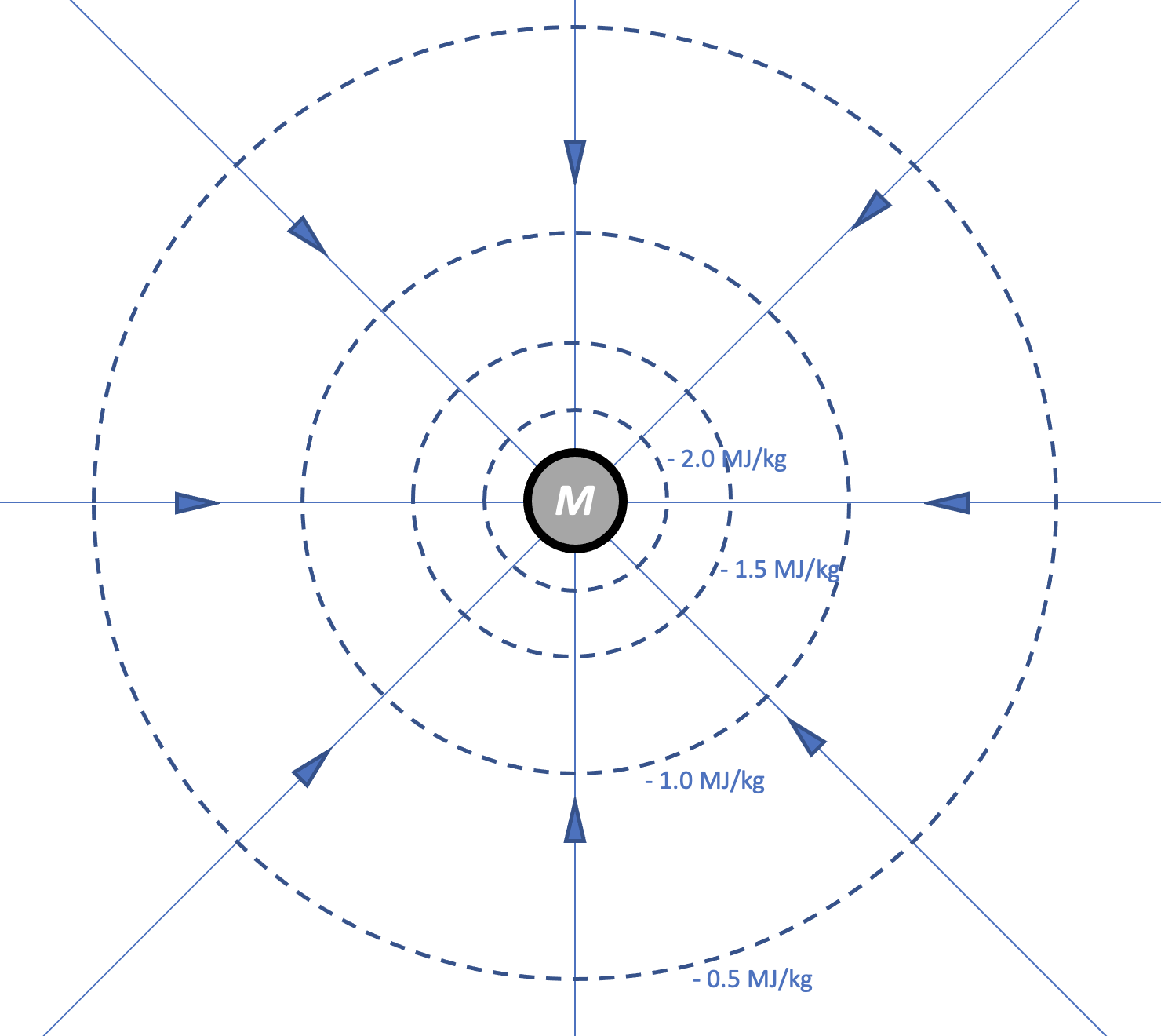
Note that the magnitude of V gets larger as r decreases. This allows us to represent a gravitational field in terms of equipotential lines (dotted on the diagram below) as well as field lines (solid).
Modelling gravitational potential as a three dimensional hole
We can engage our own and our students’ physical intuitions by picturing the equipotential lines as being contour lines indicating the depth of a three dimensional hole.
An object represented as a ball at position A will not tend to roll down into the hole since there is no discernible downhill ‘slope’ at A; in effect, as r tends towards infinity then the object is beyond the effects of M’s gravity. A position outside the gravitational field of a massive object has a gravitational potential of zero.
Let’s think about what happens as r decreases until the object is at B. Here we can intuitively surmise that it will experience a small force tending to make it fall deeper into the hole. How much work will the gravitational field have done moving an object from infinity to this position? The answer is, of course, 0.5 MJ for each kilogram of mass.
How much work will be done by the gravitational field moving the object from B to C? The answer is again an extra 0.5 MJ/kg but note that this happens over a much smaller change in r than before because the gravitational field is becoming more intense. Again, we can intuit that the object will experience a stronger gravitational force at C than at B.
We can go on to argue that a similar pattern of behaviour will also occur at D and E.
But the real value of this representation is, in my opinion, helping students understand how much energy a body needs to escape the influence of a gravitational field.
If we start at B, we would have to do 0.5 MJ/kg of work on it to make it escape. In other words, it needs 0.5 MJ/kg to climb out of the hole.
If we started at C, then we would need 1.0 MJ/kg; and D, 1.5 MJ/kg and so on.
If we were considering a spacecraft operating in the vacuum of space, then transferring 2.0 MJ/kg of kinetic energy would allow ot to completely escape the gravitational influence of M; or, in other words, to reach a value of r such that its gravitational potential is zero.
Near the Earth’s surface where r = 6.38 x 10⁶ m, the gravitational potential can be calculated as follows:
That is to say, a body would need to gain 64.4 MJ of kinetic energy for each kilogram of its mass to completely escape from the influence of the Earth’s gravity.
We can therefore calculate the escape velocity for a body near the Earth surface as follows:
As I mentioned above, I think the real power of this way of tapping into physical intuition for understanding fields comes when we use it to represent electric fields. I will cover that in a later post.
Circuit diagrams can be seen either as pictures or abstractions but it is clear that pupils often find it hard to recognise the circuits in the practical situation of real equipment. Moreover, Caillot found that students retain from their work with diagrams strong images rather than the principles they are intended to establish. The topological arrangement of a diagram or a drawing presents problems for pupils which are easily overlooked. It seems that pupils’ spatial abilities affect their use of circuit diagrams: they sometimes do not regard as identical several circuits, which, though identical, have been rotated so as to have a different spatial arrangement. […] Niedderer found that pupils, when asked whether a circuit diagram would ‘work’ in practice, more often judged symmetrical diagrams to be functioning than non-symmetric ones.
Driver et al. (1994): 124 [Emphases added]
For the reasons outlined by Driver and others above, I think it’s a good idea to vary the way that we present circuit diagrams to students when teaching electric circuits. If students always see circuit diagrams presented so that (say) the cell is at the ‘top’ and ‘facing’ a certain way; or that they are drawn so that they are symmetrical (which is an aesthetic rather that a scientific choice), then they may well incorrectly infer that these and other ‘accidental’ features of our circuit diagrams are the essential aspects that they should pay the most attention to.
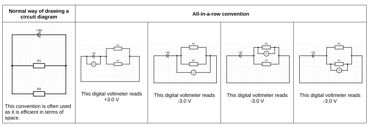
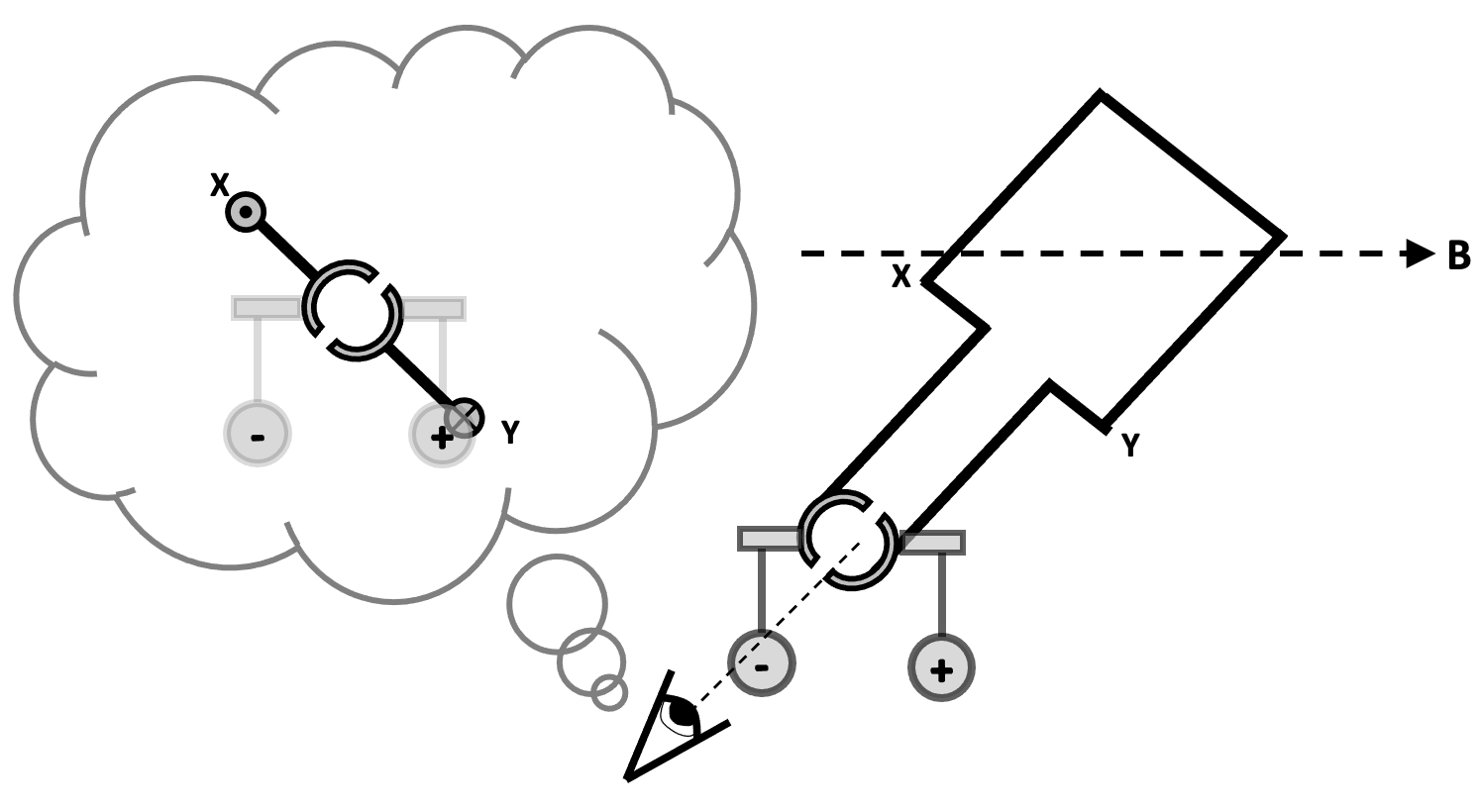
One ‘shake it up’ strategy is to redraw a circuit diagram using the ‘all-in-a-row’ convention.
If you arrange the real components in the ‘all-in-a-row’ arrangement, then a standard digital voltmeter has, what is in my opinion a regrettably underused functionality, that will show:
‘positive’ potential differences: that is to say, the energy added to the coulombs as they pass through a cell or the electromotive force; and
‘negative’ potential differences: that is to say, the energy removed from each coulomb as they pass through a resistor; these can be usefully referred to as ‘potential drops’
This can be shown on circuit diagrams as shown below/
In other words, the difference between the potential difference across the cell (energy being transferred into the circuit from the chemical energy store of the cell) is explicitly distinguished from the potential difference across the resistor (energy being transferred from the resistor into the thermal energy store of the surroundings). The all-in-a-row convention neatly sidesteps a common misconception that the potential difference across a cell is equal to the potential difference across a resistor: they are not. While they may be numerically equal, they are different in sign, as a consequence of Kirchoff’s Second Law. As I have suggested before, I think that this misconception is due to the ‘hidden rotation‘ built into standard circuit diagrams.
Potential divider circuits and the all-in-a-row convention
Although I am normally a strong proponent of the ‘parallel first heresy‘, I’ll go with the flow of ‘series circuit first’ in this post.
Diagrams 2 and 3 in the sequence show that the energy supplied to the coulombs (+1.5 V or 1.5 joules per coulomb) by the cell is transferred from the coulombs as they pass through the double resistor combination. Assuming that R1 = R2 then, as diagram 4 shows, 0.75 joules will be transferred out of each coulomb as they pass through R1; as diagram 5 shows, 0.75 joules will be transferred out of each coulomb as they pass through R2.
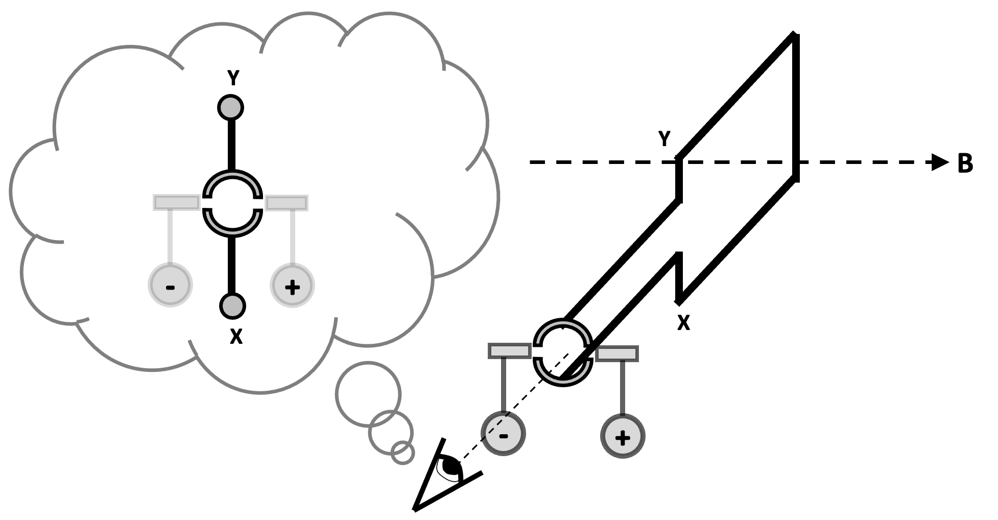
Parallel circuits and the all-in-a-row convention
I’ve written about using the all-in-a-row convention to help explain current flow in parallel circuits here, so I will focus on understanding potential difference in parallel circuit in this post.
Again, diagrams 2 and 3 in the sequence show that the positive 3.0 V potential difference supplied by the cell is numerically equal (but opposite in sign) to the negative 3.0 V potential drop across the double resistor combination. It is worth bearing in mind that each coulomb passing through the cell gains 3.0 joules of energy from the chemical energy store of the cell. Diagrams 4 and 5 show that each coulomb passing through either R1 or R1 loses its entire 3.0 joules of energy as it passes through that resistor. The all-in-a-row convention is useful, I think, for showing that each coulomb passes through just one resistor as it makes a single journey around the circuit.
Many years ago, I was taught this compact and intuitive convention to show turning moments. I think it should be more widely known, as it not only is concise and powerful, but also meets the criterion of being an effective form of dual coding which is helpful for both GCSE and A-level Physics students.
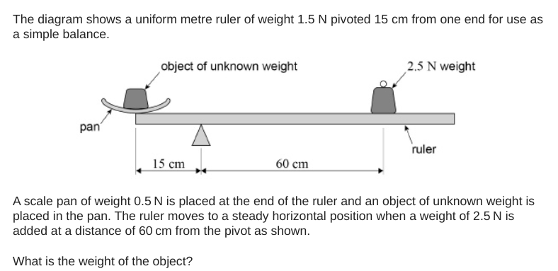
Let’s look at an example question.
Let’s start by ‘annotating the hell’ out of the diagram.
We could take moments around any of the marked points A-E on the diagram. However, we’re going to take moments around B as it enables us to ignore the upward reaction force acting on the rule at B. (This force is not shown on the diagram.)
To indicate that we’re going to be considering the sum of the clockwise moments about point B, we use this intuitive notation:
If we consider the sum of anticlockwise moments about point B, we use this:
We lay out our calculations of the total clockwise and anticlockwise moments about B as follows.
We show that we are going to apply the Principle of Moments (the sum of clockwise moments is equal to the sum of anticlockwise moments for an object in equilibrium) like this:
The rest, as they say, is not history but algebra:
I hope you find this ‘momentary’ convention useful(!)
Real life energy transfers can be messy. That is to say, they are complicated and difficult to understand. I think many students get lost in the dense forest of verbiage that has to be deployed to describe their detail and nuance. Bar models are, I think, an effective teaching tool to avoid cognitive overload, especially for GCSE Physics and Combined Science students.
Windmills of our minds
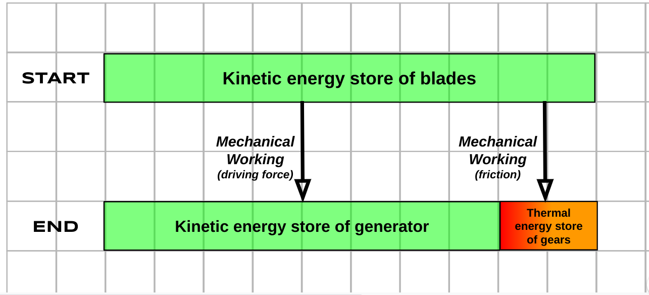
As an example, let’s consider a wind turbine used to generate electricity. As a starting point, let’s think about how much of the kinetic energy ‘harvested’ by the blades is transferred to the generator. The answer is, of course. not as much as we would hope. The majority is, hopefully, but a significant proportion is unavoidably lost via work done by friction to the thermal energy store of the gears.
This can be shown in a visually impactful way using the Bar Model approach:
Note that in this style of energy transfer diagram, the Principle of Conservation of Energy is communicated visually via the width of the bars. The bottom ‘End’ bar has to be exactly the same width as the top ‘Start’ bar.
What happens if a helpful maintenance engineer tops up the oil reservoir of the wind turbine? Well, we have a much happier situation, as shown below.
As we can see, a much greater proportion of the total energy is transferred usefully (and can be used to generate electrical power) in a well-maintained wind turbine.
Using energy efficient appliances in the home
How can we explain the advantages of using more efficient appliances in the home?
A diagram like this can help. The household that uses less efficient appliances has to buy more energy from their energy supplier to achieve exactly the same outcomes as the first. This is both more costly for the household as well as demanding that more resources are needed to generate electricity for no good reason.
Parachute vs. no parachute
Exactly the same amount of energy is transferred from the gravitational energy store of a parachutist whether their parachute deploys successfully or not. However, in the case of a successful deployment, much more energy is transferred into the thermal energy store of the surroundings than into their kinetic energy store. This helps ensure a safe landing!
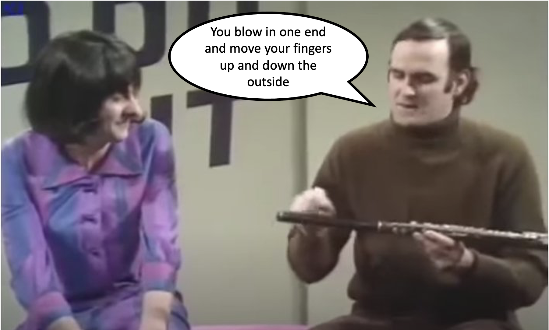
I think that teaching vectors to 14-16 year olds is a bit like teaching them to play the flute; that is to say, it’s a bit like teaching them to play the flute as presented by Monty Python (!)
Part of the trouble is that the definition of a vector is so deceptively and seductively easy: a vector is a quantity that has both magnitude and direction.
There — how difficult can the rest of it be? Sadly, there’s a good deal more to vectors than that, just as there’s much more to playing the flute than ‘moving your fingers up and down the outside'(!)
What follows is a suggested outline teaching schema, with some selected resources.
Resultant vector = total vector: the ‘I’ phase
‘2 + 2 = 4’ is often touted as a statement that is always obviously and self-evidently true. And so it is — arithmetically and for mere scalar quantities. In fact, it would be more precisely rendered as ‘scalar 2 + scalar 2 = scalar 4’.
However, for vector quantities, things are a wee bit different. For vectors, it is better to say that ‘vector 2 + vector 2 = a vector quantity with a magnitude somewhere between 0 and 4’.
For example, if you take two steps north and then a further two steps north then you end up four steps away from where you started. Also, if you take two steps north and then two steps south, then you end up . . . zero steps from where you started.
So much for the ‘zero’ and ‘four’ magnitudes. But where do the ‘inbetween’ values come from?
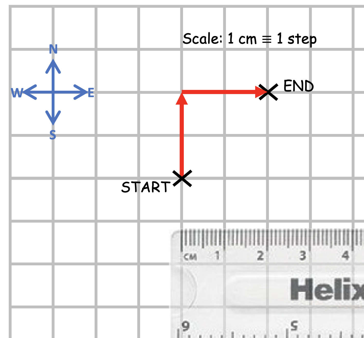
Simples! Imagine taking two steps north and then two steps east — where would you end up? In other words, what distance and (since we’re talking about vectors) in what direction would you be from your starting point?
This is most easily answered using a scale diagram.
To calculate the vector distance (aka displacement) we draw a line from the Start to the End and measure its length.
The length of the line is 2.8 cm which means that if we walk 2 steps north and 2 steps east then we up a total vector distance of 2.8 steps away from the Start.
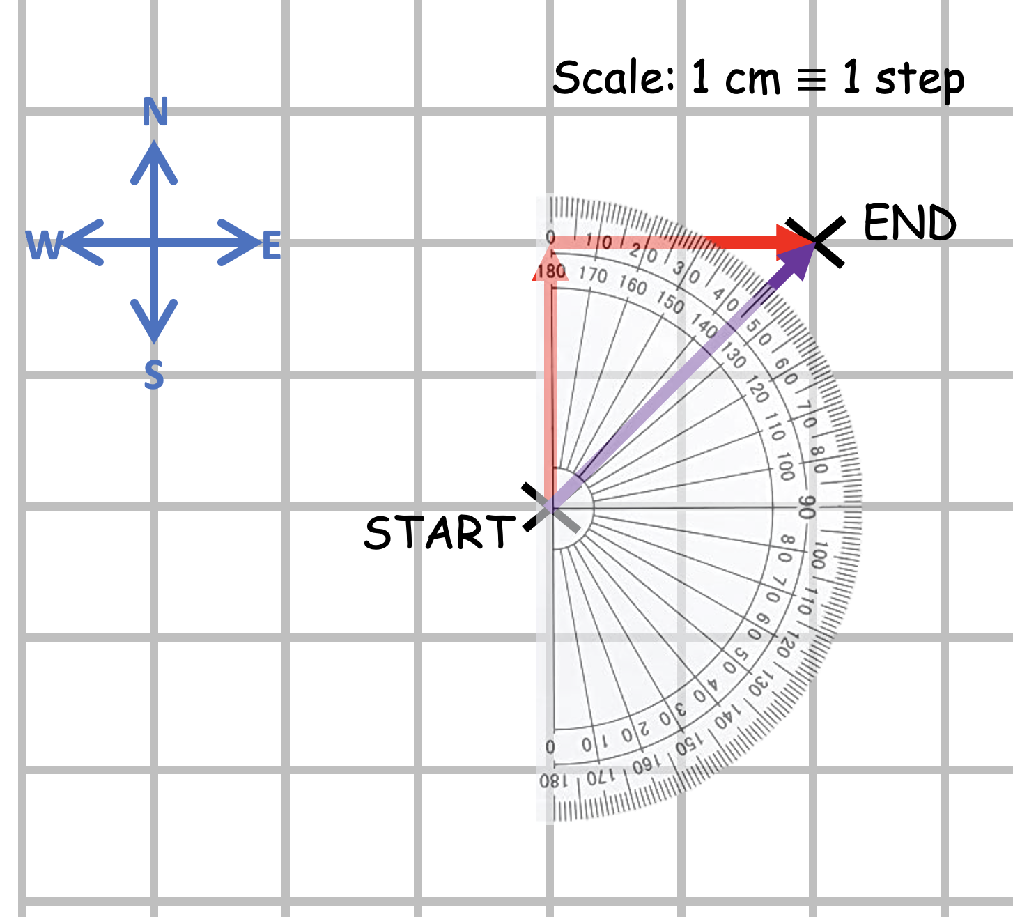
But what about direction? Because we are dealing with vector quantities, direction just as important as magnitude. We draw an arrowhead on the purple line to emphasise this.
Students may guess that the direction of the purple ‘resultant’ vector (that is to say, it is the result of adding two vectors) is precisely north-east, but this can be a vague description so let’s use a protractor so that we can find the compass bearing.
And thus we find that the total resultant vector — the result of adding 2 steps north and 2 steps east — is a displacement of 2.8 steps on a compass bearing of 045 degrees.
Resultant vector = total vector: the ‘We’ phase
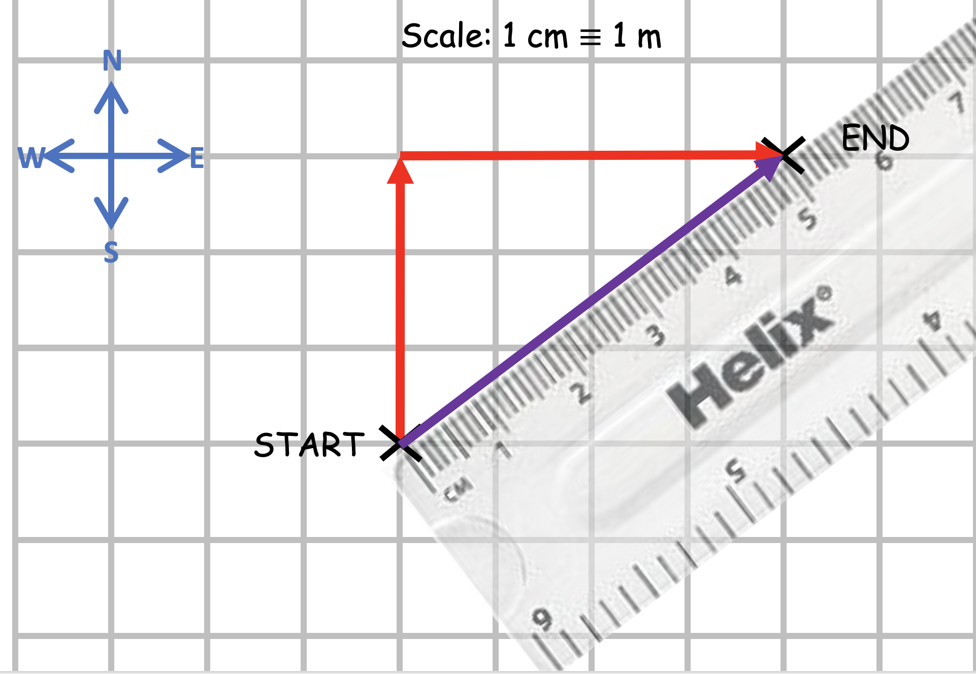
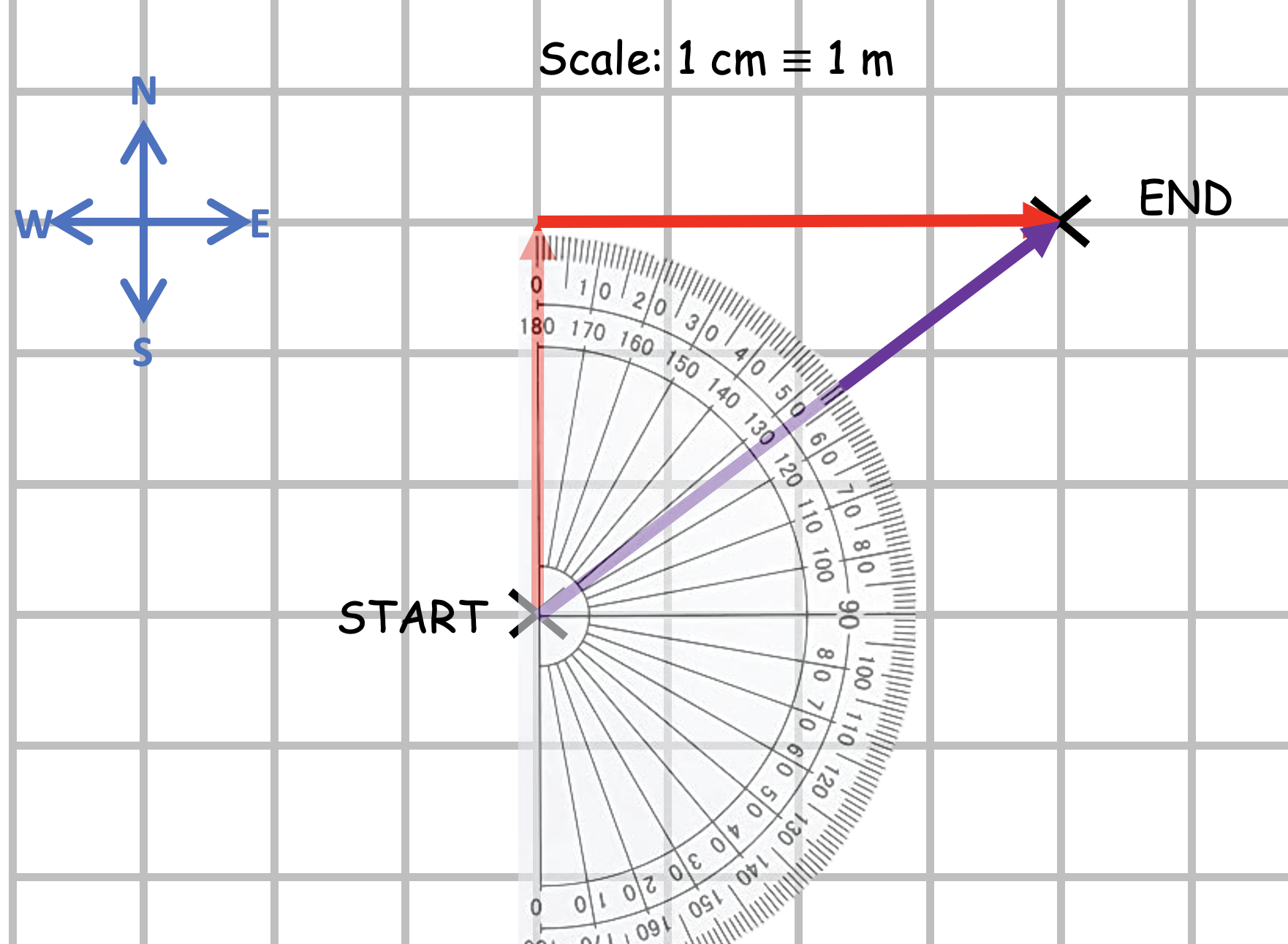
How would we go about finding the resultant vector if we moved 3 metres north and 4 metres east? If you have access to an interactive whiteboard, you could choose to use this Jamboard for this phase. (One minor inconvenience: you would have to draw the straight lines freehand but you can use the moveable and rotatable ruler and protractor to make measurements ‘live’ with your class.)
We go through a process similar to the one outlined above.
What would be a suitable scale?
How long should the vertical arrow be?
How long should the horizontal arrow be?
Where should we place the ‘End’ point?
How do we draw the ‘resultant’ vector?
What do we mean by ‘resultant vector’?
How should we show the direction of the resultant vector?
How do we find its length?
How do we convert the length of the arrow on the scale diagram into the magnitude of the displacement in real life?
The resultant vector is, of course, 5.0 m at a compass bearing of 053 degrees.
Resultant vector = total vector: the ‘You’ phase
Students can complete the questions on the worksheets which can be printed from the PowerPoint below.
They do observe I grow to infinite purchase, The left hand way;
John Webster, The Duchess of Malfi
Electromagnetic induction — the fact that moving a conductor inside a magnetic field in a certain direction will generate (or induce) a potential difference across its ends — is one of those rare-in-everyday-life phenomena that students very likely will never have come across before. In their experience, potential differences have heretofore been produced by chemical cells or by power supply units that have to be plugged into the mains supply. Because of this, many of them struggle to integrate electromagnetic induction (EMI) into their physical schema. It just seems such a random, free floating and unconnected fact.
What follows is a suggested teaching sequence that can help GCSE-level students accept the physical reality of EMI without outraging their physical intuition or appealing to a sketchily-explained idea of ‘cutting the field lines’.
‘Look, Ma! No electrical cell!’
I think it is immensely helpful for students to see a real example of EMI in the school laboratory, using something like the arrangement shown below.
A length of copper wire used to cut the magnetic field between two Magnadur magnets on a yoke will induce (generate) a small potential difference of about 5 millivolts. What is particularly noteworthy about doing this as a class experiment is how many students ask ‘How can there be a potential difference without a cell or a power supply?’
The point of this experiment is that in this instance the student is the power supply: the faster they plunge the wire between the magnets then the larger the potential difference that will be induced. Their kinetic energy store is being used to generate electrical power instead of the more usual chemical energy store of a cell.
But how to explain this to students?
A common option at this point is to start talking about the conductor cutting magnetic field lines: this is hugely valuable, but I recommend holding fire on this picture for now — at least for novice learners.
What I suggest is that we explain EMI in terms of a topic that students will have recently covered: the motor effect.
This has two big ‘wins’:
It gives a further opportunity for students to practice and apply their knowledge of the motor effect.
Students get the chance to explain an initially unknown phenomenon (EMI) in terms of better understood phenomenon (motor effect). The motor effect will hopefully act as the footing (to use a term from the construction industry) for their future understanding of EMI.
Explaining EMI using the motor effect
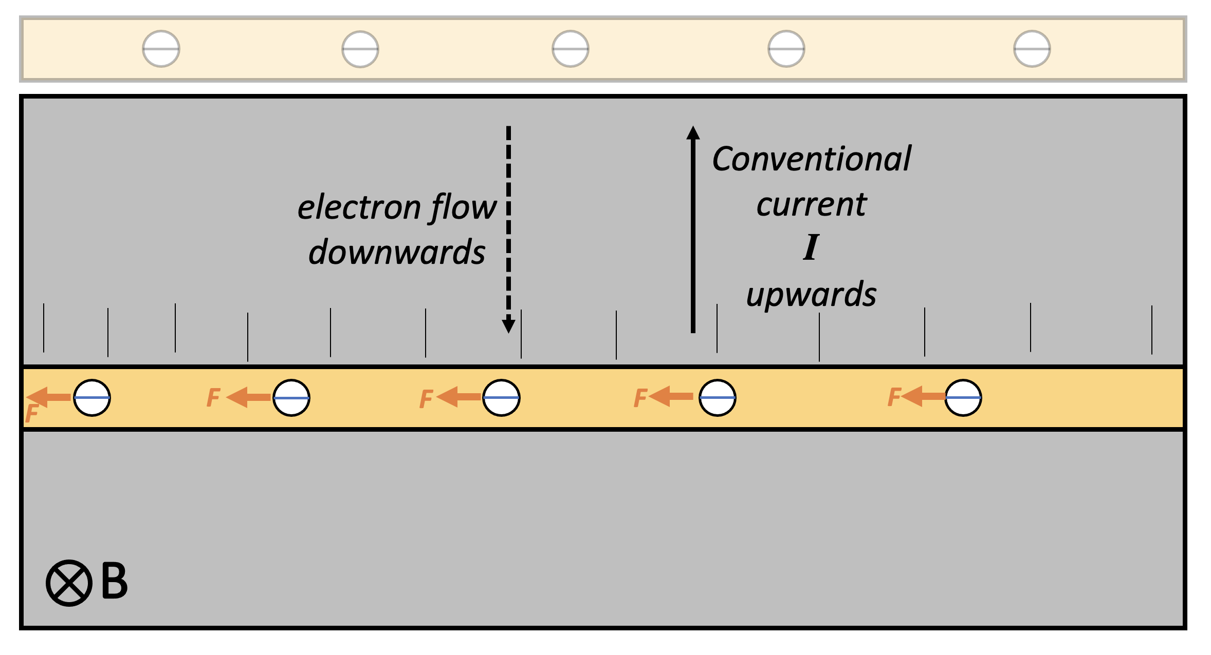
The copper conductor contains many free conduction electrons. When the conductor is moved sharply downwards, the electrons are carried downwards as well. In effect, the downward moving conductor can be thought of as a flow of charge; or, more to the point, as an electrical current. However, since electrons are negatively charged, this downward flow of negative charge is equivalent to an upward flow of positive charge. That is to say, the conventional current direction on this diagram is upwards.
Applying Fleming Left Hand Rule (FLHR) to this instance, we find that each electron experiences a small force tugging it to the left — but only while the conductor is being moved downwards.
This results in the left hand side of the conductor becoming negatively charged and the right hand side becoming positively charged: in short, a potential difference builds up across the conductor. This potential difference only happens when the conductor is moving through the magnetic field in such a way that the electrons are tugged towards one end of the conductor. (There is, of course, the Hall Effect in some other instances, but we won’t go into that here.)
As soon as the conductor stops moving, the potential difference is no longer induced as there is no ‘charge flow’ through the magnetic field and, hence, no current and no FLHR motor effect force acting on the electrons.
Faraday’s model of electromagnetic induction
Michael Faraday (1791-1867) discovered the phenomenon of electromagnetic induction in 1831 and explained it using the idea of a conductor cutting magnetic field lines. This is an immensely valuable model which not only explains EMI but can also generate quantitative predictions and, yes, it should definitely be taught to students — but perhaps the approach outlined above is better to introduce EMI to students.
The left hand rule not knowing what the right hand rule is doing . . .
We usually apply Fleming’s Right Hand Rule (FRHW) to cases of EMI, Can we replace its use with FLHR? Perhaps, if you wanted to. However, FRHR is a more direct and straightforward shortcut to predicting the direction of conventional current in this type of situation.
Students find learning about electric motors difficult because:
They find it hard to predict the direction of the force produced on a conductor in a magnetic field, either with or without Fleming’s Left Hand Rule.
They find it hard to understand how a split ring commutator works.
In this post, I want to focus on a suggested teaching sequence for the action of a split ring commutator, since I’ve covered the first point in previous posts.
Who needs a ‘split ring commutator’ anyway?
We all do, if we are going to build electric motors that produce a continuous turning motion.
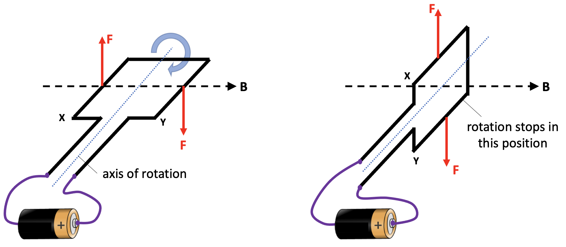
If we naively connected the ends of a coil to power supply, then the coil would make a partial turn and then lock in place, as shown below. When the coil is in the vertical position, then neither of the Fleming’s Left Hand Rule (FLHR) forces will produce a turning moment around the axis of rotation.
When the coil moves into this vertical position, two things would need to happen in order to keep the coil rotating continuously in the same direction.
The current to the coil needs to be stopped at this point, because the FLHR forces acting at this moment would tend to hold the coil stationary in a vertical position. If the current was cut at this time, then the momentum of the moving coil would tend to keep it moving past this ‘sticking point’.
The direction of the current needs to be reversed at this point so that we get a downward FLHR force acting on side X and an upward FLHR force acting on side Y. This combination of forces would keep the coil rotating clockwise.
This sounds like a tall order, but a little device known as a split ring commutator can help here.
One (split) ring to rotate them all
The word commutator shares the same root as commute and comes from the Latin commutare (‘com-‘ = all and ‘-mutare‘ = change) and essentially means ‘everything changes’. In the 1840s it was adopted as the name for an apparatus that ‘reverses the direction of electrical current from a battery without changing the arrangement of the conductors’.
In the context of this post, commutator refers to a rotary switch that periodically reverses the current between the coil and the external circuit. This rotary switch takes the form of a conductive ring with two gaps: hence split ring.
Tracking the rotation of a coil through a whole rotation
In this picture below, we show the coil connected to a dc power supply via two ‘brushes’ which rest against the split ring commutator (SRC). Current is flowing towards us through side X of the coil and away from us through side Y of the coil (as shown by the dot and cross 2D version of the diagram. This produces an upward FLHR force on side X and a downward FLHR force on side Y which makes the coil rotate clockwise.
Now let’s look at the coil when it has turned 45 degrees. We note that the SRC has also turned by 45 degrees. However, it is still in contact with the brushes that supply the current. The forces on side X and side Y are as noted before so the coil continues to turn clockwise.
Next, we look at the situation when the coil has turned by another 45 degrees. The coil is now in a vertical position. However, we see that the gaps in the SRC are now opposite the brushes. This means that no current is being supplied to the coil at this point, so there are no FLHR forces acting on sides X and side Y. The coil is free to continue rotating clockwise because of momentum.
Let’s now look at the situation when the coil has rotated a further 45 degrees to the orientation shown below. Note that the side of the SRC connected to X is now touching the brush connected to the positive side of the power supply. This means that current is now flowing away from us through side X (whereas previously it was flowing towards us). The current has reversed direction. This creates a downward FLHR force on side X and an upward FLHR force on side Y (since the current in Y has also reversed direction).
And a short time later when the coil has moved a total of180 degrees from its starting point, we can observe:
And later:
And later still:
And then:
And then eventually we get back to:
Summary
In short, a split ring commutator is a rotary switch in a dc electric motor that reverses the current direction through the coil each half turn to keep it rotating continuously.
I hope that this teaching sequence will allow more students to be comfortable with the concept of a split ring commutator — anything that results in a fewer split ring commuHATERS would be a win for me 😉
Do we delve deeply enough into the actual physical mechanism of current flow through electrical conductors using the concepts of charge carriers and electric fields in our treatments for GCSE and A-level Physics? I must reluctantly admit that I am increasingly of the opinion that the answer is no.
In part one we discussed two common misconceptions about the physical mechanism of current flow, namely:
The all-the-electrons-in-a-conductor-repel-each-other misconception; and
The electric-field-of-the-battery-makes-all-the-charge-carriers-in-the-circuit-move misconception.
In part two we looked at how the distribution of surface charges on electrical conductors produces the internal electric fields that guide and push charges around electric circuits and highlighted the published evidence that supports this model.
A representation of a surface charge distribution giving rise to the internal electric field (purple arrows) of a current-carrying conductor
In part three, we are going to look at the transient processes that produce the required distribution of surface charges. In this treatment, I am going to lean very heavily on the analysis presented in Duffin (1980: 167-8).
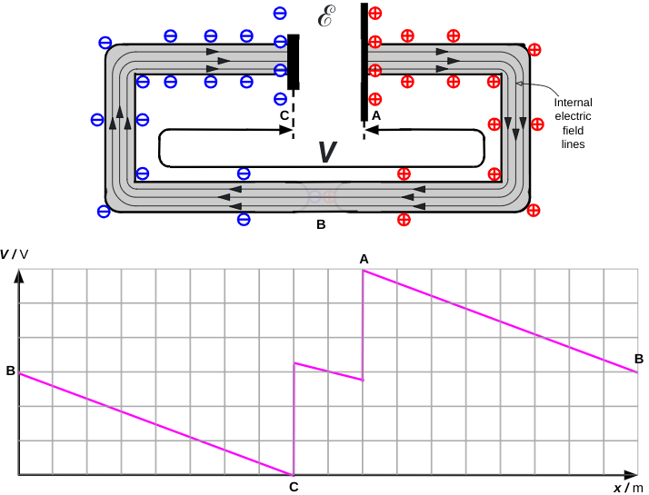
Connecting wires to a chemical cell
Let’s connect up a simple circuit using a chemical cell as our source of EMF ℰ.
The first diagram shows the cell and wires before they are connected.
When the wires are connected there is a momentary current flow from the cell that creates the surface charge distribution shown below.
The current will stop when the ends of the wire at a potential difference V which is equal to the EMF ℰ of the cell. The ends of the wire act as a small capacitor (∼10-15 F or less). The wires act as equipotential volumes so the very small charge must be distributed over the surface of the wires with a slight concentration of charge at the ends.
Making the circuit
If the ends of the wire are now connected, then the capacitance drops to zero and the ends of the wires become discharged. This leads to very low concentration of surface charge in this region.
However, just enough surface charge remains to produce the internal electric field as shown below. The field lines of the internal electric field are parallel to the wire.
The potential diagram is after Figure 6.17 (Duffin 1980: 160). The ‘dip’ between C and A is due to the effect of the internal resistance of the cell. As we can see in this instance, when there is a steady flow of current then V is slightly smaller than ℰ.
Reference
Duffin, W. J. (1980). Electricity and magnetism (3rd ed.). McGraw Hill Book Co
In part one, we looked at the fact that the hotter an object then the greater the intensity of electromagnetic radiation that will be emitted. For simplicity, we looked at so-called ‘blackbodies’ — that is say, objects which are perfect absorbers (hence ‘blackbodies’) and more importantly, perfect emitters of electromagnetic radiation.
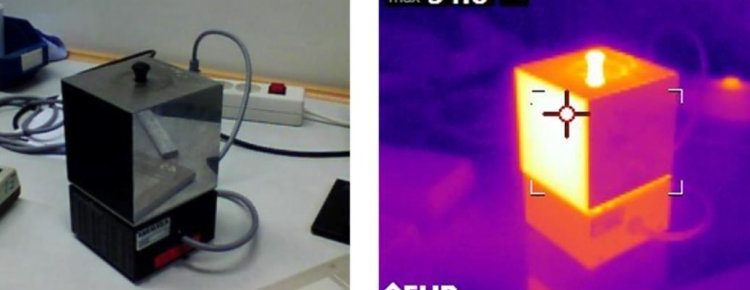
To human eyes, things look very dull in the visible part of the electromagnetic spectrum until we reach temperatures of several hundreds of degrees — however, objects at room temperature (or just above) glow brightly in the infrared part of the electromagnetic spectrum, as we can see easily if we have access to an infrared camera.
By ‘intensity’ of course, we mean the power (‘energy per second’) emitted per unit area.
This links in neatly with 4.6.3.2 of the 2015 AQA GCSE Physics specification:
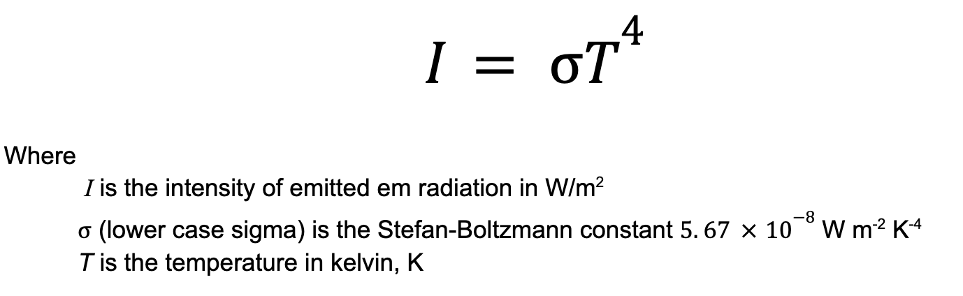
Stretch and challenge for students (1): Is the intensity of emitted radiation directly proportional to the temperature of the object?
The short answer is no. If you doubled the temperature (measured in kelvins!) of an object then the intensity of radiation would increase by a factor of 16. In other words, the intensity I of radiation emitted by an object is directly proportional to the absolute temperature Traised to the power of 4.
In part 1 we estimated the intensity of radiation emitted by two blackbodies by ‘counting squares’ to find the area underneath a graph. We can show that the values obtained are consistent with the Stefan-Boltzmann radiation law.
Since we have dealt comprehensively with the relationship between intensity of radiation and temperature, I propose to move along and look at how the wavelength distribution changes with the temperature of the body.
How does the temperature of a blackbody affect the distribution of emitted wavelengths?
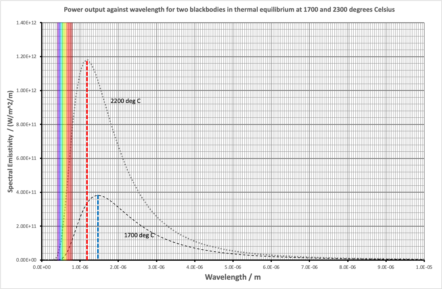
Let’s consider an object that approximates to a blackbody: the filament of an old school incandescent lamp.
The graph of the radiation produced by both objects is shown below.
First, let’s look at the visible wavelengths produced by both bulbs.
The 1700 degree Celsius bulb produces only a very small amount of visible light and the vast majority of that is towards the red end of the spectrum: you can see the section where the left hand edge of the 1700 curve just nicks the visible light wavelengths. This means that the 1700 degree filament emits a barely perceptible reddish glow to our eyes with its peak output still firmly in the infrared.
The 2200 degree Celsius bulb produces a much larger amount of visible light: look at the left hand side of the curve. What is more, it appears as white light to our eyes since it includes all the colours of the rainbow. However, it’s still a very reddish-tinged white. Photographs taken in artificial light with chemical films (very old school!) had to be taken using special colour balanced film stock otherwise this bias was very evident in the final print(!) Modern digital cameras have software that automatically compensates for artificial vs. daylight colour balance issues.
Second, let’s look at the position of the peak wavelength.
The 1700 degree Celsius bulb has its peak output at a wavelength of 1.5 x 10⁻⁶ m (shown by the blue dotted line on the graph).
The 2200 degree Celsius bulb has its peak output at a wavelength of 1.2 x 10⁻⁶ m (shown by the red dotted line on the graph.)
Assuming that you wanted to, these findings could be summarised in song (sung to the tune of ‘Black Betty’ by Ram Jam):
Whoa, black body (Bam-ba-lam)
Whoa, black body (Bam-ba-lam)
More heat, peak shifts left
Waves out with more zest
Wavelengths out not alike
Some hues power spike!
Whoa, black body (Bam-ba-lam)
Whoa, black body
Bam-ba-laaam, yeah yeah
Stretch and challenge for students (2): predicting the position of the peak output wavelength
The position of the peak output wavelength can be predicted using Wien’s Displacement Law (studied in A-level Physics:
As we can see, the peak output wavelength on the graph agrees well with the position as calculated by Wien’s Displacement Law.
An unannotated pdf of the graph can be downloaded here: