The worst circuit in the world (part 2)

What is the worst circuit in the world? Many teachers think it is the one below.

This is the circuit that AQA (2018: 47) strongly suggest should be used to capture the data for plotting IV characteristics (aka current against potential difference graphs) for a fixed resistor, a filament lamp and a diode. The reasons why it is ‘the worst circuit in world’ were outlined in part one; and also some reasons why, nonetheless, schools teaching the 2016 AQA GCSE Physics / Combined Science specifications should (arguably) continue to use it.

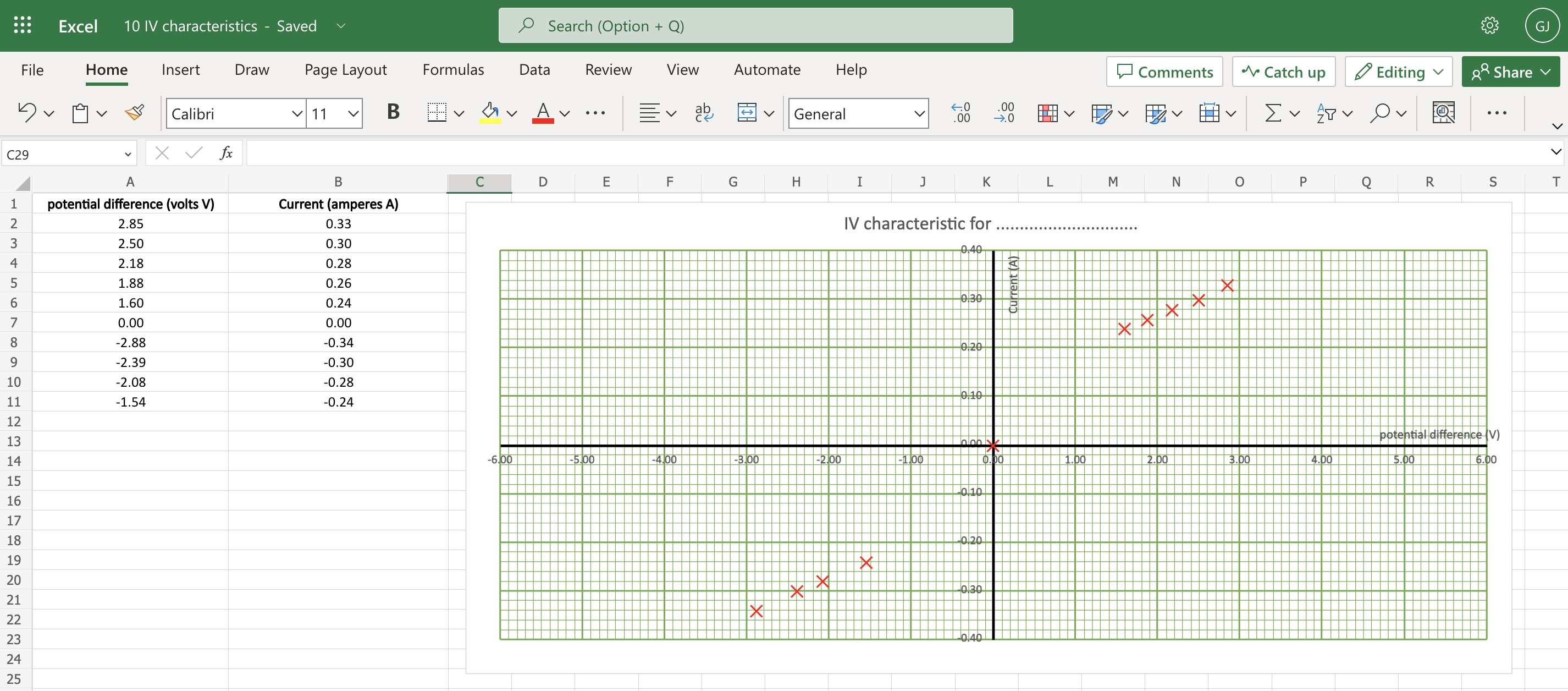
The procedure outlined isn’t ‘perfect’ but works well using the equipment we have available and enables students to capture (and plot using a FREE Excel spreadsheet!) the data with only minor troubleshooting from the teacher.

Step the first: ‘These are the graphs you’re looking for.’

I find this required practical runs more smoothly if students have some awareness of what kind of graphs they are looking for. So, to borrow a phrase, I usually just tell ’em.

You can access an unannotated version of the slides on Google Jamboard and pdf below.

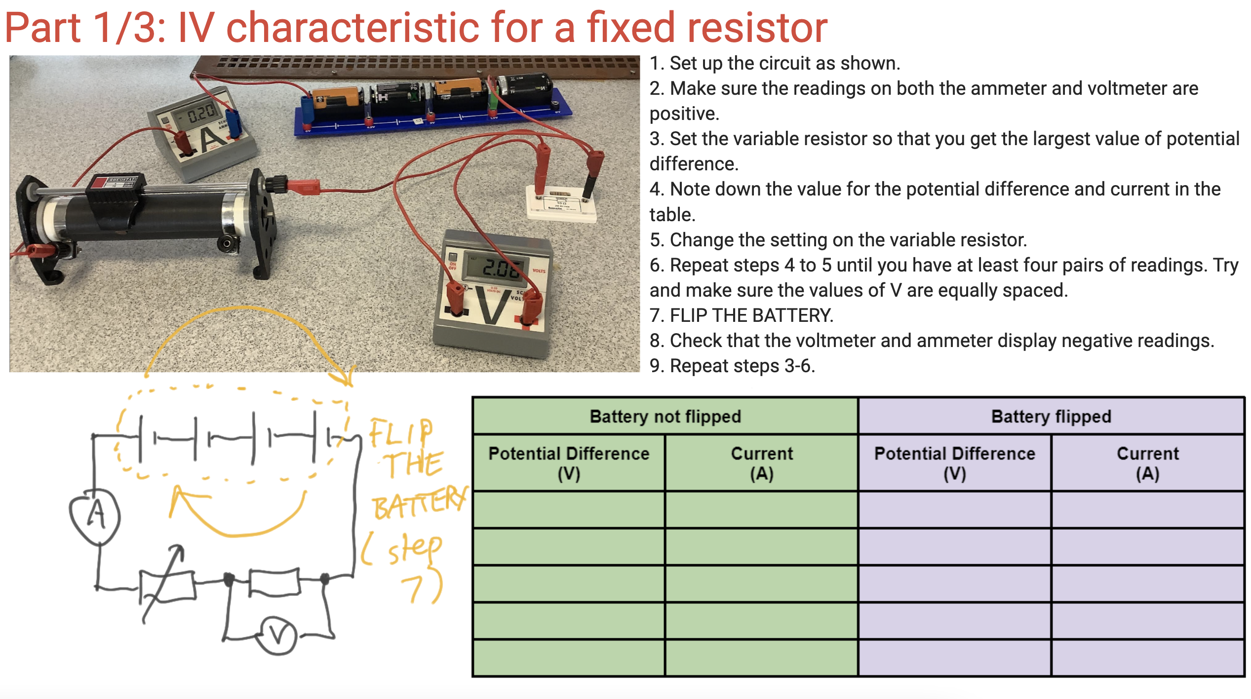
Step the second: capture the data for the fixed resistor

It is a continual source of amazement to me that students seem to find a photograph of a circuit easier to interpret than a nice, clean, minimalist circuit diagram, so for an easier life I present both.

You can, if you have access to ICT, get the students to plot their results ‘live’ on an Excel spreadsheet (link below). I think this is excellent for helping to manage the cognitive demand on our students (as I have argued before here). Please note that I have not used the automated ‘line of best fit’ tools available on Excel as I think it is important for students to practice drawing lines of best fit — including, especially, curved lines of best fit (sorry, Maths teachers, in science there are such things as curved lines!)

Results for a fixed resistor from a typical group of students. These results are clearly consistent with a straight line of best fit going through the origin. However, they can be criticised for not being evenly spaced across the range — but this is a limitation of using the ‘worst circuit in the world’ and, happily(!), gives the students something to write about in their evaluation.

Step the second: capture the data for the filament lamp

In this circuit, we replaced the previous 0-16 ohm variable resistor with a 0 – 1000 ohm variable resistor paired with 2.5 V, 0.2 A filament lamp because the bulb has a resistance of about 60 ohms when run at 2.5 V and so the 0-16 ohm variable resistor is often ineffective. We allowed a maximum potential difference of just over 3.0 V to ‘over run’ the bulb so as to be sure of obtaining the ‘flattening’ of the graph. The method calls for very small adjustments of the variable resistor to obtain noticeable changes of brightness of the bulb. Note that the cells used in the photograph had seen many years of service with our physics department(!) and so were fairly depleted such that three of them were needed to produce a measly three volts; you would likely only need two ‘fresher’, ‘newer’ cells to achieve the same.

These are the results obtained by a typical student group. The results are clearly consistent with the elongated ‘S’ shaped curve predicted from theory. The results can be criticised for clustering, but this can be addressed by students in their evaluation of the experiment.

Step the third (sub-parts a and b): capturing the data for a diode

Results for diode captured by a group of students following the procedure outlined above.

Resources

Click here to get a clean copy of the Google Jamboard.

You can download a clean pdf of the slides here:

You can download the Excel spreadsheet used to plot the graphs here:

And, by popular request, a copy of the PowerPoint below (although, trust me, I think Google Jamboard is superior when using ‘live’ in front of a class)

REFERENCES

AQA (2018). Practical Handbook: GCSE Physics. Retrieved from https://filestore.aqa.org.uk/resources/physics/AQA-8463-PRACTICALS-HB.PDF on 7/5/23

The ‘all-in-a-row’ circuit diagram convention for series and parallel circuits

Circuit diagrams can be seen either as pictures or abstractions but it is clear that pupils often find it hard to recognise the circuits in the practical situation of real equipment. Moreover, Caillot found that students retain from their work with diagrams strong images rather than the principles they are intended to establish. The topological arrangement of a diagram or a drawing presents problems for pupils which are easily overlooked. It seems that pupils’ spatial abilities affect their use of circuit diagrams: they sometimes do not regard as identical several circuits, which, though identical, have been rotated so as to have a different spatial arrangement. […] Niedderer found that pupils, when asked whether a circuit diagram would ‘work’ in practice, more often judged symmetrical diagrams to be functioning than non-symmetric ones.

Driver et al. (1994): 124 [Emphases added]

For the reasons outlined by Driver and others above, I think it’s a good idea to vary the way that we present circuit diagrams to students when teaching electric circuits. If students always see circuit diagrams presented so that (say) the cell is at the ‘top’ and ‘facing’ a certain way; or that they are drawn so that they are symmetrical (which is an aesthetic rather that a scientific choice), then they may well incorrectly infer that these and other ‘accidental’ features of our circuit diagrams are the essential aspects that they should pay the most attention to.

One ‘shake it up’ strategy is to redraw a circuit diagram using the ‘all-in-a-row’ convention.

If you arrange the real components in the ‘all-in-a-row’ arrangement, then a standard digital voltmeter has, what is in my opinion a regrettably underused functionality, that will show:

  • ‘positive’ potential differences: that is to say, the energy added to the coulombs as they pass through a cell or the electromotive force; and
  • ‘negative’ potential differences: that is to say, the energy removed from each coulomb as they pass through a resistor; these can be usefully referred to as ‘potential drops’

This can be shown on circuit diagrams as shown below/

In other words, the difference between the potential difference across the cell (energy being transferred into the circuit from the chemical energy store of the cell) is explicitly distinguished from the potential difference across the resistor (energy being transferred from the resistor into the thermal energy store of the surroundings). The all-in-a-row convention neatly sidesteps a common misconception that the potential difference across a cell is equal to the potential difference across a resistor: they are not. While they may be numerically equal, they are different in sign, as a consequence of Kirchoff’s Second Law. As I have suggested before, I think that this misconception is due to the ‘hidden rotation‘ built into standard circuit diagrams.

Potential divider circuits and the all-in-a-row convention

Although I am normally a strong proponent of the ‘parallel first heresy‘, I’ll go with the flow of ‘series circuit first’ in this post.

Diagrams 2 and 3 in the sequence show that the energy supplied to the coulombs (+1.5 V or 1.5 joules per coulomb) by the cell is transferred from the coulombs as they pass through the double resistor combination. Assuming that R1 = R2 then, as diagram 4 shows, 0.75 joules will be transferred out of each coulomb as they pass through R1; as diagram 5 shows, 0.75 joules will be transferred out of each coulomb as they pass through R2.

Parallel circuits and the all-in-a-row convention

I’ve written about using the all-in-a-row convention to help explain current flow in parallel circuits here, so I will focus on understanding potential difference in parallel circuit in this post.

Again, diagrams 2 and 3 in the sequence show that the positive 3.0 V potential difference supplied by the cell is numerically equal (but opposite in sign) to the negative 3.0 V potential drop across the double resistor combination. It is worth bearing in mind that each coulomb passing through the cell gains 3.0 joules of energy from the chemical energy store of the cell. Diagrams 4 and 5 show that each coulomb passing through either R1 or R1 loses its entire 3.0 joules of energy as it passes through that resistor. The all-in-a-row convention is useful, I think, for showing that each coulomb passes through just one resistor as it makes a single journey around the circuit.

Acknowledgements

Circuit simulations from the excellent https://phet.colorado.edu/sims/html/circuit-construction-kit-dc/latest/circuit-construction-kit-dc_en.html

Circuit diagrams drawn using https://www.circuit-diagram.org/editor/

Reference

Driver, R., Squires, A., Rushworth, P., & Wood-Robinson, V. (1994). Making sense of secondary science: Research into children’s ideas. Routledge.

Teaching refraction using a ripple tank

It is a truth universally acknowledged that student misconceptions about waves are legion. Why do so many students find understanding waves so difficult?

David Hammer (2000: S55) suggests that it may, in fact, be not so much a depressingly long list of ‘wrong’ ideas about waves that need to be laboriously expunged; but rather the root of students misconceptions about waves might be a simple case of miscategorisation.

Hammer (building on the work of di Sessa, Wittmann and others) suggests that students are predisposed to place waves in the category of object rather than the more productive category of event.

Thinking of a wave as an object imbues them with a notional permanence in terms of shape and location, as well as an intuitive sense of ‘weightiness’ or ‘mass’ that is permanently associated with the wave.

Looking at a wave through this p-prim or cognitive filter, students may assume that it can be understood in ways that are broadly similar to how an object is understood: one can simply look at or manipulate the ‘object’ whilst ignoring its current environment and without due consideration of its past or its future

For example, students who think that (say) flicking a slinky spring harder will produce a wave with a faster wave speed rather than the wave speed being dependent on the tension in the spring. They are using the misleading analogy of how an object such as a ball behaves when thrown harder rather than thinking correctly about the actual physics of waves.

A series of undulating events…

Hammer suggests that perhaps a more productive cognitive resource that we should seek to activate in our students when learning about waves is that of an event.

An event can be expected to have a location, a duration, a time of occurrence and a cause. Events do not necessarily possess the aspects of permanence that we typically associate with objects; that is to say, an event is expected to be a transient phenomenon that we can learn about by looking, yes, but we have to be looking at exactly the right place at the right time. We also cannot consider them independently of their environment: events have an effect on their immediate environment and are also affected by the environment.

If students think of waves as a series of events propagating through space they are less likely to imbue them with ‘permanent’ properties such as a fixed shape that can be examined at leisure rather than having to be ‘captured’ at one instant. Hammer suggests using a row of falling dominoes to introduce this idea, but you might also care to use this suggested procedure.

You can access an editable copy of the slides that follow in Google Jamboard format by clicking on this link.

Teaching Refraction Step 1: Breaking = bad waves

I like to start by anchoring the idea of changing wave speed in a context that students may be familiar with: waves on a beach. However, we should try and separate the general idea of an undulating water wave from that of a breaking wave. Begin by asking this question:

Give thirty seconds thinking time and then ask students to hold up either one or two fingers on 3-2-1-now! to show their preferred answer. (‘Finger voting’ is a great method for ensuring that every student answers without having to dig out those mini whiteboards).

The correct answer is, of course, the top diagram. This is because the bottom diagram shows a breaking wave.

Teaching Refraction Step 2: Why do waves ‘break’?

In short, because waves slow down as they hit the beach. The top part of the wave is moving faster than the bottom so the wave breaks up as it slides off the bottom part. In effect, the wave topples over because the bottom is moving more slowly than the top part.

The correct answer is ‘two fingers’

It is important that students appreciate that although the wavelength of the wave does change, the frequency of the wave does not. The frequency of the wave depends on the weather patterns that produced the wave in the deep ocean many hundreds or thousand of miles away. The slope of the beach cannot produce more or fewer waves per second. In other words, the frequency of a wave depends on its history, not its current environment.

All the beach can do is change the wave speed, not the wave frequency.

Teaching Refraction Step 3: the view from above

We can check our students’ understanding by asking them to comment or annotate a diagram similar to the one below.

Some good questions to ask — before the wavelength annotations are added — are:

  • Are we viewing the waves from above or from the side? (From above.)
  • Can we tell where the crests of the waves are? (Yes, where the line of foam are.)
  • Can we tell where the troughs of the waves are? (Yes, midway between the crests.)
  • Can we measure the wavelength of the waves? (Yes, the crest to crest distance.)
  • Can we tell if the waves are speeding up or slowing down as they reach the shore? (Yes, the waves are bunching together which suggests that slow down as they reach the shore.)

Teaching Refraction Step 4: Understanding the ripple tank

Physics teachers often assume that the operation and principles of a ripple tank are self-evident to students. In my experience, they are not and it is worth spending a little time exploring and explaining how a ripple tank works.

Teaching Refraction Step 5: the view from the side

Teaching Refraction Step 6: Seeing refraction in the ripple tank (1)

It’s a good idea to first show what happens when the waves hit the boundary at right angles; in other words, when the direction of travel of the waves is parallel to the normal line.

I like to add the annotations live with the class using Google Jamboard. (The questions can be covered with a blank box until you are ready to show them to the students.)

You can access an animated, annotable version of this and the other slides in this post in Google Jamboard format by clicking on this link.

Teaching Refraction Step 7: Seeing refraction in the ripple tank (2)

The next step is to show what happens when the water waves arrive at the boundary at an angle i; in other words, the direction of travel of the waves makes an angle of i degrees with the normal line.

Again, I like to add the annotations live using Google Jamboard.


References

Hammer, D. (2000). Student resources for learning introductory physicsAmerican Journal of Physics68(S1), S52-S59.

Wittmann, M. C., Steinberg, R. N., & Redish, E. F. (1999). Making sense of how students make sense of mechanical wavesThe physics teacher37(1), 15-21.

The Acceleration Required Practical Without Light Gates PART DEUX

I have written about completing the acceleration practical without light gates before but I thought I’d share a slight variation on the original method that I have found to work well with my teaching groups. Links to some digital resources (spreadsheet, powerpoint and worksheet) will be included.

The method does not require light gates or a data logger. In fact, the only measuring instruments needed are a metre rule and a stop clock. The other items are standard laboratory equipment (dynamic trolley, bench pulley, string. 4 x 10 g masses on a hanger, 4 x 100 g masses on a hanger, and wooden runway). If your class can access IT then a rather clever spreadsheet is included, but this is not essential.

We use small 10 g masses to accelerate the trolley so the time it takes to travel a certain distance (between 0.50 to 0.90 m) can be timed manually with a stop clock (typical time for the 10 g mass is between 3 and 5 seconds).

This works well as a class practical, especially if you follow Adam Boxer’s excellent ‘Slow Practical’ method.

The Powerpoint that I use to run this practical can be downloaded here.

Set up a friction-compensated slope

The F in Newton’s Second Law stands for the resultant force (or total force) so ideally we should eliminate any frictional force tending to slow down the trolley. This can be done by tilting the runway slightly as shown.

Using one or two 100 g slotted masses propped under one end of the runway provides enough of a slope so that the trolley continues moving at a steady speed when given a short, gentle push. Use trial and error to find the precise angle of the slope needed.

Students should mark START and STOP lines on the runway and measure the distance s between them and record it on the worksheet (or in the spreadsheet).

Make sure the weight stack does not hit the ground before the trolley crosses the stop line, otherwise the results will be unreliable as the trolley will not be accelerating over the full distance.

Use a system of constant mass

Increase the mass of the trolley, but keep F fixed

Calculate the acceleration

The force of the weight stack on the trolley can be calculated using W=mg where m is the mass in kilograms and g is the gravitational field strength of 9.81 N/kg, although the approximation 10 g = 0.10 N can be useful if students are performing the calculations and plotting the graph manually.

Students can use the formula a = 2s/t2 to calculate the acceleration manually. Note that the units of this expression are m/s2 as we would expect for a valid equation for acceleration.

A derivation of this expression suitable for GCSE students is outlined on Slide 5 of the Powerpoint.

If students have access to tablets or computers, they can use this spreadsheet to automatically calculate the results and plot the graph. Students can print the graph if they click on the relevant tab. (The line of best fit is not included as all students generally benefit from practicing this skill!)

Evaluate the results

Students can evaluate the results using Slide 7 of the Powerpoint.

Note that in the graph shown, although there is a convincing straight line of best fit, there is also a noticeable systematic error: the acceleration is slightly too small for the indicated force. This would suggest that the runway was not tilted steeply enough to eliminate all frictional forces.

If you find this blog and resources useful, please leave a comment and/or share it on Twitter 🙂

Reducing Cognitive Overload in Practicals by graphing with Excel

Confession, they say, is good for the soul. I regret to say that for far too many years as a Science teacher, I was in the habit of simply ‘throwing a practical’ at a class in the belief that it was the best way for students to learn.

However, I now believe that this is not the case. It is another example of the ‘curse of the expert’. As a group, Science teachers are (whether you believe this of yourself and your colleagues or not) a pretty accomplished group of professionals. That is to say, we don’t struggle to use measuring instruments such as measuring cylinders, metre rules (not ‘metre sticks’, please, for the love of all that’s holy), ammeters or voltmeters. Through repeated practice, we have pretty much mastered tasks such as tabulating data, calculating the mean, scaling axes and plotting graphs to the point of automaticity.

But our students have not. The cognitive load of each of the myriad tasks associated with the successful completion of full practical should not be underestimated. For some students, it must seem like we’re asking them to climb Mount Everest while wearing plimsols and completing a cryptic crossword with one arm tied behind their back.

One strategy for managing this cognitive load is Adam Boxer’s excellent Slow Practical method. Another strategy, which can be used in tandem with the Slow Practical method or on its own, is to ‘atomise’ the practical and focus on specific tasks, as Fabio Di Salvo suggests here.

Simplifying Graphs (KS3 and KS4)

If we want to focus on our students’ graph scaling and plotting skills, it is often better to supply the data they are required to plot. If the focus is interpreting the data, then Excel provides an excellent tool for either: a) providing ready scaled axes; or b) completing the plotting process.

Typical exam board guidance states that computer drawn graphs are acceptable provided they are approximately A4 sized and include a ‘fine grid’ similar to that of standard graph paper (say 2 mm by 2 mm) is used.

Excel has the functionality to produce ‘fine grids’ but this can be a little tricky to access, so I have prepared a generic version here: Simple Graphs workbook link.

Data is entered on the DATA1 tab. (BTW if you wish to access the locked non-green cells, go to Review > Unlock sheet)

The data is automatically plotted on the ‘CHART1 (with plots)’ tab.

Please note that I hardly ever use the automatic trendline drawing functionality of Excel as I think students always need practice at drawing a line of best fit from plotted points.

Alternatively, the teacher can hand out a ‘blank’ graph with scaled axes using the ‘CHART1 (without) plots’ tab.

Using the Simple Graph workbook with a class

I have used this successfully with classes in a number of ways:

  • Plotting the data of a demo ‘live’ and printing out a copy of the completed graph for each student.
  • Supplying laptops or tablet so that students can enter their own data ‘live’.
  • Posting the workbook on a VLE so that students can process their own data later or for homework.

Adjusting the Simple Results Graph workbook for different ranges

But what if the data range you wish to enter is vastly different from the generic values I have randomly chosen?

It may look like a disaster, but it can be resolved fairly easily.

Firstly, right click (or ctrl+click on a Mac) on any number on the x-axis. Select ‘Format Axis’ and navigate to the sub-menu that has the ‘Maximum’ and ‘Minimum’ values displayed.

Since my max x data value is 60 I have chosen 70. (BTW clicking on the curved arrow may activate the auto-ranging function.)

I also choose a suitable value of ’10’ for the “Major unit’ which is were the tick marks appear. And I also choose a value of ‘1’ for the minor unit (Generally ‘Major unit’/10 is a good choice)

Next, we right click on any number on the y-axis and select ‘Format Axis’. Going through a similar process for the y-axis yields this:

… which, hopefully, means ‘JOB DONE’

Plotting More Advanced Graphs at KS4 and KS5

The ‘Results Graph (KS4 and KS5)’ workbook (click on link to access and download) will not only calculate the mean of a set of repeats, but will also calculate absolute uncertainties, percentage uncertainties and plot error bars.

Again, I encourage students to manually draw a line of best fit for the data, and (possibly) calculate a gradient and so on.

And finally…

If you find these Excel workbooks useful, please leave a comment on this blog or Tweet a link (please add @emc2andallthat to alert me).

Happy graphing, folks 🙂