As I have written before, many students struggle with unit conversions. The Porter Method helps students’ understanding by making the process explicit.
Using the Porter Method to explain the mysteries of unit conversions
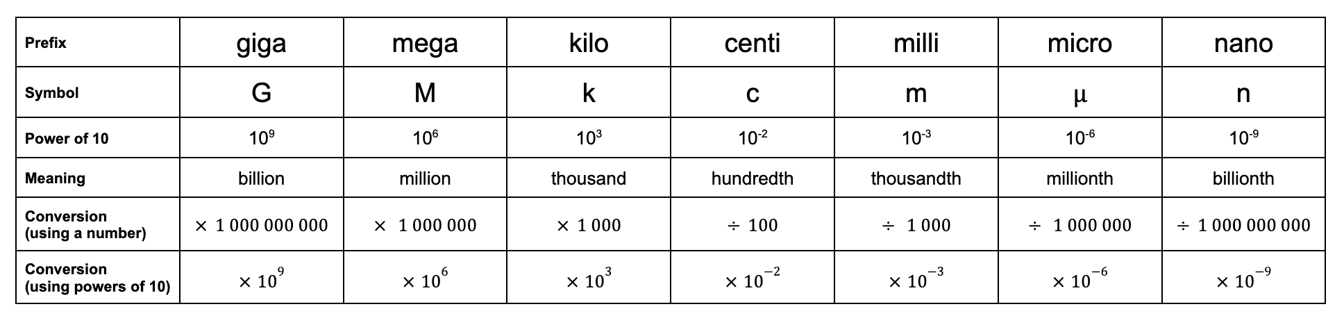
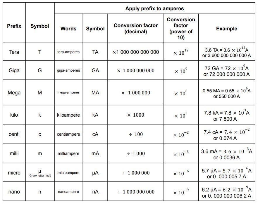
As of the time of writing, GCSE Science (2015 specification) students are expected to know the SI unit prefixes from giga- to nano-.
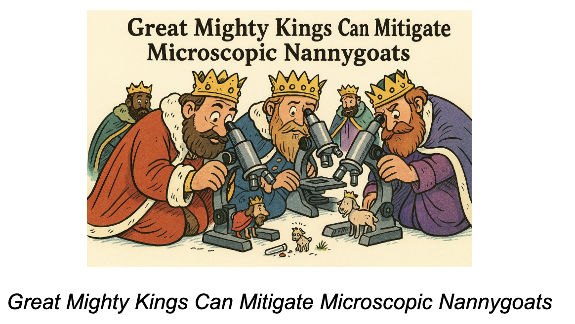
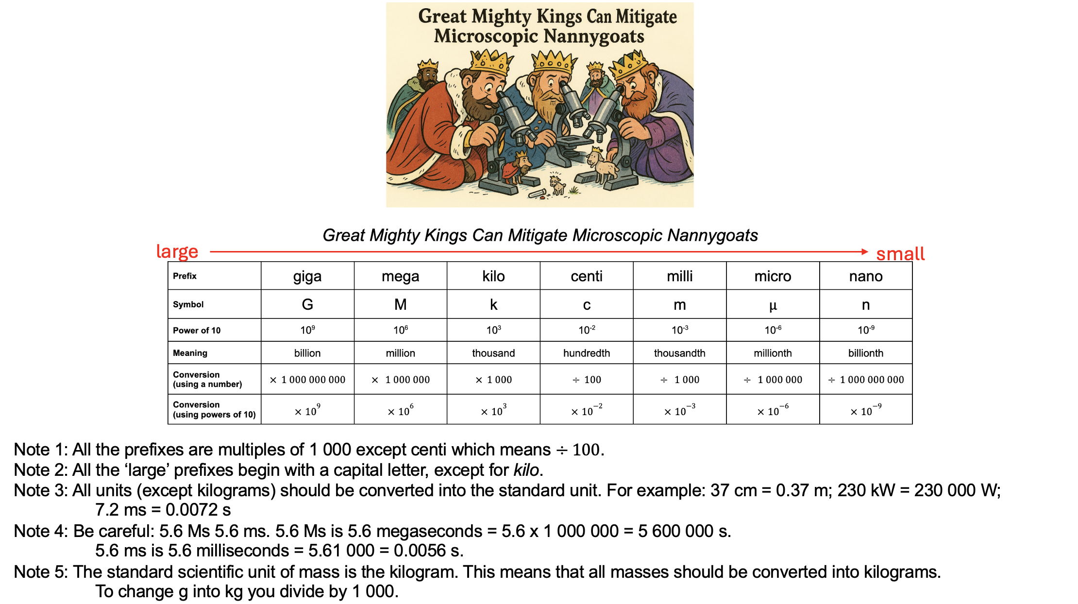
I suggest the following mnemonic:
A mnemonic for memorising the SI unit prefixes needed for GCSE
Choosing a mnemonic can be difficult because ‘mega’, ‘milli’ and ‘micro’ all begin with m, and even the first two letters of ‘milli’ and ‘micro’ are both ‘mi’. The mnemonic about helps students remember the difference between ‘milli’ and ‘micro’ by using ‘microscopic’ to help.
If you think this approach will be useful for your students, the Powerpoint is attached.
Enjoy!
PS You can find more of my thoughts on the SI system here
Gustav Robert Kirchhoff (1824 – 1887) was a pioneer in the study of the radiation given off by hot objects and was the first person to use the term ‘black body radiation’. He also made groundbreaking contributions to what was then the ‘new’ science of spectroscopy.
High school students first encounter his name when studying electric circuits. Kirchhoff developed laws which describe the behaviour of electric circuits and, rightly, these laws still bear his name.
Newton needed three laws to explain the whole of motion; Kirchhoff needed only two to explain the behaviour of all circuits.
Kirchhoff’s First Law (aka KCL or Kirchhoff’s Current Law)
This law is a consequence of the Principle of Conservation of Electric Charge.
The algebraic sum of all the currents flowing through all the wires in a network that meet at a point is zero
Oxford Dictionary of Physics (2015)
‘Algebraic sum’ means that we must take account of whether the electric currents are positive or negative; or, in other words, their direction.
This can be stated more simply as: the sum of electric currents flowing into a junction is equal to the sum of the electric currents flowing out of the junction.
Kirchhoff’s Second Law (aka KVL or Kirchhoff’s Voltage Law)
This law is a consequence of the Principle of Conservation of Energy.
The algebraic sum of the e.m.f.s within any closed circuit is equal to the sum of the products of the currents and the resistances in the various portions of the circuit.
Oxford Dictionary of Physics (2015)
This can be more directly understood as saying that in any closed loop of the circuit, the sum of the energies gained by the charge carriers as they pass through parts of the loop with a positive potential difference is equal to the sum of the energies lost by the charge carriers as they pass through parts of the circuit with electrical resistance.
In other words, the sum of the positive potential differences (e.m.f.s) is equal to the sum of the negative potential differences around any closed loop of a circuit.
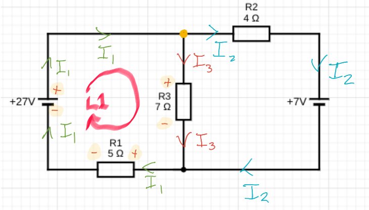
Applying Kirchhoff’s Laws to a circuit problem
Find the current flowing through each resistor in this circuit
Applying Kirchhoff’s First Law
But wait — is the current I2 flowing in the right way? Surely it should be coming out of the positive terminal of the 7 V battery, no?
Perhaps. The direction of I2 is simply my semi-educated guess at its direction given the relative strength of the 27 V cell and the 7 V cell.
But the happy truth of using Kirchhoff’s First Law is that . . . it doesn’t matter. Even if we have guessed the direction wrong, after we have gone through the process all that will happen is that we will get the correct numerical value for I2 but our mistake will be revealed by the fact that it will have a negative value.
If we look at the junction highlighted in yellow, we can see that the algebriac sum of currents is: I1 – I2 – I3 = 0.
We can rewrite this as: I1 = I2 + I3.
And that’s about as far as we can get using just Kirchhoff’s First Law. We have three unknowns so somehow we need to obtain two more independent expressions of their relationships to solve this circuitous conundrum.
Luckily, we still have Kirchhoff Second Law to bring into play…
Applying Kirchhoff’s Second Law (Part 1 of 2)
Before starting, I find it immensely helpful to indicate which ends of the components have a positive potential and which have a negative potential. This process is part of a general maxim that I try to apply to all areas of physics problem solving: why think hard when your diagram can do the thinking for you? (See here for a similar process applied to dynamics problems.)
An example of ‘Why think hard when the diagram will do it for you?’
Going around loop L1 in the direction shown by the arrow:
The emf 27 V will be positive as the potential increases (as we are moving from – to +).
I3R3 will be negative as the potential decreases (as we are moving from + to -).
I1R1 will be negative as the potential decreases (as we are moving from + to -).
This gives us:
Applying Kirchhoff’s Second Law (Part 2 of 2)
Yet another example of ‘Let the diagram do the hard thinking for you!’
Going around Loop L2 we find that:
The emf 7 V will be positive as the potential increases (as we are moving from – to +).
I2R2 will be positive as the potential increases (as we are moving from – to +).
I3R3 will be negative as the potential decreases (as we are moving from + to -).
This gives us:
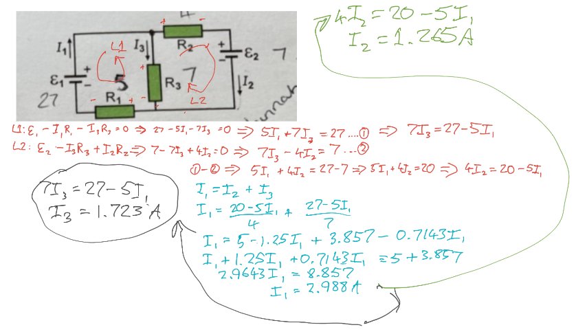
The rest is history algebra
Going through a rather involved process of using simultaneous equations for solving for I1, I2 and I3 . . .
(NB There’s probably a quicker way than the way I chose, but I got there in the end and that’s the important thing. AND I guessed the direction of I2 correctly. *Pats himself on the back*).
Conclusion
Kirchhoff’s Laws: I hope you give them a spin, whether or not you decide to use the procedure outlined above 🙂
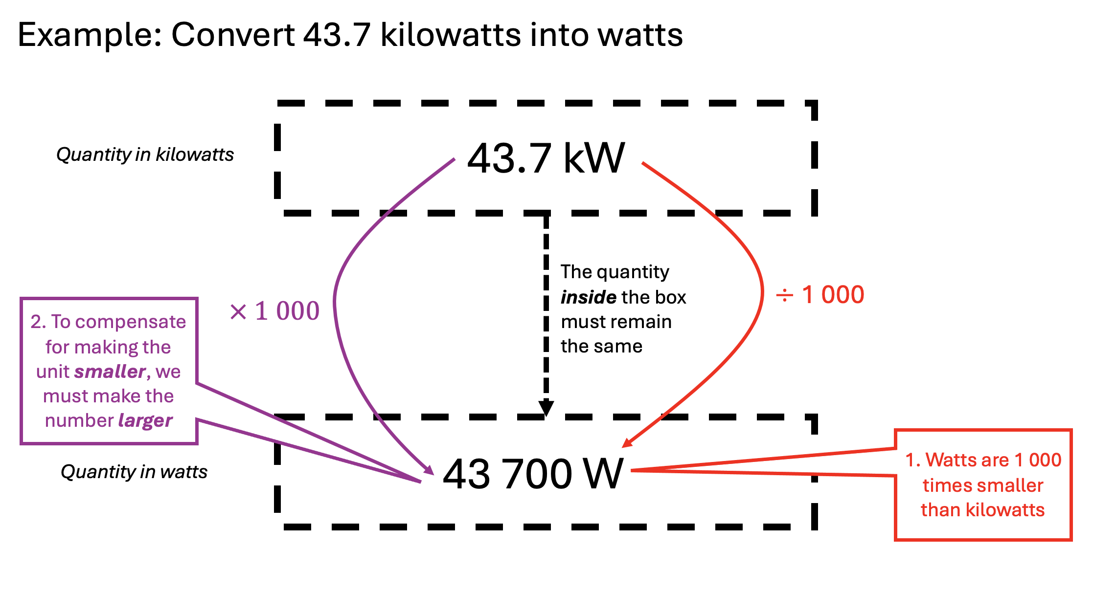
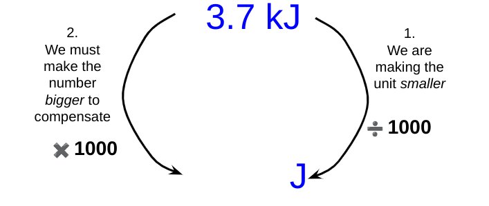
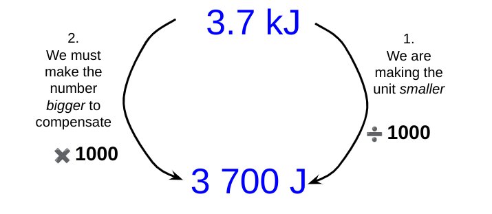
As noted earlier, some students struggle with unit conversions. To take a simple example: if we need to convert 3.7 kilojoules (or ‘killer-joules’ as some insist on calling them *shudders*) into joules, then whilst many students know that the conversion involves applying a factor of one thousand, they do not know whether to multiply 3.7 by a thousand or divide 3.7 by a thousand.
Michael Porter shared a brilliant suggestion for helping students over this hurdle. He suggests that we break down the operation into two parts:
Consider if we are making the unit larger or smaller.
If making the unit larger, we must make the number smaller to compensate; and vice versa.
Let’s look at using the Porter system for the example shown above.
(Note: I have used kilojoules for our first example since, at least for GCSE Science calculation contexts, students are unlikely to have to convert kilograms into grams. This is because, of course, the kilogram (not the gram) is the base unit of mass in the SI System.)
By changing from kilojoules to joules we are making the unit smaller, since one kilojoule is larger than one joule.
To keep the measured quantity of energy the same magnitude, we must therefore make the number part of the measurement bigger to compensate for the reduction in size of the unit.
This leads us to the final answer.
Now let’s look if we had to convert 830 microamps into amps:
The strange case of time
Obviously 1 minute is a very small quantity of time compared with a whole week. Indeed, our forefathers considered it small as compared with an hour, and called it “one minùte,” meaning a minute fraction — namely one sixtieth — of an hour. When they came to require still smaller subdivisions of time, they divided each minute into 60 still smaller parts, which, in Queen Elizabeth’s days, they called “second minùtes” (i.e., small quantities of the second order of minuteness).
Silvanus P. Thompson, “Calculus Made Easy” (1914)
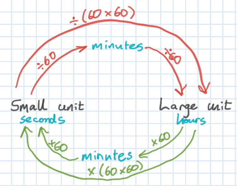
It is probable that the division of units of time into sixtieths dates back many thousands of years to the ancient Babylonians(!) Is it any wonder that some students find it hard to convert units of time?
We can use the Porter system to help students with these conversions. For example, what is 7 hours in seconds?
This type of diagram is, I think, very useful for showing students explicitly what we are doing.
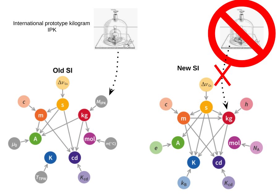
The S.I. System of Units is a thing of beauty: a lean, sinewy and utilitarian beauty that is the work of many committees, true; but in spite of that common saw about ‘a camel being a horse designed by a committee’, the S.I. System is truly a thing of rigorous beauty nonetheless.
Even the pedestrian Wikipedia entry on the 2019 Redefinition of the S.I. System reads like a lost episode from Homer’s Odyssey. As Odysseus tied himself to the mast of his ship to avoid the irresistible lure of the Sirens, so in 2019 the S.I, System tied itself to the values of a select number of universal physical constants to remove the last vestiges of merely human artifacts such as the now obsolete International Prototype Kilogram.
Meet the new (2019) SI, NOT the same as the old SI
However, the austere beauty of the S.I. System is not always recognised by our students at GCSE or A-level. ‘Units, you nit!!!’ is a comment that physics teachers have scrawled on student work from time immemorial with varying degrees of disbelief, rage or despair at errors of omission (e.g. not including the unit with a final answer); errors of imprecision (e.g. writing ‘j’ instead of ‘J’ for ‘joule — unforgivable!); or errors of commission (e.g. changing kilograms into grams when the kilogram is the base unit, not the gram — barbarous!).
The saddest occasion for writing ‘Units, you nit!’ at least in my opinion, is when a student has incorrectly converted a prefix: for example, changing millijoules into joules by multiplying by one thousand rather than dividing by one thousand so that a student writes that 5.6 mJ = 5600 J.
This odd little issue can affect students from across the attainment range, so I have developed a procedure to deal with it which is loosely based on the Singapore Bar Model.
A procedure for illustrating S.I. unit conversions
One millijoule is a teeny tiny amount of energy, so when we convert it joules it is only a small portion of one whole joule. So to convert mJ to J we divide by 1000.
One joule is a much larger quantity of energy than one millijoule, so when we convert joules to millijoules we multiply by one thousand because we need one thousand millijoules for each single joule.
In time, and if needed, you can move to a simplified version to remind students.
A simplified procedure for converting units
Strangely, one of the unit conversions that some students find most difficult in the context of calculations is time: for example, hours into seconds. A diagram similar to the one below can help students over this ‘hump’.
Helping students with time conversions
These diagrams may seem trivial, but we must beware of ‘the Curse of Knowledge’: just because we find these conversions easy (and, to be fair, so do many students) that does not mean that all students find them so.
The conversions that students may be asked to do from memory are listed below (in the context of amperes).
A table showing all the SI prefixes that GCSE students need to know
It is a thing plainly repugnant . . . to Minister the Sacraments in a Tongue not understanded of the People.
Gilbert, Bishop of Sarum. An exposition of the Thirty-nine articles of the Church of England (1700)
How can we help our students understand physics better? Or, in more poetic language, how can we make physics a thing that is more ‘understanded of the pupils’?
Redish and Kuo (2015: 573) suggest that the Resources Framework being developed by a number of physics education researchers can be immensely helpful.
In summary, the Resources Framework models a student’s reasoning as based on the activation of a subset of cognitive resources. These ‘thinking resources’ can be classified broadly as:
Embodied cognition: these are simple, irreducible cognitive resources sometimes referred to as ‘phenomenological primitives’ or p-prims such as ‘if-resistance-increases-then-the-output-decreases‘ and ‘two-opposing-effects-can-result-in-a-state-of-dynamic-balance‘. They are typically straightforward and ‘obvious’ generalisations of our lived, everyday experience as we move through the physical world. Embodied cognition is perhaps summarised as our ‘sense of mechanism’.
Encyclopedic (ancillary) knowledge: this is a complex cognitive resource made of a large number of highly interconnected elements: for example, the concept of ‘banana’ is linked dynamically with the concept of ‘fruit’, ‘yellow’, ‘curved’ and ‘banana-flavoured’ (Redish and Gupta 2009: 7). Encyclopedic knowledge can be thought of as the product of both informal and formal learning.
Contextualisation: meaning is constructed dynamically from contextual and other clues. For example, the phrase ‘the child is safe‘ cues the meaning of ‘safe‘ = ‘free from the risk of harm‘ whereas ‘the park is safe‘ cues an alternative meaning of ‘safe‘ = ‘unlikely to cause harm‘. However, a contextual clue such as the knowledge that a developer had wanted to but failed to purchase the park would make the statement ‘the park is safe‘ activate the ‘free from harm‘ meaning for ‘safe‘. Contextualisation is the process by which cognitive resources are selected and activated to engage with the issue.
Using the Resources Framework for teaching
I have previously used aspects of the Resources Framework in my teaching and have found it thought provoking and helpful to my practice. However, the ideas are novel and complex — at least to me — so I have been trying to think of a way of conveniently organising them.
What follows in my ‘first draft’ . . . comments and suggestions are welcome!
The RGB Model of the Resources Framework
The RGB Model of the Resources Framework
The red circle (the longest wavelength of visible light) represents Embodied Cognition: the foundation of all understanding. As Kuo and Redish (2015: 569) put it:
The idea is that (a) our close sensorimotor interactions with the external world strongly influence the structure and development of higher cognitive facilities, and (b) the cognitive routines involved in performing basic physical actions are involved in even in higher-order abstract reasoning.
The green circle (shorter wavelength than red, of course) represents the finer-grained and highly-interconnected Encyclopedic Knowledge cognitive structures.
At any given moment, only part of the [Encyclopedic Knowledge] network is active, depending on the present context and the history of that particular network
Redish and Kuo (2015: 571)
The blue circle (shortest wavelength) represents the subset of cognitive resources that are (or should be) activated for productive understanding of the context under consideration.
A human mind contains a vast amount of knowledge about many things but has limited ability to access that knowledge at any given time. As cognitive semanticists point out, context matters significantly in how stimuli are interpreted and this is as true in a physics class as in everyday life.
Redish and Kuo (2015: 577)
Suboptimal Understanding Zone 1
A common preconception held by students is that the summer months are warmer because the Earth is closer to the Sun during this time of year.
The combination of cognitive resources that lead students to this conclusion could be summarised as follows:
Encyclopedic knowledge: the Earth’s orbit is elliptical
Embodied cognition: The closer to a heat source you are the warmer it is.
Both of these cognitive resources, considered individually, are true. It is their inappropriate selection and combination that leads to the incorrect or ‘Suboptimal Understanding Zone 1’.
To address this, the RF(RGB) suggests a two pronged approach to refine the contextualisation process.
Firstly, we should address the incorrect selection of encyclopedic knowledge. The Earth’s orbit is elliptical but the changing Earth-Sun distance cannot explain the seasons because (1) the point of closest approach is around Jan 4th (perihelion) which is winter in the northern hemisphere; (2) seasons in the northern and southern hemispheres do not match; and (3) the Earth orbit is very nearly circular with an eccentricity e of 0.0167 where a perfect circle has e = 0.
Secondly, the closer-is-warmer p-prim is not the best embodied cognition resource to activate. Rather, we should seek to activate the spread-out-is-less-intense ‘sense of mechanism’ as far as we are able to (for example by using this suggestion from the IoP).
Suboptimal Understanding Zone 2
Another common preconception held by students is all waves have similar properties to the ‘breaking’ waves on a beach and this means that the water moves with the wave.
The structure of this preconception could be broken down into:
Embodied cognition: if I stand close to the water on a beach, then the waves move forward to wash over my feet.
Encyclopaedic knowledge: the waves observed on a beach are water waves
Considered in isolation, both of these cognitive resources are unproblematic: they accurately describes our everyday, lived experience. It is the contextualisation process that leads us to apply the resources inappropriately and places us squarely in Suboptimal Understanding Zone 2.
The RF(RGB) Model suggests that we can address this issue in two ways.
Firstly, we could seek to activate a more useful embodied cognition resource by re-contextualising. For example, we could ask students to imagine themselves floating in deep water far from the shore: do the waves carry them in any particular direction or simply move them up or down as they pass by?
Secondly, we could seek to augment their encyclopaedic knowledge: yes, the waves on a beach are water waves but they are not typical water waves. The slope of the beach slows down the bottom part of the wave so the top part moves faster and ‘topples over’ — in other words, the water waves ‘break’ leading to what appears to be a rhythmic back-and-forth flow of the waves rather than a wave train of crests and troughs arriving a constant wave speed. (This analysis is over a short period of time where the effect of any tidal effects is negligible.)
Both processes try to ‘tug’ student understanding into the central, optimal zone.
Suboptimal Understanding Zone 3
Redish and Kuo (2015: 585) recount trying to help a student understand the varying brightness of bulbs in the circuit shown.
All bulbs are identical. Bulbs A and D are bright; bulbs B and C are dim.
The student said that they had spent nearly an hour trying to set up and solve the Kirchoff’s Law loop equations to address this problem but had been unsuccessful in accounting for the varying brightnesses.
Redish suggested to the student that they try an analysis ‘without the equations’ and just look at the problems in simpler physical terms using just the concept of electric current. Since current is conserved it must split up to pass through bulbs B and C. Since the brightness is dependent on the current, the smaller currents in B and C compared with A and D accounts for their reduced brightness.
When he was introduced to [this] approach to using the basic principles, he lit up and was able to solve the problem quickly and easily, saying, ‘‘Why weren’t we shown this way to do it?’’ He would still need to bring his conceptual understanding into line with the mathematical reasoning needed to set up more complex problems, but the conceptual base made sense to him as a starting point in a way that the algorithmic math did not.
Analysing this issue using the RF(RGB) it is plausible to suppose that the student was trapped in Suboptimal Understanding Zone 3. They had correctly selected the Kirchoff’s Law resources from their encyclopedic knowledge base, but lacked a ‘sense of mechanism’ to correctly apply them.
What Redish did was suggest using an embodied cognition resource (the idea of a ‘material flow’) to analyse the problem more productively. As Redish notes, this wouldn’t necessarily be helpful for more advanced and complex problems, but is probably pedagogically indispensable for developing a secure understanding of Kirchoff’s Laws in the first place.
Conclusion
The RGB Model is not a necessary part of the Resources Framework and is simply my own contrivance for applying the RF in the context of physics education at the high school level. However, I do think the RF(RGB) has the potential to be useful for both physics and science teachers.
Hopefully, it will help us to make all of our subject content more ‘understanded of the pupils’.
References
Redish, E. F., & Gupta, A. (2009). Making meaning with math in physics: A semantic analysis. GIREP-EPEC & PHEC 2009, 244.
Redish, E. F., & Kuo, E. (2015). Language of physics, language of math: Disciplinary culture and dynamic epistemology. Science & Education, 24(5), 561-590.
A huge thank you to everyone who has viewed, read or commented on one of my posts in 2021: whether you agreed or disagreed with my point of view, you are the people that make the work of writing this blog so enjoyable and rewarding.
The top 3 most-read posts of 2021 were:
1. What to do if your school has a batshit crazy marking policy
This particular post was written back in 2019 and it’s sobering to realise that it is still relevant enough that it was featured by @TeacherTapp in November 2021. As edu-blog writers will know, this unlooked for honour generates thousands of views — thanks, @TeacherTapp!
Note to schools: please, if you haven’t done so already, please please please sort out your marking policy and make sure it is workable and fit for purpose. It would seem that, even now, teachers are being made to mark for the sake of marking, rather than for any tangible educational benefit.
2. FIFA for the GCSE Physics Calculation Win!
The next post is one I am very proud of, even though FIFA is just a silly mnemonic to help students follow the “substitute-first-and-then-rearrange” method favoured by AQA mark schemes. Yes, FIFA did start life as a “mark-grubbing” dodge; however, somewhat to my own surprise, I found that the vast majority of students (LPAs included), can rearrange successfully if they substitute the numbers in first. Many other teachers have found the same thing as well — search #FIFAcalc on Twitter for some illustrative tweets from FIFAcalc’s biggest fans.
However, it is clear that the formula triangle method still has many adherents. I think this is unfortunate because: (a) they only work for a limited subset of formulas with the format y=mx; (b) they are a cognitive dead end that actively block students from accessing higher level STEM courses; and (c) as Ed Southall argues effectively, they are a form of procedural teaching rather than conceptual teaching.
3. Why does kinetic energy = 1/2mv^2?
This post is a surprise “sleeper” hit also dating from 2019. It outlines an accessible method for deriving the kinetic energy formula. From getting a respectable but niche 200 views per year in 2019 and 2020, in 2021 it shot up to over 3K views. What is very encouraging for me is that most of these views come from internet searches by individuals from a wide range of backgrounds and not just my fellow denizens of the online edu-Bubble!
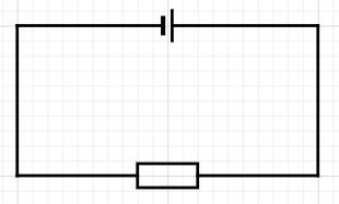
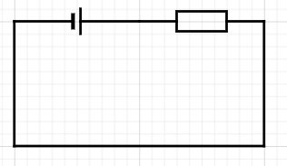
Old ways are the best ways…? (Spoiler: not always)
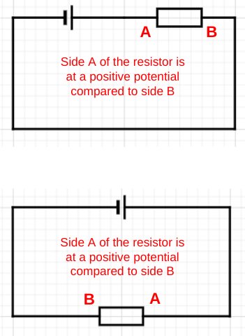
This is a very typical, conventional way of showing a simple circuit.
A simple circuit as usually presented
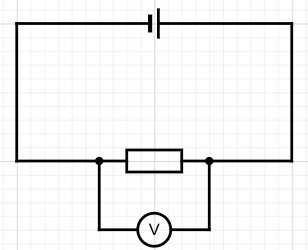
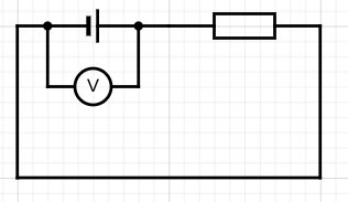
Now let’s measure the potential difference across the cell…
Measuring the potential difference across the cell
…and across the resistor.
Measuring the potential difference across the resistor
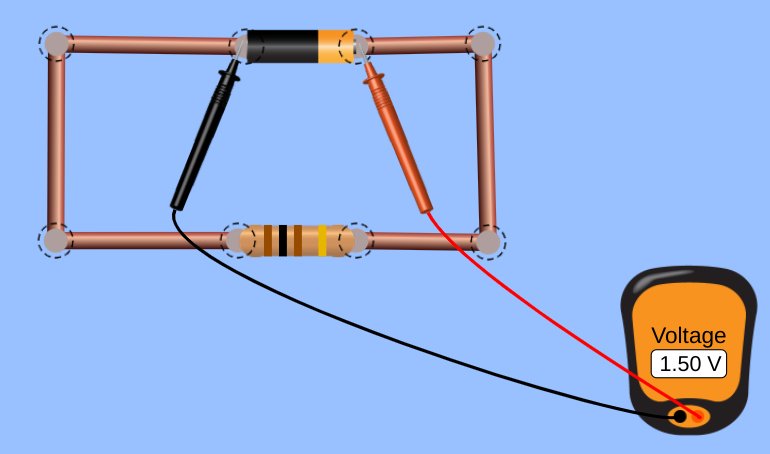
Using a standard school laboratory digital voltmeter and assuming a cell of emf 1.5 V and negligible internal resistance we would get a value of +1.5 volts for both positions.
Simulation of measuring the p.d. across the cell and across the resistor
Indeed, one might argue with some very sound justification that both measurements are actually of the same potential difference and that there is no real difference between what we chose to call ‘the potential difference across the cell’ and ‘the potential difference across the resistor’.
Try another way…
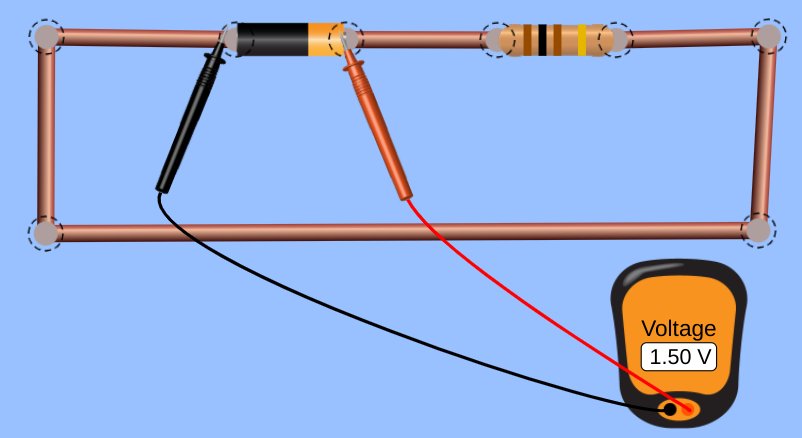
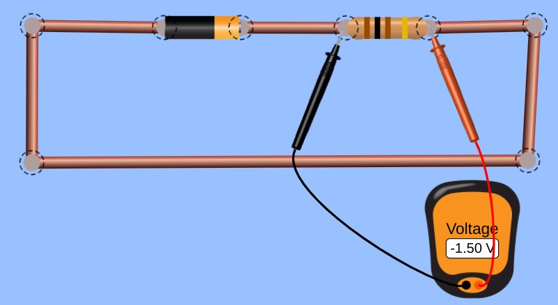
But let’s consider drawing the circuit a different (but operationally identical) way:
The same circuit drawn ‘all-in-a-row’
What would happen if we measured the potential difference across the cell and the resistor as before…
Measuring the potential difference across the cell and the resistor in the new orientationSimulation of measuring the p.d. across the cell and across the resistor in the new orientation
This time, we get a reading (same assumptions as before) of [positive] +1.5 volts of potential difference for the potential difference across the cell and [negative] -1.5 volts for the potential difference across the resistor.
This, at least to me, is a far more conceptually helpful result for student understanding. It implies that the charge carriers are gaining energy as they pass through the cell, but losing energy as they pass through the resistor.
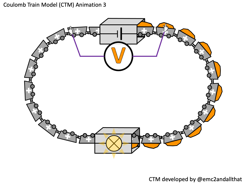
Using the Coulomb Train Model of circuit behaviour, this could be shown like this:
+1.5 V of potential difference represented using the Coulomb Train Model-1.5 V of potential difference represented using the Coulomb Train Model. (Note: for a single resistor circuit, the emerging coulomb would have zero energy.)
We can, of course, obtain a similar result for the conventional layout, but only at the cost of ‘crossing the leads’ — a sin as heinous as ‘crossing the beams’ for some students (assuming they have seen the original Ghostbusters movie).
Crossing the leads on a voltmeter
A Hidden Rotation?
The argument I am making is that the conventional way of drawing simple circuits involves an implicit and hidden rotation of 180 degrees in terms of which end of the resistor is at a more positive potential.
A hidden rotation…?
Of course, experienced physics learners and instructors take this ‘hidden rotation’ in their stride. It is an example of the ‘curse of knowledge’: because we feel that it is not confusing we fail to anticipate that novice learners could find it confusing. Wherever possible, we should seek to make whatever is implicit as explicit as we can.
Conclusion
A translation is, of course, a sliding transformation, rather than a circumrotation. Hence, I had to dispense with this post’s original title of ‘Circuit Diagrams: Lost in Translation’.
However, I do genuinely feel that some students understanding of circuits could be inadvertently ‘lost in rotation’ as argued above.
I hope my fellow physics teachers try introducing potential difference using the ‘all-in-row’ orientation shown.
The all-in-a-row orientation for circuit diagrams to help student understanding of potential difference
I would be fascinated to know if they feel its a helpful contribition to their teaching repetoire!
The Coulomb Train Model (CTM) is a helpful model for both explaining and predicting the behaviour of real electric circuits which I think is suitable for use with KS3 and KS4 students (that’s 11-16 year olds for non-UK educators).
I have written about it before (see here and here) but I have recently been experimenting with animated versions of the original diagrams.
Essentially, the CTM is a donation model akin to the famous ‘bread and bakery van’ or even the ‘penguins and ski lift’ models, but to my mind it has some major advantages over these:
The trucks (‘coulombs’) in the CTM are linked in a continuous chain. If one ‘coulomb’ stops then they all stop. This helps students grasp why a break anywhere in a circuit will stop all current.
The CTM presents a simplified but still quantitatively accurate picture of otherwise abstract entities such as coulombs and energy rather than the more whimsical ‘bread van’ = ‘charge carrier’ and ‘bread’ = ‘energy’ (or ‘penguin’ = ‘charge carrier’ and ‘gpe of penguin’ = ‘energy of charge carrier’) for the other models.
Explanations and predictions scripted using the CTM use direct but substantially correct terminiology such as ‘One ampere is one coulomb per second’ rather than the woolier ‘current is proportional to the number of bread vans passing in one second’ or similar.
Modelling current flow using the CTM
The coulombs are the ‘trucks’ travelling clockwise in this animation. This models conventional current.
Charge flow (in coulombs) = current (in amps) x time (in seconds)
So a current of one ampere is one coulomb passing in one second. On the animation, 5 coulombs pass through the ammeter in 25 seconds so this is a current of 0.20 amps.
We have shown two ammeters to emphasise that current is conserved. That is to say, the coulombs are not ‘used up’ as they pass through the bulb.
The ammeters are shown as semi-transparent as a reminder that an ammeter is a ‘low resistance’ instrument.
Modelling ‘a source of potential difference is needed to make current flow’ using the CTM
Energy transferred (in joules) = potential difference (in volts) x charge flow (in coulombs)
So the potential difference = energy transferred divided by the number of coulombs.
The source of potential difference is the number of joules transferred into each coulomb as it passes through the cell. If it was a 1.5 V cell then 1.5 joules of energy would be transferred into each coulomb.
This is represented as the orange stuff in the coulombs on the animation.
What is this energy? Well, it’s not ‘electrical energy’ for certain as that is not included on the IoP Energy Stores and Pathways model. In a metallic conductor, it would be the sum of the kinetic energy stores and electrical potential energy stores of 6.25 billion billion electrons that make up one coulomb of charge. The sum would be a constant value (assuming zero resistance) but it would be interchanged randomly between the kinetic and potential energy stores.
For the CTM, we can be a good deal less specific: it’s just ‘energy’ and the CTM provides a simplified, concrete picture that allows us to apply the potential difference equation in a way that is consistent with reality.
Or at least, that would be my argument.
The voltmeter is shown connected in parallel and the ‘gloves’ hint at it being a ‘high resistance’ instrument.
More will follow in part 2 (including why I decided to have the bulb flash between bright and dim in the animations).
Newton’s First and Second Laws of Motion are universal: they tell us how any set of forces will affect any object.
The “Push-Me-Pull-You” made famous by Dr Doolittle
If the forces are ‘balanced’ (dread word! — saying ‘total force is zero’ is better, I think) then the object will not accelerate: that is the essence of the First Law. If the sum of the forces is anything other than zero, then the object will accelerate; and what is more, it will accelerate at a rate that is directly proportional to the total force and inversely proportional to the mass of the object; and let’s not forget that it will also accelerate in the direction in which the total force acts. Acceleration is, after all, a vector quantity.
So far, so good. But what about the Third Law? It goes without saying, I hope, that Newton’s Third Law is also universal, but it tells us something different from the first two.
The first two tell us how forces affect objects; the third tells us how objects affect objects: in other words, how objects interact with each other.
The word ‘interact’ can be defined as ‘to act in such a way so as to affect each other’; in other words, how an action produces a reaction. However, the word ‘reaction’ has some unhelpful baggage. For example, you tap my knee (lightly!) with a hammer and my leg jerks. This is a reaction in the biological sense but not in the Newtonian sense; this type of reaction (although involuntary) requires the involvement of an active nervous system and an active muscle system. Because of this, there is a short but unavoidable time delay between the stimulus and the response.
The same is not true of a Newton Third Law reaction: the action and reaction happen simultaneously with zero time delay. The reaction is also entirely passive as the force is generated by the mere fact of the interaction and requires no active ‘participation’ from the ‘acted upon’ object.
I try to avoid the words ‘action’ and ‘reaction’ in statements of Newton’s Third Law for this reason.
If body A exerts a force on body B, then body B exerts an equal and opposite force on body A.
The best version of Newton’s Third Law(imho)
In our universe, body B simply cannot help but affect body A when body A acts on it. Newton’s Third Law is the first step towards understanding that of necessity we exist in an interconnected universe.
Getting the Third Law wrong…
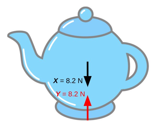
Let’s consider a stationary teapot. (Why not?)
This is NOT a good illustation of Newton’s Third Law…
We can reject this as an appropriate example of Newton’s Third Law for two reasons:
Reason 1: Force X and Force Y are acting on a single object. Newton’s Third Law is about the forces produced by an interaction between objects and so cannot be illustrated by a single object.
Reason 2: Force X and Force Y are ‘equal’ only in the parochial and limited sense of being merely ‘equal in magnitude’ (8.2 N). They are very different types of force: X is an action-at-distance gravitational force and Y is an electromagnetic contact force. (‘Electromagnetic’ because contact forces are produced by electrons in atoms repelling the electrons in other atoms.) The word ‘equal’ in Newton’s Third Law does some seriously heavy lifting…
Getting the Third Law right…
The Third Law deals with the forces produced by interactions and so cannot be shown using a single diagram. Free body diagrams are the answer here (as they are in a vast range of mechanics problems).
This is a good illustration of Newton’s Third Law
The Earth (body A) pulls the teapot (body B) downwards with the force X so the teapot (body B) pulls the Earth (body A) upwards with the equal but opposite force W. They are both gravitational forces and so are both colour-coded black on the diagram because they are a ‘Newton 3 pair’.
It is worth noting that, applying Newton’s Second Law (F=ma), the downward 8.2 N would produce an acceleration of 9.8 metres per second per second on the teapot if it was allowed to fall. However, the upward 8.2 N would produce an acceleration of only 0.0000000000000000000000014 metres per second per second on the rather more massive planet Earth. Remember that the acceleration produced by the resultant force is inversely proportional to the mass of the object being accelerated.
Similarly, the Earth’s surface pushes upward on the teapot with the force Y and the teapot pushes downward on the Earth’s surface with the force Z. These two forces form a Newton 3 pair and so are colour-coded red on the diagram.
We can summarise this in the form of a table:
Testing understanding
One the best exam questions to test students’ understanding of Newton’s Third Law (at least in my opinion) can be found here. It is a really clever question from the legacy Edexcel specificiation which changed the way I thought about Newton’s Third Law because I was suddenly struck by the thought that the only force that we, as humans, have direct control over is force D on the diagram below. Yes, if D increases then B increases in tandem, but without the weighty presence of the Earth we wouldn’t be able to leap upwards…