2021 Retrospective

A huge thank you to everyone who has viewed, read or commented on one of my posts in 2021: whether you agreed or disagreed with my point of view, you are the people that make the work of writing this blog so enjoyable and rewarding.

The top 3 most-read posts of 2021 were:

1. What to do if your school has a batshit crazy marking policy

Extract from blog post "What to do if your school has a batshit crazy marking policy"

This particular post was written back in 2019 and it’s sobering to realise that it is still relevant enough that it was featured by @TeacherTapp in November 2021. As edu-blog writers will know, this unlooked for honour generates thousands of views — thanks, @TeacherTapp!

Note to schools: please, if you haven’t done so already, please please please sort out your marking policy and make sure it is workable and fit for purpose. It would seem that, even now, teachers are being made to mark for the sake of marking, rather than for any tangible educational benefit.

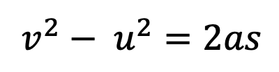
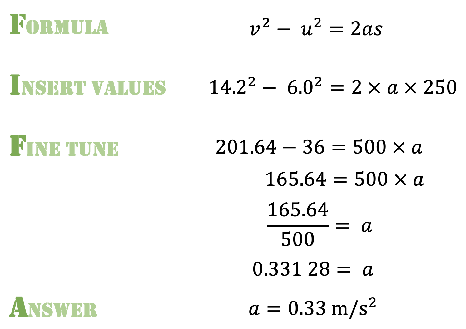
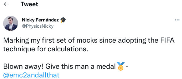
2. FIFA for the GCSE Physics Calculation Win!

Extract from "FIFA for the GCSE Physics Calculation Win" blog.

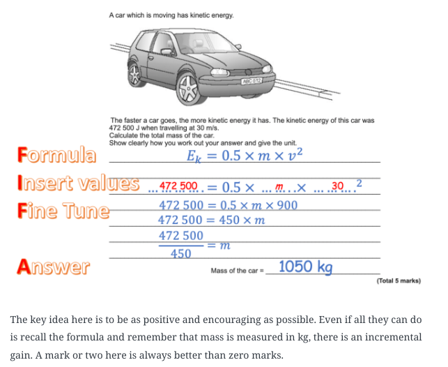
The next post is one I am very proud of, even though FIFA is just a silly mnemonic to help students follow the “substitute-first-and-then-rearrange” method favoured by AQA mark schemes. Yes, FIFA did start life as a “mark-grubbing” dodge; however, somewhat to my own surprise, I found that the vast majority of students (LPAs included), can rearrange successfully if they substitute the numbers in first. Many other teachers have found the same thing as well — search #FIFAcalc on Twitter for some illustrative tweets from FIFAcalc’s biggest fans.

However, it is clear that the formula triangle method still has many adherents. I think this is unfortunate because: (a) they only work for a limited subset of formulas with the format y=mx; (b) they are a cognitive dead end that actively block students from accessing higher level STEM courses; and (c) as Ed Southall argues effectively, they are a form of procedural teaching rather than conceptual teaching.

3. Why does kinetic energy = 1/2mv^2?

Extract from blog explaining how to derive the kinetic energy equation

This post is a surprise “sleeper” hit also dating from 2019. It outlines an accessible method for deriving the kinetic energy formula. From getting a respectable but niche 200 views per year in 2019 and 2020, in 2021 it shot up to over 3K views. What is very encouraging for me is that most of these views come from internet searches by individuals from a wide range of backgrounds and not just my fellow denizens of the online edu-Bubble!

Here’s to 2022, folks!

Waves: Introduce With Trolleys, Not Slinkys

A number of interesting questions came up in the recent author Q&A run by @Chatphysics about my contribution to Cracking Key Concepts in Secondary Science: many thanks to Jinny Bell (@MissB0107) for hosting!

In this post, the question I want to address in more detail is: why do I recommend introducing waves using dynamics trolleys rather than a slinky spring or elastic rope?

I think I have a couple of persuasive reasons; but first a digression.

A thing doing a thing…

Robert Graves wrote his charming comedic poem Welsh Incident in 1929. It describes (at least as I read it) the visitation of disparate group of space aliens to a small town on the North Wales coast in the 1920s.

I will paraphrase one line where the Narrator says:

Then one of things did a thing that was finally recognisable as a thing.

The first example of a thing doing a thing…

Now don’t get me wrong: slinky springs and elastic ropes are brilliant examples of mechanical waves and I do use them (a lot!) — I just don’t use them as the first example.

The problem as I see it is that they could lead students to file wave mechanics in an entirely separate and independent category from mechanics.

I want students to see that wave behaviour isn’t distinct from forces and particles but rather is a direct (and fairly straightforward) consequence of a particular arrangement of particles with a specific pattern of forces between them.

Since the first example, is often the ‘loudest’ (metaphorically speaking), it’s not a bad idea to start with longitudinal waves.

I use standard wooden dynamics trolleys. Dowel rods or metal posts can be used to link the trolleys together. The system is more stable if a pair of springs is used at the front and back of each trolley. The springs used are the ones we typically use for the Hooke’s Law experiment.

A compression carrying energy along a line of trolleys linked by springs can be easily modelled:

Modelling energy transfer by compression of a longitudinal wave using a line of dynamics trolleys and springs

So can a rarefaction:

Using a line of dynamics trolley linked together with spring to demonstrate the transmission of a rarefaction pulse

Transverse waves can be modelled like this:

A transverse wave modelled using a line of dynamics trolleys linked with springs

Amongst the advantages of this approach are:

  • Students are introduced to an unknown thing (wave behaviour) by means of more familiar things (trolleys and springs)
  • The idea that there is no net movement of the ‘particles’ as energy is transferred is much more directly observable using this arrangement rather than the slinky or elastic rope.
  • The frequency of a wave (which in some ways is a more fundamental measurement than wavelength) can be associated with the repeating motion of a single ‘particle’ and extended outwards to the whole system, rather than vice versa.

You can read more in Chapter 25 of Cracking Key Concepts in Secondary Science.

Conclusion

I hope readers will try this demonstation: hopefully introducing students to a thing which is already recognisable as a thing will make wave behaviour more comprehensible and less like an unwelcome diversion into terra incognita.

Readers who are ‘rich in years’ like myself will recognise this demonstration as being adapted from the old Nuffield linear A-level Physics course.

You can listen to Richard Burton’s great reading of Robert Graves’ Welsh Incident here.

Dual Coding and Equations of Motion for GCSE

Necessity may well be the mother of invention, but teacher desperation is often the mother of new pedagogy.

For an unconscionably long time, I think that I failed to adequately help students understand the so called ‘equations of motion’ (the mathematical descriptions of uniformly accelerated motion using the standard v, u, a, s and t notation) because I suffered from the ‘curse of knowledge’: I did not find the topic hard, so I naturally assumed that students wouldn’t either. This, sadly, proved not to be the case, even when the equation was printed on the equation sheet!

What follows is a summary of a dual coding technique that I have found really helpful in helping students become confident with problems involving the ‘equations of motion’. This is especially true at GCSE, where students encounter formulas such as

Equation of motion (v^2 - u^2 = 2as)

for the first time.

A dual coding convention for representing motion

Table to show dual coding convention

Applying dual coding to an equation of motion problem

EXAMPLE: A car is travelling at 6.0 m/s. As the car passes a lamp-post it accelerates up to a velocity of 14.2 m/s over a distance of 250 m. Calculate a) the acceleration; and b) the time taken for this change.

The problem can be represented using the dual coding convention as shown below.

Diagram showing car accelerating past a lamp-post using the dual coding convention outlined in the blog

Note that the arrow for v is longer than the arrow for u since the car has a positive acceleration; that is to say, the car in this example is speeding up. Also, the convention has a different style of arrow for acceleration, emphasising that it is an entirely different type of quantity from velocity.

We can now answer part (a) using the FIFA calculation system.

Working showing solution for part (a)

Part (b) can be answered as shown below.

Working for part b of the problem

Visualising Stopping Distance Questions

These can be challenging for many students, as we often seem to grabbing numbers and manipulating them without rhyme or reason. Dual coding helps make our thinking explicit,

EXAMPLE: A driver has a reaction time of 0.7 seconds. The maximum deceleration of the car is 2.6 metres per second squared. Calculate the overall stopping distance when the car is travelling at 13 m/s.

We need to calculate both the thinking distance and the braking distance to solve this problem

The acceleration of the car is zero during the driver’s reaction time, since the brakes have not been applied yet.

We visualise the first part of the problem like this.

Using s=vt we find that the thinking distance is 9.1 m.

Now let’s look at the second part of the question.

There are three things to note:

  • Since the car comes to a complete stop, the final velocity v is zero.
  • The acceleration is negative (shown as a backward pointing arrow) since we are talking about a deceleration: in other words, the velocity gradually decreases in size from the initial velocity value of u as the car traverses the distance s.
  • Since the second part of the question does not involve any consideration of time we have omitted the ‘clock’ symbols for the second part of the journey.

We can now apply FIFA:

Working for braking distance part of problem

Since the acceleration arrow points in the opposite direction to the positive arrow, we enter it as a negative value. When we get to the third line of the Fine Tune stage, we see that a negative 169 divided by negative 4.4 gives positive 38.408 — in other words, the dual coding convention does the hard work of assigning positive and negative values!

And finally, we can see that the overall stopping distance is 9.1 + 38.4 = 47.5 metres,

Conclusion

I have found this form of dual coding extremely useful in helping students understand the easily-missed subtleties of motion problems, and hope other science teachers will give it a try.


If you have enjoyed this post, you might enjoy these also:

Circuit Diagrams: Lost in Rotation…?

Is there a better way of presenting circuit diagrams to our students that will aid their understanding of potential difference?

I think that, possibly, there may be.

(Note: circuit diagrams produced using the excellent — and free! — web editor at https://www.circuit-diagram.org/.)

Old ways are the best ways…? (Spoiler: not always)

This is a very typical, conventional way of showing a simple circuit.

A simple circuit as usually presented

Now let’s measure the potential difference across the cell…

Measuring the potential difference across the cell

…and across the resistor.

Measuring the potential difference across the resistor

Using a standard school laboratory digital voltmeter and assuming a cell of emf 1.5 V and negligible internal resistance we would get a value of +1.5 volts for both positions.

Let me demonstrate this using the excellent — and free! — pHET circuit simulation website.

Indeed, one might argue with some very sound justification that both measurements are actually of the same potential difference and that there is no real difference between what we chose to call ‘the potential difference across the cell’ and ‘the potential difference across the resistor’.

Try another way…

But let’s consider drawing the circuit a different (but operationally identical) way:

The same circuit drawn ‘all-in-a-row’

What would happen if we measured the potential difference across the cell and the resistor as before…

This time, we get a reading (same assumptions as before) of [positive] +1.5 volts of potential difference for the potential difference across the cell and [negative] -1.5 volts for the potential difference across the resistor.

This, at least to me, is a far more conceptually helpful result for student understanding. It implies that the charge carriers are gaining energy as they pass through the cell, but losing energy as they pass through the resistor.

Using the Coulomb Train Model of circuit behaviour, this could be shown like this:

+1.5 V of potential difference represented using the Coulomb Train Model
-1.5 V of potential difference represented using the Coulomb Train Model. (Note: for a single resistor circuit, the emerging coulomb would have zero energy.)

We can, of course, obtain a similar result for the conventional layout, but only at the cost of ‘crossing the leads’ — a sin as heinous as ‘crossing the beams’ for some students (assuming they have seen the original Ghostbusters movie).

Crossing the leads on a voltmeter

A Hidden Rotation?

The argument I am making is that the conventional way of drawing simple circuits involves an implicit and hidden rotation of 180 degrees in terms of which end of the resistor is at a more positive potential.

A hidden rotation…?

Of course, experienced physics learners and instructors take this ‘hidden rotation’ in their stride. It is an example of the ‘curse of knowledge’: because we feel that it is not confusing we fail to anticipate that novice learners could find it confusing. Wherever possible, we should seek to make whatever is implicit as explicit as we can.

Conclusion

A translation is, of course, a sliding transformation, rather than a circumrotation. Hence, I had to dispense with this post’s original title of ‘Circuit Diagrams: Lost in Translation’.

However, I do genuinely feel that some students understanding of circuits could be inadvertently ‘lost in rotation’ as argued above.

I hope my fellow physics teachers try introducing potential difference using the ‘all-in-row’ orientation shown.

The all-in-a-row orientation for circuit diagrams to help student understanding of potential difference

I would be fascinated to know if they feel its a helpful contribition to their teaching repetoire!

Signposting Fleming’s Left Hand and Right Hand Rules

Students undoubtedly find electromagnetism tricky, especially at GCSE.

I have found it helpful to start with the F = BIl formula.

Introducing the “magnetic Bill” formula

This means that we can use the streamlined F-B-I mnemonic — developed by no less a personage than Robert J. Van De Graaff (1901-1967) of Van De Graaff generator fame — instead of the cumbersome “First finger = Field, seCond finger = Current, thuMb = Motion” convention.

Students find the beginning steps of applying Fleming’s Left Hand Rule (FLHR) quite hard to apply, so I print out little 3D “signposts” to help them. You can download file by clicking the link below.

You can see how they are used in the photo below.

Photograph to show how to use the FLHR signpost

Important tip: it can be really helpful if students label the arrows on both sides, such as in the example shown below. (The required precision in double sided printing defeated me!)

Another example of the FLHR signpost in use

Signposts for Fleming’s Right Hand Rule are included on the template.


Other posts I have written on magnetism include:

Feel free to dip into these 🙂

Misconceptions and p-prims at ResearchED 2021

Many thanks to all those who attended my talk on “Dealing with Misconceptions: the p-prim and refining raw intuitions approach” and for the stimulating discussions afterwards!

And especially huge thanks to Bill Wilkinson for his help in sorting out some tech issues!

The PowerPoint can be downloaded below.

You can watch a short summary of the talk here.

The references are below with links to freely available copies (where I’ve been able to find them).

I think Redish and Kuo (2015) is an excellent introduction to the Resources Framework.


DiSessa, A. A. (1988). Knowledge in pieces. In G. Forman & P. B. Pufall (Eds.), Constructivism in the computer age (pp. 49–70). Lawrence Erlbaum Associates, Inc.

DiSessa, A. A. (1993). Toward an epistemology of physics. Cognition and instruction10(2-3), 105-225.

Hammer, D. (2000). Student resources for learning introductory physics. American Journal of Physics68(S1), S52-S59.

Nelmes, A. (2004). Putting conceptions in their place: using analogy to cue and strengthen scientifically correct conceptions.

Redish, E. F., & Kuo, E. (2015). Language of physics, language of math: Disciplinary culture and dynamic epistemology. Science & Education24(5), 561-590.

Booklet for teaching the Coulomb Train Model

At the bottom of the post are some links to a student booklet for teaching part of the electricity content for AQA GCSE Physics / AQA GCSE Combined Science using the Coulomb Train Model.

Extract from booklet

I have believed for a long time that the electricity content is often ‘under-explained’ at GCSE: in other words, not all of the content is explicitly taught. I have deliberately have gone to the opposite extreme here — indeed, some teachers may feel that I have ‘over-explained’ too much of the content. However, the booklets are editable so feel free to adapt!

I think the booklet is suitable for teacher-led instruction as well as independent study — I would love to hear how your students have responded to it.

The animations will be ‘live’ for the Google Docs and MS Word versions, but will be frozen for the PDF version. They can be cut and pasted into Powerpoint or other teaching packages (but please note that in some versions of PPT, the animations will appear frozen until you go into presenter mode).

Please feel free to download, use and adapt as you see fit. It is released under the terms of the Creative Commons Attribution License CC BY-SA 4.0 (details here), so please flag if you see versions being sold on TES or similar websites.

The remaining content for AQA electricity will be released (fingers crossed) over the next couple of months.

Feedback and comments (hopefully mainly positive) always welcome….

Why we wrote ‘Cracking Key Concepts in Secondary Science’

From the Introduction

“We strongly believe that the central part of any science lesson or learning sequence is a well-crafted and executed explanation.

“But we are also aware that many – if not most – teachers have had very little training in how to actually go about crafting or executing their explanations. As advocates of evidence-informed teaching, we hope to bring a new perspective and set of skills to your teaching and empower you to take your place in the classroom as the imparter of knowledge.

“We do, however, wish to put paid to the suspicion that we advocate science lessons to be all chalk and talk: we strongly urge that teachers should use targeted and interactive questioning, model answers, practical work, guided practice and supported individual student practice in tandem with ‘teacher talk’. There is a time when the teacher should be a ‘guide on the side’ but the main focus of this book is to enable you to shine when you are called to be a science ‘sage on the stage’.

[…] “For many years, it seems that teacher explanation has been taken for granted. In a nation-wide focus on pedagogy, activity, student-led learning and social constructivism, the role of the teacher in taking challenging material and explaining it has been de-emphasised, with discovery, enquiry, peer-to-peer tuition and ‘figuring things out for yourself’ becoming ascendant. Not only that, but a significant number of influential organisations and individuals championed the cause of ‘talk-less teaching’ where the teacher was relegated to a near-voiceless ‘guide on the side’, sometimes enforced by observers with a stopwatch and an inflexible ‘teacher talk’ time limit.

“We earnestly hope that such egregious excesses are now a thing of the past; but we must admit that all too often, the mistakes engendered by well-meaning edu-initiatives live on, while whatever good they achieved lies composting with the CPD packs from ancient training days. Even if they are a thing of the past, there has been a collective deskilling when it comes to the crafting of a science explanation – there is little institutional wisdom and few, if any, resources for teachers to use as a reference.”

And that is one reason why we wrote the book.

What follows is an example of how we discuss a teaching sequence in the book.

Viewing waves through the lens of concrete to abstract progression

Many students have a concrete idea of a wave as something ‘wavy’ i.e. something with crests and troughs. However, in a normal teaching sequence we often shift from a wave profile representation to a wavefront representation to a ray diagram representation with little or no explanation — is it any wonder that some students get confused?

I have found it useful to consider the sequence from wave profile to wavefront to ray as representations that move from the concrete and familiar representation of waves as something that looks ‘wavy’ (wave profile) to something that looks less wavy (wavefront) to something more abstract that doesn’t look at all ‘wavy’ (ray diagram) as summarised in the table below.

Each row of the table shows the same situation represented by different conventions and it is important that students recognise this. You can quiz students to check they understand this idea. For example:

  • Top row: which part of the wave do the straight lines in the middle picture represent? (The crests of the waves.)
  • Top row: why are the rays in the last picture parallel? (To show that the waves are not spreading out.)
  • Middle row: compare the viewpoints in the first and middle picture. (The first is ‘from the side’, the middle is ‘from above, looking down.’)
  • Middle row: why are the rays in the last picture not parallel? (Because the waves are spreading out in a circular pattern.)

Once students are familiar with this shift in perspective, we can use to explain more complex phenomena such as refraction.

For example, we begin with the wave profile representation (most concrete and familiar to most students) and highlight the salient features.

Next, we move on to the same situation represented as wavefronts (more abstract).

Finally, we move on to the most abstract ray diagram representation.


‘Cracking Key Concepts in Secondary Science’ is available in multiple formats from Amazon and Sage Publishing. You can also order the paperback and hardback versions direct from your local bookshop 🙂

We hope you enjoy the book and find it useful.

STOP PRESS! 25% discount!

This is only available if you order directly from SAGE Publishing before 31/12/2021 and some terms and conditions apply (see SAGE website).

  1. Go to https://uk.sagepub.com/
  2. Search for ‘Cracking Key Concepts’
  3. Enter the discount code ‘UK21AUTHOR’ at the checkout.
  4. Wait for your copy to be delivered post-haste by Royal Mail.
  5. Enjoy!

From the Earth to the Sun in 270 BC

The sun is only 32 miles across and not more than 3000 miles from the Earth. It stands to reason it must be so. God made the sun to light the earth, and therefore must have placed it close to the task it was designed to do. What would you think of a man who built a house in Zion, Illinois and put the lamp to light it in Kenosha, Wisconsin?

Wilbur Glen Voliva c.1915 (quoted in Morgan and Langford 1982: 106)

Contrary to the above quote from noted ‘Flat Earther’ Wilbur Glen Voliva (1870-1942), we have very good reason to believe that the Sun is very far away from both the Earth and the Moon.

The argument was first put forward by Aristarchus (310 – 230 BC) and it relies on shadows and geometry.

The daylight moon

A surprisingly large proportion of people are unaware that the crescent or gibbous Moon is often visible in the daylight sky. (‘Gibbous’ = less than full, more than half.)

It’s actually only a completely Full Moon that is visible only at night since, almost by definition, it will rise at sunset and set at sunrise. (Which I find strange, because a common symbol for ‘night’ or ‘sleep’ is a stylised cresent Moon — but I digress…)

It’s only a phase . . .

A daylight Moon can provide a memorable demonstration of why the Moon has phases. Just stand in a patch of sunlight and hold up a ball when the Moon is in the sky…

The ping pong ball has the same ‘phase’ as the Moon. The Moon is also a ball partially lit by the Sun but much further away… [Image from https://skyandtelescope.org/astronomy-resources/what-are-the-phases-of-the-moon/]

By the light of the silvery (half) Moon…

Aristarchus realised that when the Moon was half-lit by the Sun as viewed from the Earth (the phases known as ‘First quarter’ and ‘Last quarter’) then a line drawn from the centre of the Earth to the Moon would be at 90 degrees to a line connecting the Moon to the Sun as shown below.

To an observer on Earth, the angular distance θ measured between the Moon and the Sun would be small if the Sun was close to the Earth; conversely, the angle θ would be large if the Sun was far away from the Earth.

Aristarchus realised that if he measured the angle θ between the Moon when it was half lit (i.e. during First Quarter or Last Quarter) and the Sun, then he would be able to find the ratio between the Earth-Moon distance and the Earth-Sun distance. Since he had previously worked out a method to measure the Earth-Moon distance, this meant that he could calculate the distance from the Earth to the Sun.

Modern measurements of the angle θ produce a mean value of 89 degrees and 51.2 minutes of arc (it does vary as the Moon has an elliptical rather than a circular orbit).

Using some trigonometry we calculate that the Earth-Sun distance (ES) is 400 times the Earth-Moon distance.

Quibbles and Caveats

Aristarchus measured an angle of 87 degrees for θ which meant that he calculated that the Sun was only 20 times further away from the Earth than the Moon. Also, trigonometrical techniques were not available to him which meant he had to use a geometrical method to calculate the Earth-Sun distance. However, Aristarchus achievement is still worth celebrating!


This is part 3 of a series exploring how humans ‘measured the size of the sky’.

Part 1: How Eratosthenes measured the size of the Earth

Part 2: How Aristarchus measured the distance from the Earth to the Moon

REFERENCE

Langford D & Morgan C.. (1982), Facts and Fallacies: A book of definitive mistakes and misguided predictions. Corgi Books.

From the Earth to the Moon in 270 BC

The brain is wider than the sky,

For, put them side by side,

The one the other will include

With ease, and you beside.

Emily Dickinson

How did human beings first work out the distance from the Earth to the Moon?

Aristrarchus of Samos (310 BC – 230 BC) figured out a way to do so in terms of the radius of the Earth in 270 BC. Combined with Eratosthenes’ measurement of the radius of the Earth (c. 240 BC) it enabled people to calculate the actual distance to the Moon. The ancient Greeks used a measurement of distance called stadia (singular: stadium) but we will present the measurements here in terms of kilometres.

Magic with a shadow, not with mirrors

Aristarchus used the fact that the Moon passes through the Earth’s shadow during a total lunar eclipse, which happen once every two to three years on average.

What does a total lunar eclipse look like? Watch this amazing 33 second time lapse video from astrophotographer Bartosz Wojczyński.

https://www.youtube.com/watch?v=LK_44AbfH2Q Note that Mr Wojczyński altered the exposure time of each shot to compensate for the reduced brightness of the Moon as it crossed into the shadow. For reference, the exposure time for the brightly lit Moon was 1/2500 second, and for the dim ‘Blood Moon’ (turned red by sunlight refracted by the Earth’s atmosphere) it was 6 seconds.

The video is sped up so that 1 second of video represents 8 minutes of real time. In the video, the Moon is in shadow for 24 seconds which equates to 8 x 24 = 192 minutes or 3 hours 12 minutes. We will use this later to model Aristarchus’ original calculation.

It’s always Aristarchus before the dawn…

Aristarchus began with the assumption that the Earth of radius r creates a cylinder of shadow that is 2r wide as shown in the diagram below.

The Moon orbits the Earth on a roughly circular path of radius R so it cover a total distance of 2πR. This means that its average speed over its whole journey is 2πR/T where T is the orbital period of the Moon, which is 27.3 days or 27.3 x 24 = 655.2 hours.

The average speed of the Moon as it passes through the Earth’s shadow is 2r / t where t is the time for a lunar eclipse (3 hours 12 minutes, in our example).

The average speed of the speed of the Moon is the same in both instances so we can write:

We can simplify by cancelling out the common factor of two:

Then we can rearrange to make R the subject:

Putting in values for t = 3 hours 12 minutes or 3.2 hours, T = 655.2 hours and Eratosthenes’ value for the radius of the Earth r = 6371 km (which was established a few years later):

So now they do it with mirrors…

Aristarchus’ value is just a shade over 7% too large compared with the modern value of the Earth-Moon distance of 384 400 km, but is impressive for a first approximation carried out in antiquity!

The modern value is measured in part by directing laser beams on to special reflectors left on the Moon’s surface by the Apollo astronauts and also the automated Lunokhod missions. Under ideal conditions, this method can measure the Earth-Moon distance to the nearest millimetre.

Quibbles, Caveats and Apologies

Aristarchus’ estimate was too large in part because of his assumption that Earth’s shadow was a cylinder with a uniform diameter. The Sun is an extended light source so Earth’s shadow forms a cone as shown below.

The value of t is smaller than it would if the shadow was 2r wide, leading to a too-large value of R using Aristarchus’ method.

Also, the plane of the Moon’s orbit is tilted with respect to the plane of the Earth’s orbit. This means that the path of the Moon during an eclipse might not pass through the ‘thickest’ part of the shadow. Aristarchus used the average time t calculated from a number of lunar eclipses.

When timing the lunar eclipse shown in Mr Wojczyński’s excellent video, I started the clock when the leading edge of the Moon entered the shadow, but I confess that I ‘cheated’ a little bit by not stopping the clock when the leading edge of the Moon left the shadow — the error is entirely mine and was deliberate in order to arrive at a reasonable value of R for pedagogic impact.

UPDATE: You could also watch this stunning visualisation of a lunar eclipse from Andrew McCarthy where the shadow of the Earth is tracked rather than the Moon.


This is part 2 of a series exploring how humans ‘measured the size of the sky’.

Part 1: How Eratosthenes measured the size of the Earth

Part 3: How Aristarchus measured the distance from the Earth to the Sun