Make choo choo go faster

Captain Matthew Henry Phineas Riall Sankey sighed and shaded his tired eyes from the bright glare of the oil lamp. Its light reflected harshly from the jumbled mounds of papers that entirely covered the dark oak surface of his desk. He took a moment to roll down the wick and dim the light. The chaos of his work area hinted at the chaos currently roiling in his usually precise and meticulous engineer’s mind.

He leaned backward in his chair, his shoulders slumped in despair. This problem had defeated many other men before him, he reflected as he stroked his luxuriant moustache: there would be no shame in admitting defeat.

After all, he was only one man and he was attempting to face down the single most serious and most pressing scientific and engineering issue known to the world in the Victorian Era. And yet — he couldn’t help but feel that he was, somehow, close to solving it. The answer seemed to hover mirage-like in front of him, almost within his grasp but blurred and indistinct. It became as insubstantial as mist each time he reached for it. He needed a fresh perspective, a new way of looking simultaneously both at the whole and at the parts of the question. It was not so much a question of not seeing the wood for the trees, but rather seeing the wood, trees, twigs and leaves in sufficient detail at the same time.

And what was this problem that was occupying the finest scientific and technical minds at the close of the nineteenth century? It was simply this:

Make choo choo go faster

You think I jest. But no: in 1898 the world ran on the power of steam. Steam engines were the shining metal giants that laboured tirelessly where hundreds of millions of men and beasts had toiled in misery before. In less enlightened times, industry had rested on the backs of living things that strained and suffered under their load; now. however, it was built on the back of machines that felt no pain and could work day and night when fed with coal.

So much progress had been made over the years from the clanking primitive behemoths pioneered by Thomas Newcomen and James Watt. Those wasteful old engines had always teetered far too close to the edge of scalding catastrophe for comfort and demanded the tribute of a mountain of coal for a miserly hillock of work.

Modern steam engines were sleeker, safer and more efficient. But they still demanded too much coal for a given amount of work: somewhere, deep within their intricate web of moving parts, energy was wastefully haemorrhaging. No matter how much coal you loaded into the firebox or how hotly it burned, the dreadful law of diminishing returns worked its malevolent magic: the engine would accelerate to a certain speed, but no faster, no matter what you did. You always got less work out than you put in.

Captain Henry Phineas Sankey was searching for a tourniquet that would stem the malign loss of energy in the innards of these vital machines. He could not help but think of the wise words written by Jonathan Swift many long years ago:

Whoever could make two ears of corn, or two blades of grass, to grow upon a spot of ground where only one grew before, would deserve better of mankind, and do more essential service to his country, than the whole race of politicians put together.

What Captain Henry Phineas Sankey hoped to do was nothing less than reverse engineer the venerable Jonathan Swift: whereas previously a steam engine would burn two tons of coal to perform a task, he wanted to build an engine that would do the same work by burning only one ton of coal. That he hoped would be his enduring memorial both of his service to his country and to mankind.

But how to achieve this? How could one man hold in his head the myriad moving, spinning parts of a modern steam engine and ascertain how much loss there was here rather than there, and whether it was better to try and eliminate the loss here which might increase the weight of that particular part and hence lead to an unavoidably greater loss over there . . .

Captain Sankey’s restless eyes alighted on a framed drawing on the wall. It had been painstakingly drawn some years ago by his son, Crofton, and then delicately painted in watercolours by his daughter, Celia, when they were both still very young children. They had both been fascinated by the story of Napoleon’s ill-fated Russian Campaign of 1812. The drawing showed Charles Minard’s famous map of 1869.

It showed the initial progress of Napoleon’s huge army as a wide thick band as they proudly marched towards Moscow and its gradual whittling down by the vicissitudes of battle and disease; it also showed the army’s agonised retreat, harried by a resurgent Russian military, and fighting a constant losing battle against the merciless ‘General Winter’. Only a few — a paltry, unhappy few — Frenchmen had made it home, represented by the sad emaciated black line at journey’s end.

Mrs Eliza Sankey had questioned allowing their children to spend so much time studying such a ‘horrible history’ but Captain Sankey had encouraged them. Children should not only know the beauties of the world but also its cruelties, and everyone should attend to the lesson that ‘Pride goeth before a fall’.

The map showed all of that. It was not just a snapshot, but a dynamic model of the state of Napoleon’s army during the whole of the campaign: from the heady joys of its swift, initial victories to its inevitable destruction by cruel attrition. It was a technical document of genius, comparable to a great work of art, for it showed not only the wood but the trees and even the twigs all at one time . . .

Captain Sankey started suddenly. He had an idea. Unwilling to spare even an instant in case this will ‘o the wisp of an idea disappeared, he immediately clipped a blank sheet of paper to his drawing board. He slid the T-square into place and began to draw rapidly. This is the work that Captain Sankey wrought:

Later that evening, he wrote:

No portion of a steam plant is perfect, and each is the seat of losses more or less serious. If therefore it is desired to improve the steam plant as a whole, it is first of all necessary to ascertain separately the nature of the losses due to its various portions; and in this connection the diagrams in Plate 5 have been prepared, which it is hoped may assist to a clearer understanding of the nature and extent of the various losses.

The boiler; the engine; the condenser and air-pump; the feedpump and the economiser, are indicated by rectangles upon the diagram. The flow of heat is shown as a stream, the width of which gives the amount of heat entering and leaving each part of the plant per unit of time; the losses are shown by the many waste branches of the stream. Special attention is called to the one (unfortunately small) branch which represents the work done upon the pistons of the engine

Captain Sankey (1898)

The ubiquitous Sankey diagram had been born . . .

How NOT to draw a Sankey diagram for a filament lamp

Although this diagram draws attention to the ‘unfortunately small’ useful output of a filament lamp, and it is still presented in many textbooks and online resources, it is not consistent with the IoP’s Energy Stores and Pathways model since it shows the now defunct ‘electrical energy’ and ‘light energy’.

Note that I use the ‘block’ approach which is far easier to draw on graph paper as opposed to the smooth, aesthetically pleasing curves on the original Sankey diagram.

How to draw a Sankey diagram for a filament lamp

We can, however, draw a similar Sankey diagram for a filament lamp that is completely consistent with the IoP’s Energy Stores and Pathways model if we focus on the pathways by which energy is transferred, rather than on the forms of energy.

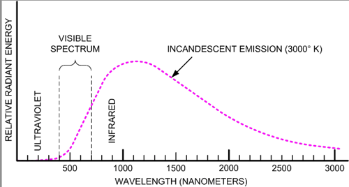
The second diagram, in my opinion, provides a much more secure foothold for understanding the emission spectrum of an incandescent filament lamp.

And, as the Science National Curriculum reminds us, we should seek to use ‘physical processes and mechanisms, rather than energy, to explain’ how systems behave. Energy is a useful concept for placing a limit on what can happen, but at the school level I think it is sometimes overused as an explanation of why things happen.

Closing thought

Stephen Hawking surmised that humanity had perhaps 100 years left on a habitable Earth. We are in a race to make a less destructive impact on our environment. ‘Reverse engineering’ Swift’s ‘two ears of corn where one grew before’ so that one joule of energy would do the same work as two joules did previously would be a huge step forward.

And for that goal, the humble Sankey diagram might prove to be an invaluable tool.

Helping Students With Extended Writing Questions in Science

Part one: general principles

He knew all the tricks: dramatic irony, metaphor, pathos, puns, parody, litotes* and . . . satire. He was vicious.

Monty Python, The Tale of the Pirhana Brothers

As we all know, students really struggle with questions in science exams which require answers written ‘at paragraph length’ (dread words!). What follows are some tips that I have found useful when coaching students to improve performance.

Many teachers of English enjoy great success with acronyms such as PEEL (Point. Example. Explain. Link). However, I think these have limited applicability in Science as the required output of extended writing questions (EWQs) varies too much for even a loose one-size-fits-all approach.

What I encourage students to do is:

1. Write in bullet points

The bullet points (BPs) should be short but fully grammatical sentences (and not single words or part sentences).

The reason for this is twofold:

  • Focus: it stops an attempted answer spiralling out of control. Without organising my answer using BPs, I find myself running out of space. I start with the best of intentions but realise, as I fill in the last remaining line of the allocated space, that I haven’t reached the end of the first sentence yet!!!
  • Organisation: it discourages students from repeating the same thing again and again. I have sometimes marked extended writing answers that repeat the same point multiple times. Yes, they have filled the space and yes, they have written in complete sentences. But there is no additional information except the first section rewritten using different words!

2. Use correct scientific vocabulary

Students often make the incorrect assumption that ‘Explain‘ means ‘Explain to a non-specialist using jargon-free everyday language‘.

In fact nothing could be further from the truth. The expectation of EWQs in general is that students should be able to communicate to a scientist-peer using technical language appropriate for GCSE or A-level.

Partly, this misconception is our own fault. When students ask for an explanation from their teachers, we often — with the best of intentions! — try to express it in non-threatening, jargon-free language.

This is the model that many students follow when responding to EWQs. For example, I remember groaning in frustration when marking an A-level Physics script where the student has repeatedly written the word ‘move’ when the terms ‘accelerate’ or ‘constant velocity’ would have communicated her understanding with far more clarity.

In Science, what is often derided as ‘jargon’ isn’t an actual barrier to understanding. In truth, a shared, specialist language is an essential pathway to concision and clarity and a guard-rail against inadvertent miscommunication.

3. Write as many BPs as there are marks

For example, students should aim to write 3 BPs in response to a 3-mark EWQ.

4. Read all your BPs. Taken as a whole — do they *answer* the damn question?

If yes, move on. If no, then add another BP.


Part two: modelling the EWQ response-process

‘What does “quantum” mean, anyway?’

‘It means “add another nought.”‘

Terry Pratchett, Pyramids

This EWQ has 3 marks, so we should aim for 3 BPs.

I use the analogy of crossing a river using stepping stones. One stepping stone won’t be enough but three will let us get across — hopefully without us getting our feet wet.

Let’s write our first BP. I suggest that students begin by stating what they may think is obvious.

Next, we think about what we could write as our second BP. But — and this is essential! — we consider it from the vantage point of our first BP.

Our second BP is the next-most-obvious-BP: what happens to the solenoid when an electric current goes through it? Remember that we are supposed to use technical language, so we will call a solenoid a solenoid, so to speak.

Next, we consider what to write for our third (and maybe final) BP. Again, we should be thinking of this from the viewpoint of what we have already written.

Finally, and this point is not to be missed, we should look back at all the BPs we have written and ask ourselves the all-important ‘Have I actually answered the question that was asked originally?

In this case, the answer is YES, we have explained why the door unlocks when the switch is closed.

This means that we can stop here and move on to the next question.


*Litotes (LIE-tote-ees): an ironic understatement in which an affirmative is expressed as a negative e.g. I won’t be sorry to get to the end of this not-at-all-overlong blog post.

The Apparatus of Golgi: Science As It Should Be

Carl Sagan said that science is unique in having it’s own built-in error correcting machinery:

The scientific way of thinking is at once imaginative and disciplined. This is central to its success. Science invites us to let the facts in, even when they don’t conform to our preconceptions [ . . .] One of the reasons for its success is that science has built-in, error correcting machinery at its very heart. Some may consider this an overbroad characterization, but to me every time we exercise self-criticism, every time we test our ideas against the outside world, we are doing science. When we are self-indulgent and uncritical, when we confuse hopes and facts, we slide into pseudoscience and superstition.

Sagan 1997: 35 [emphasis added]

Of course, scientists are only human, and are sometimes as susceptible to self-indulgence and reluctance to criticise their own “pet” theories as the next person. But not always.

Richard Dawkins (2006) shares the following story about the reaction of a highly respected “elder statesman” of science to evidence countering his long-held opinion about a structure inside living cells called the Apparatus of Golgi (GOL-jee).

An animal cell. The Apparatus of Golgi is labelled 6. For other labels, click on the link https://en.wikipedia.org/wiki/Golgi_apparatus

I have previously told the story of a respected elder statesman of the Zoology Department at Oxford when I was an undergraduate [c.1960]. For years he had passionately believed, and taught, that the Golgi Apparatus (a microscopic feature of the interior of cells) was not real: an artefact, an illusion. Every Monday afternoon it was the custom for the whole department to listen to a research talk by a visiting lecturer. One Monday, the visitor was an American cell biologist who presented completely convincing evidence that the Golgi Apparatus was real. At the end of the lecture, the old man strode to the front of the hall, shook the American by the hand and said — with passion — “My dear fellow, I wish to thank you. I have been wrong these fifteen years.” We clapped our hands red.

Dawkins 2006: 283

References

Dawkins, R. (2006). The God Delusion. Bantam Press.

Sagan, C. (1997). The Demon-Haunted World: Science As A Candle In The Dark. Random House Digital, Inc

Using dimensional analysis to estimate the energy released by an atomic bomb

Legend has it that in the early 1950s, British physicist G. I. Taylor was visited by some very serious men from the military authorities. His crime? He had apparently secured unauthorised access to worryingly accurate and top secret information about the energy released by the first atom bomb.

Sir G. I. Taylor (1896-1965)

Taylor explained that, actually, he hadn’t: he had estimated the energy yield from a series of photographs of the first atomic test explosion published by Life magazine. Taylor had used the standard physics technique known as dimensional analysis.

Part of the sequence of photographs of the Trinity atomic weapon test (16/7/45) published by Life magazine in 1950

The published pictures had helpfully included a scale to indicate the size of the atomic fireball in each photograph and Taylor had been able to complete a back-of-the-envelope calculation which gave a surprisingly accurate value for what was then the still highly classified energy yield of an atomic weapon.

This story was shared by the excellent David Cotton (@NewmanPhysics) on Twitter, and included a link to a useful summary which forms the basis of what follows. (NB Any errors or omissions are my own.)

It is presented here for A-level Physics teachers to consider using as an example of the power of dimensional analysis beyond the usual “predicting the form of the equation for the period of a simple pendulum”(!)

Taylor’s method: step one

Taylor began by assuming that the radius R of the fireball would depend on:

  • The energy E released by the bomb. The larger the energy released then the larger the fireball.
  • The density of the air ρ. The greater the density of the air then the smaller the fireball since more work would have to be done to push the air out of the path of the fireball.
  • The time elapsed t from the explosion. The longer the time then the larger the size of the fireball (until the moment when it began to collapse).

These three factors can be combined into a single relationship:

k is an unknown arbitrary constant. Note that we would expect the exponent y to be negative since R is expected to decrease as ρ increases. We would, however, expect x and z to be positive.

Taylor’s method: step two

Next we think of the dimensions of each of the values in terms of the basic dimensions or measurements of length [L], mass [M] and time [T].

  • R has the dimension of length, so R = [L].
  • E is in joules or newton metres (since work done = force x distance). From F=ma we can conclude that the dimensions of newtons are [M] [L] [T]-2. This makes the dimensions of energy [M] [L]2 [T]-2.
  • ρ is in kilograms per cubic metre so it has the dimensions [M] [L]-3.
  • t has the dimension of time [T].

Taylor’s method: step three

Next we write equation 1 in terms of the dimensions of each of the quantities. We can ignore k as we assume that this is a purely numerical value with no units. This gives us:

Simplifying this expression, we get:

Taylor’s method: step four

Next, let’s look at the exponents of [M], [L] and [T].

Firstly, we can see that x + y = 0 since there is no [M] term on the left hand side.

Secondly, we can see that 2x – 3y = 1 since there is an [L] term on the left hand side.

Thirdly, we can see that z – 2x = 0 since there is no [T] term on the left hand side.

Taylor’s method: step five

We now have a system of three equations detailing three unknowns.

We can solve for x, y and z using simultaneous equations. This gives us x=(1/5), y=(-1/5) and z=(2/5).

Taylor’s method: step six

Let’s rewrite equation 1 using these values. This gives us:

Rearranging for E gives us:

Taylor’s method: step seven

Next we read off the value of t=0.006 s and estimate R=75 m from the photograph. The density of air ρ at normal atmospheric pressure is ρ=1.2 kg/m3.

If we substitute these values into equation 6 (assuming that k=1) we get E= 7.9 x 10¹³ joules.

Conclusion

Modern sources estimate the yield of the Trinity test as being equivalent to between 18-20 kilotons of TNT. Let’s take the mean value of 19 kilotons. One kiloton is equivalent to 4.184 terajoules. This means that, according to declassified sources that were not available to Taylor, the energy released by the Trinity test was 7.9 x 10¹³ joules.

As you can see, Taylor’s “guesstimated” value using the dimensional analysis technique was remarkably close to the actual value. No wonder that the military authorities were concerned about this apparent “leak” of classified information.

Why we wrote ‘Cracking Key Concepts in Secondary Science’

From the Introduction

“We strongly believe that the central part of any science lesson or learning sequence is a well-crafted and executed explanation.

“But we are also aware that many – if not most – teachers have had very little training in how to actually go about crafting or executing their explanations. As advocates of evidence-informed teaching, we hope to bring a new perspective and set of skills to your teaching and empower you to take your place in the classroom as the imparter of knowledge.

“We do, however, wish to put paid to the suspicion that we advocate science lessons to be all chalk and talk: we strongly urge that teachers should use targeted and interactive questioning, model answers, practical work, guided practice and supported individual student practice in tandem with ‘teacher talk’. There is a time when the teacher should be a ‘guide on the side’ but the main focus of this book is to enable you to shine when you are called to be a science ‘sage on the stage’.

[…] “For many years, it seems that teacher explanation has been taken for granted. In a nation-wide focus on pedagogy, activity, student-led learning and social constructivism, the role of the teacher in taking challenging material and explaining it has been de-emphasised, with discovery, enquiry, peer-to-peer tuition and ‘figuring things out for yourself’ becoming ascendant. Not only that, but a significant number of influential organisations and individuals championed the cause of ‘talk-less teaching’ where the teacher was relegated to a near-voiceless ‘guide on the side’, sometimes enforced by observers with a stopwatch and an inflexible ‘teacher talk’ time limit.

“We earnestly hope that such egregious excesses are now a thing of the past; but we must admit that all too often, the mistakes engendered by well-meaning edu-initiatives live on, while whatever good they achieved lies composting with the CPD packs from ancient training days. Even if they are a thing of the past, there has been a collective deskilling when it comes to the crafting of a science explanation – there is little institutional wisdom and few, if any, resources for teachers to use as a reference.”

And that is one reason why we wrote the book.

What follows is an example of how we discuss a teaching sequence in the book.

Viewing waves through the lens of concrete to abstract progression

Many students have a concrete idea of a wave as something ‘wavy’ i.e. something with crests and troughs. However, in a normal teaching sequence we often shift from a wave profile representation to a wavefront representation to a ray diagram representation with little or no explanation — is it any wonder that some students get confused?

I have found it useful to consider the sequence from wave profile to wavefront to ray as representations that move from the concrete and familiar representation of waves as something that looks ‘wavy’ (wave profile) to something that looks less wavy (wavefront) to something more abstract that doesn’t look at all ‘wavy’ (ray diagram) as summarised in the table below.

Each row of the table shows the same situation represented by different conventions and it is important that students recognise this. You can quiz students to check they understand this idea. For example:

  • Top row: which part of the wave do the straight lines in the middle picture represent? (The crests of the waves.)
  • Top row: why are the rays in the last picture parallel? (To show that the waves are not spreading out.)
  • Middle row: compare the viewpoints in the first and middle picture. (The first is ‘from the side’, the middle is ‘from above, looking down.’)
  • Middle row: why are the rays in the last picture not parallel? (Because the waves are spreading out in a circular pattern.)

Once students are familiar with this shift in perspective, we can use to explain more complex phenomena such as refraction.

For example, we begin with the wave profile representation (most concrete and familiar to most students) and highlight the salient features.

Next, we move on to the same situation represented as wavefronts (more abstract).

Finally, we move on to the most abstract ray diagram representation.


‘Cracking Key Concepts in Secondary Science’ is available in multiple formats from Amazon and Sage Publishing. You can also order the paperback and hardback versions direct from your local bookshop 🙂

We hope you enjoy the book and find it useful.

STOP PRESS! 25% discount!

This is only available if you order directly from SAGE Publishing before 31/12/2021 and some terms and conditions apply (see SAGE website).

  1. Go to https://uk.sagepub.com/
  2. Search for ‘Cracking Key Concepts’
  3. Enter the discount code ‘UK21AUTHOR’ at the checkout.
  4. Wait for your copy to be delivered post-haste by Royal Mail.
  5. Enjoy!

Measuring the radius of the Earth in 240 BC

The brain is wider than the sky,
For, put them side by side,
The one the other will include
With ease, and you beside.

Emily Dickinson, ‘The Brain’

Most science teachers find that ‘Space’ is one of the most enduringly fascinating topics for many students: the sense of wonder engendered as our home planet becomes lost in the empty vastness of the Solar System, which then becomes lost in the trackless star-studded immensity of the Milky Way galaxy, is a joy to behold.

But a common question asked by students is: How do we know all this? How do we know the distance to the nearest star to the Sun is 4 light-years? Or how do we know the distance to the Sun? Or the Moon?

I admit, with embarrassment, that I used to answer with a casual and unintentionally-dismissive ‘Oh well, scientists have measured them!’ which (though true) must have sounded more like a confession of faith rather than a sober recounting of empirical fact. Which, to be fair, it probably was; simply because I had not yet made the effort to find out how these measurements were first taken.

The technological resources available to our ancestors would seem primitive and rudimentary to our eyes but, coupled with the deep well of human ingenuity that I like to think is a hallmark of our species, it proved not just ‘world-beating’ but ‘universe-beating’.

I hope you enjoy this whistle stop tour of this little-visited corner of the scientific hinterland, and choose to share some these stories with your students. It is good to know that the brain is indeed ‘wider than the sky’.

I have presented this in a style and format suitable for sharing and discussing with KS3/KS4 students (11-16 year olds).

Mad dogs and Eratosthenes go out in the midday Sun…

To begin at the beginning: the first reliable measurement of the size of the Earth was made in 240 BC and it all began (at least in this re-telling) with the fact that Eratosthenes liked talking to tourists. (‘Err-at-oss-THen-ees’ with the ‘TH’ said as in ‘thermometer’ — never forget that students of all ages often welcome help in learning how to pronounce unfamiliar words)

Alexandria (in present day Egypt) was a thriving city and a tourist magnet. Eratosthenes made a point of speaking to as many visitors as he could. Their stories, taken with a pinch of salt, were an invaluable source of information about the wider world. Eratosthenes was chief librarian of the Library of Alexandria, regarded as one of the Seven Wonders of the World at the time, and considered it his duty to collect, catalogue and classify as much information as he could.

One visitor, present in Alexandria on the longest day of the year (June 21st by our calendar), mentioned something in passing to Eratosthenes that the Librarian found hard to forget: ‘You know,’ said the visitor, ‘at noon on this day, in my home town there are no shadows.’

How could that be? pondered Eratosthenes. There was only one explanation: the Sun was directly overhead at noon on that day in Syene (the tourist’s home town, now known as Aswan).

The same was not true of Alexandria. At noon, there was a small but noticeable shadow. Eratosthenes measured the angle of the shadow at midday on the longest day. It was seven degrees.

No shadows at Syene, but a 7 degree shadow at Alexandria at the exact same time. Again, there was only one explanation: Alexandria was ’tilted’ by 7 degrees with respect to Syene.

Seven degrees of separation

The sphericity of the Earth had been recognised by astronomers from c. 500 BC so this difference was no surprise to Eratosthenes, but what he realised that since he was comparing the length of shadows at two places on the Earth’s surface at the same time then the 7o wasn’t just the angle of the shadow: 7o was the angle subtended at the centre of the Earth by radial lines drawn from both locations.

Eratosthenes paid a person to pace out the distance between Alexandria and Syene. (This was not such an odd request as it sounds to our ears: in the ancient world there were professionals called bematists who were trained to measure distances by counting their steps.)

It took the bematist nearly a month to walk that distance and it turned out to be 5000 stadia or 780 km by our measurements.

Eratosthenes then used a simple ratio method to calculate the circumference of the Earth, C:

Then:

The modern value for the radius of the Earth is 6371 km.

Ifs and buts…

There is still some debate as to the actual length of one Greek stadium but Eratosthenes’ measurement is generally agreed to within 1-2% of the modern value.

Sadly, none of the copies of the book where Eratosthenes explained his method called On the measure of the earth have survived from antiquity so the version presented here is a simplified one outlined by Cleomedes in a later book. For further details, readers are directed to the excellent Wikipedia article on Eratosthenes.

Astronomer Carl Sagan also memorably explained this method in his 1980 TV documentary series Cosmos.

You might want to read…

This is part of a series exploring how humans ‘measured the size of the sky’:

Part 2: How Aristarchus measured the distance between the Earth and the Moon

Part 3: How Aristarchus measured the distance between the Earth and the Sun

Binding energy: the pool table analogy

Nuclear binding energy and binding energy per nucleon are difficult concepts for A-level physics students to grasp. I have found the ‘pool table analogy’ that follows helpful for students to wrap their heads around these concepts.

Background

Since mass and energy are not independent entities, their separate conservation principles are properly a single one — the principle of conservation of mass-energy. Mass can be created or destroyed , but when this happens, an equivalent amount of energy simultaneously vanishes or comes into being, and vice versa. Mass and energy are different aspects of the same thing.

Beiser 1987: 29

E = mc2

There, I’ve said it. This is the first time I have directly referred to this equation since starting this blog in 2013. I suppose I have been more concerned with the ‘andallthat‘-ness side of things rather than E=mc2. Well, no more! E=mc2 will form the very centre of this post. (And about time too!)

The E is for ‘rest energy’: that is to say, the energy an object of mass m has simply by virtue of being. It is half the energy that would be liberated if it met its antimatter doppelganger and particles and antiparticles annihilated each other. A scientist in a popular novel sternly advised a person witnessing an annihilation event to ‘Shield your eyes!’ because of the flash of electromagnetic radiation that would be produced.

Well, you could if you wanted to, but it wouldn’t do much good since the radiation would be in the form of gamma rays which are to human eyes what the sound waves from a silent dog whistle are to human ears: beyond the frequency range that we can detect.

The main problem is likely to be the amount of energy released since the conversion factor is c2: that is to say, the velocity of light squared. For perspective, it is estimated that the atomic bomb detonated over Hiroshima achieved its devastation by directly converting only 0.0007 kg of matter into energy. (That would be 0.002% of the 38.5 kg of enriched uranium in the bomb.)

Matter contains a lot of energy locked away as ‘rest energy’. But these processes which liberate rest energy are mercifully rare, aren’t they?

No, they’re not. As Arthur Beiser put it in his classic Concepts of Modern Physics:

In fact, processes in which rest energy is liberated are very familiar. It is simply that we do not usually think of them in such terms. In every chemical reaction that evolves energy, a certain amount of matter disappears, but the lost mass is so small a fraction of the total mass of the reacting substances that it is imperceptible. Hence the ‘law’ of conservation of mass in chemistry.

Beiser 1987: 29

Building a helium atom

The constituents of a helium nucleus have a greater mass when separated than they do when they’re joined together.

Here, I’ll prove it to you:

The change in mass due to the loss of energy as the constituents come together is appreciable as a significant fraction of its original mass. Although 0.0293/4.0319*100% = 0.7% may not seem like a lot, it’s enough of a difference to keep the Sun shining.

The loss of energy is called the binding energy and for a helium atom it corresponds to a release of 27 MeV (mega electron volts) or 4.4 x 10⁻¹² joules. Since there are four nucleons (particles that make up a nucleus) then the binding energy per nucleon (which is a guide to the stability of the new nucleus) is some 7 MeV.

But why must systems lose energy in order to become more stable?

The Pool Table Analogy for binding energy

Imagine four balls on a pool table as shown.

The balls have the freedom to move anywhere on the table in their ‘unbound’ configuration.

However, what if they were knocked into the corner pocket?

To enter the ‘bound’ configuration they must lose energy: in the case of the pool balls we are talking about gravitational potential energy, a matter of some 0.30 J per ball or a total energy loss of 4 x 0.30 = 1.2 joules.

The binding energy of a pool table ‘helium nucleus’ is thus some 1.2 joules while the ‘binding energy per nucleon’ is 0.30 J. In other words, we would have to supply 1.2 J of energy to the ‘helium nucleus’ to break the forces binding the particles together so they can move freely apart from each other.

Just as a real helium nucleus, the pool table system becomes more stable when some of its constituents lose energy and less stable when they gain energy.


Reference

Beiser, A. (1987). Concepts of modern physics. McGraw-Hill Companies.

Visualising How Transformers Work

‘Transformers’ is one of the trickier topics to teach for GCSE Physics and GCSE Combined Science.

I am not going to dive into the scientific principles underlying electromagnetic induction here (although you could read this post if you wanted to), but just give a brief overview suitable for a GCSE-level understanding of:

  • The basic principle of a transformer; and
  • How step down and step up transformers work.

One of the PowerPoints I have used for teaching transformers is here. This is best viewed in presenter mode to access the animations.

The basic principle of a transformer

A GIF showing the basic principle of a transformer.
(BTW This can be copied and pasted into a presentation if you wish,)

The primary and secondary coils of a transformer are electrically isolated from each other. There is no charge flow between them.

The coils are also electrically isolated from the core that links them. The material of the core — iron — is chosen not for its electrical properties but rather for its magnetic properties. Iron is roughly 100 times more permeable (or transparent) to magnetic fields than air.

The coils of a transformer are linked, but they are linked magnetically rather than electrically. This is most noticeable when alternating current is supplied to the primary coil (green on the diagram above).

The current flowing in the primary coil sets up a magnetic field as shown by the purple lines on the diagram. Since the current is an alternating current it periodically changes size and direction 50 times per second (in the UK at least; other countries may use different frequencies). This means that the magnetic field also changes size and direction at a frequency of 50 hertz.

The magnetic field lines from the primary coil periodically intersect the secondary coil (red on the diagram). This changes the magnetic flux through the secondary coil and produces an alternating potential difference across its ends. This effect is called electromagnetic induction and was discovered by Michael Faraday in 1831.

Energy is transmitted — magnetically, not electrically — from the primary coil to the secondary coil.

As a matter of fact, a transformer core is carefully engineered so to limit the flow of electrical current. The changing magnetic field can induce circular patterns of current flow (called eddy currents) within the material of the core. These are usually bad news as they heat up the core and make the transformer less efficient. (Eddy currents are good news, however, when they are created in the base of a saucepan on an induction hob.)

Stepping Down

One of the great things about transformers is that they can transform any alternating potential difference. For example, a step down transformer will reduce the potential difference.

A GIF showing the basic principle of a step down transformer.
(BTW This can be copied and pasted into a presentation if you wish,)

The secondary coil (red) has half the number of turns of the primary coil (green). This halves the amount of electromagnetic induction happening which produces a reduced output voltage: you put in 10 V but get out 5 V.

And why would you want to do this? One reason might be to step down the potential difference to a safer level. The output potential difference can be adjusted by altering the ratio of secondary turns to primary turns.

One other reason might be to boost the current output: for a perfectly efficient transformer (a reasonable assumption as their efficiencies are typically 90% or better) the output power will equal the input power. We can calculate this using the familiar P=VI formula (you can call this the ‘pervy equation’ if you wish to make it more memorable for your students).

Thus: Vp Ip = Vs Is so if Vs is reduced then Is must be increased. This is a consequence of the Principle of Conservation of Energy.

Stepping up

A GIF showing the basic principle of a step up transformer.
(BTW This can be copied and pasted into a presentation if you wish,)

There are more turns on the secondary coil (red) than the primary (green) for a step up transformer. This means that there is an increased amount of electromagnetic induction at the secondary leading to an increased output potential difference.

Remember that the universe rarely gives us something for nothing as a result of that damned inconvenient Principle of Conservation of Energy. Since Vp Ip = Vs Is so if the output Vs is increased then Is must be reduced.

If the potential difference is stepped up then the current is stepped down, and vice versa.

Last nail in the coffin of the formula triangle…

Although many have tried, you cannot construct a formula triangle to help students with transformer calculations.

Now is your chance to introduce students to a far more sensible and versatile procedure like FIFA (more details on the PowerPoint linked to above)

A Gnome-inal Value for ‘g’

The Gnome Experiment Kit from precision scale manufacturers Kern and Sohn.

. . . setting storms and billows at defiance, and visiting the remotest parts of the terraqueous globe.

Samuel Johnson, The Rambler, 17 April 1750

That an object in free fall will accelerate towards the centre of our terraqueous globe at a rate of 9.81 metres per second per second is, at best, only a partial and parochial truth. It is 9.81 metres per second per second in the United Kingdom, yes; but the value of both acceleration due to free fall and the gravitational field strength vary from place to place across the globe (and in the SI System of measurement, the two quantities are numerically equal and dimensionally equivalent).

For example, according to Hirt et al. (2013) the lowest value for g on the Earth’s surface is atop Mount Huascarán in Peru where g = 9.7639 m s-2 and the highest is at the surface of the Arctic Ocean where g = 9.8337 m s-2.

Why does g vary?

There are three factors which can affect the local value of g.

Firstly, the distribution of mass within the volume of the Earth. The Earth is not of uniform density and volumes of rock within the crust of especially high or low density could affect g at the surface. The density of the rocks comprising the Earth’s crust varies between 2.6 – 2.9 g/cm3 (according to Jones 2007). This is a variation of 10% but the crust only comprises about 1.6% of the Earth’s mass since the density of material in the mantle and core is far higher so the variation in g due this factor is probably of the order of 0.2%.

Secondly, the Earth is not a perfect sphere but rather an oblate spheroid that bulges at the equator so that the equatorial radius is 6378 km but the polar radius is 6357 km. This is a variation of 0.33% but since the gravitational force is proportional to 1/r2 let’s assume that this accounts for a possible variation of the order of 0.7% in the value of g.

Thirdly, the acceleration due to the rotation of the Earth. We will look in detail at the theory underlying this in a moment, but from our rough and ready calculations above, it would seem that this is the major factor accounting for any variation in g: that is to say, g is a minimum at the equator and a maximum at the poles because of the Earth’s rotation.


The Gnome Experiment

In 2012, precision scale manufacturers Kern and Sohn used this well-known variation in the value of g to embark on a highly successful advertising campaign they called the ‘Gnome Experiment’ (see link 1 and link 2).

Whatever units their lying LCD displays show, electronic scales don’t measure mass or even weight: they actually measure the reaction force the scales exert on the item in their top pan. The reading will be affected if the scales are accelerating.

In diagram A, the apple is not accelerating so the resultant upward force on the apple is exactly 0.981 N. The scales show a reading of 0.981/9.81 = 0.100 000 kg = 100.000 g (assuming, of course, that they are calibrated for use in the UK).

In diagram B, the apple and scales are in an elevator that is accelerating upward at 1.00 metres per second per second. The resultant upward force must therefore be larger than the downward weight as shown in the free body diagram. The scales show a reading of 1.081/9.81 – 0.110 194 kg = 110.194 g.

In diagram C, the the apple and scales are in an elevator that is accelerating downwards at 1.00 metres per second per second. The resultant upward force must therefore be smaller than the downward weight as shown in the free body diagram. The scales show a reading of 0.881/9.81 – 0.089 806 kg = 89.806 g.


Never mind the weight, feel the acceleration

Now let’s look at the situation the Kern gnome mentioned above. The gnome was measured to have a ‘mass’ (or ‘reaction force’ calibrated in grams, really) of 309.82 g at the South Pole.

Showing this situation on a diagram:

Looking at the free body diagram for Kern the Gnome at the equator, we see that his reaction force must be less than his weight in order to produce the required centripetal acceleration towards the centre of the Earth. Assuming the scales are calibrated for the UK this would predict a reading on the scales of 3.029/9.81= 0.30875 kg = 308.75 g.

The actual value recorded at the equator during the Gnome Experiment was 307.86 g, a discrepancy of 0.3% which would suggest a contribution from one or both of the first two factors affecting g as discussed at the beginning of this post.

Although the work of Hirt et al. (2013) may seem the definitive scientific word on the gravitational environment close to the Earth’s surface, there is great value in taking measurements that are perhaps more directly understandable to check our comprehension: and that I think explains the emotional resonance that many felt in response to the Kern Gnome Experiment. There is a role for the ‘artificer’ as well as the ‘philosopher’ in the scientific enterprise on which humanity has embarked, but perhaps Samuel Johnson put it more eloquently:

The philosopher may very justly be delighted with the extent of his views, the artificer with the readiness of his hands; but let the one remember, that, without mechanical performances, refined speculation is an empty dream, and the other, that, without theoretical reasoning, dexterity is little more than a brute instinct.

Samuel Johnson, The Rambler, 17 April 1750

References

Hirt, C., Claessens, S., Fecher, T., Kuhn, M., Pail, R., & Rexer, M. (2013). New ultrahigh‐resolution picture of Earth’s gravity fieldGeophysical research letters40(16), 4279-4283.

Jones, F. (2007). Geophysics Foundations: Physical Properties: Density. University of British Columbia website, accessed on 2/5/21.

<

Mnemonics for the S.I. Prefixes

The S.I. System of Weights and Measures may be a bit of a dog’s dinner, but at least it’s a dog’s dinner prepped, cooked, served and — more to the point — eaten by scientists.

A brief history of the Système international d’unités

It all began with the métre (“measure”), of course. This was first proposed as a universal measure of distance by the post-Revolutionary French Academy of Sciences in 1791. According to legend (well, not legend precisely — think of it as random speculative gossip, if you prefer), they first proposed that the metre should be one millionth of the distance from the North Pole to the equator.

When that turned out to be a little on the large side, they reputedly shrugged in that inimitable Gallic fashion said: “D’accord, faisons un dix millionième alors, mais c’est ma dernière offre.” (“OK, let’s make it one ten millionths then, but that’s my final offer.”)

Since then, what measurement-barbarians loosely (and egregiously incorrectly) call “the metric system” has been through many iterations and revisions to become the S.I. System. Its full name is the Système international d’unités which pays due honour to France’s pivotal role in developing and sustaining it.

When some of those same measurement-barbarians call for a return to the good old “pragmatic” Britsh Imperial System of inches and poundals, I urge all fair-minded people to tell them, as kindly as possible, that they can’t: not now, not ever.

Since 1930, the inch has been defined as 25.4 millimetres. (It was, so I believe, the accuracy and precision needed to design and build jet engines that led to the redefinition. The older definitions of the inch simply weren’t precise enough.)

You simply cannot replace the S.I. system, you can, however, dress it up a little bit and call a distance of 25.4 millimetres “one inch” if you really wanted to — but, in the end, what would be the point of that?

The Power of Three (well, ten to the third power, anyways)

For human convenience, the S.I. system includes prefixes. So a large distance might measured in kilometres where the prefix kilo- indicates multiplying by a factor of 1000 (or 10 raised to the third power). The distance between the Globe Theatre in London and Slough Station is 38.6 km. Longer distances such as London and New York, NY would be 5.6 megametres (or 5.6 Mm — note capital ‘M’ for mega [one million] to avoid confusion with the prefix milli- ).

The S.I. System has prefixes for all occasions, as shown below.

The ‘big’ SI prefixes.
Note that every one of them, except for kilo, is represented by a capital letter.

Note also that one should convert all prefixes into standard units for calculations e.g. meganewtons should be converted to newtons. The sole exception is kilograms because the base unit is the kilogram not the gram, so a megagram should be converted into kilograms, not grams. I trust that’s clear. (Did I mention the “dog’s dinner” part yet?)

For perspective, the distance between Earth and the nearest star outside our Solar System is 40 petametres, and current age of the universe is estimated to be 0.4 exaseconds (give or take a petasecond or two).

A useful mnemonic for remembering these is Karl Marx Gives The Proletariat Eleven Zeppelins (and one can imagine the proletariat expressing their gratitude by chanting in chorus: “Yo! Ta, Mr Marx!” as they march bravely forward.)

Karl Marx Gives The Proletariat Eleven Zeppelins (“Yo! Ta, Mr. Marx!)

But what about the little prefixes?

Milli- we have already covered above. The diameter of one of your red blood cells in 8 micrometres and the time it takes light to travel a distance equal to the diameter of a hydrogen atom is 300 zeptoseconds.

Again, there is an SI prefix for every occasion:

The ‘little’ SI prefixes.
(Handily, all of them are represented by lower case letters — including micro which is shown the lower case Greek letter ‘mu’)

A useful mnemonic would be: Millie’s Microphone Needs a Platform For Auditioning Zebra Yodellers.

For the record, GCSE Physics students are expected to know the SI prefixes between giga- and pico-, but if you’re in for a pico- then you’re in for anything between a yotta- and a yocto- in my opinion (if you catch my drift).

Very, very, very small to very, very, very big

The mean lifetime of a Z-boson (the particle that carries the Weak force) is 0.26 yoctoseconds.

According to our current understanding of physics, the stars will have stopped shining and all the galaxies will dissipate into dissassociated ions some 315 yottaseconds from now.

Apart from that, happy holidays everyone!