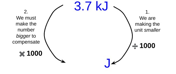
As noted earlier, some students struggle with unit conversions. To take a simple example: if we need to convert 3.7 kilojoules (or ‘killer-joules’ as some insist on calling them *shudders*) into joules, then whilst many students know that the conversion involves applying a factor of one thousand, they do not know whether to multiply 3.7 by a thousand or divide 3.7 by a thousand.
Michael Porter shared a brilliant suggestion for helping students over this hurdle. He suggests that we break down the operation into two parts:
Consider if we are making the unit larger or smaller.
If making the unit larger, we must make the number smaller to compensate; and vice versa.
Let’s look at using the Porter system for the example shown above.
(Note: I have used kilojoules for our first example since, at least for GCSE Science calculation contexts, students are unlikely to have to convert kilograms into grams. This is because, of course, the kilogram (not the gram) is the base unit of mass in the SI System.)
By changing from kilojoules to joules we are making the unit smaller, since one kilojoule is larger than one joule.
To keep the measured quantity of energy the same magnitude, we must therefore make the number part of the measurement bigger to compensate for the reduction in size of the unit.
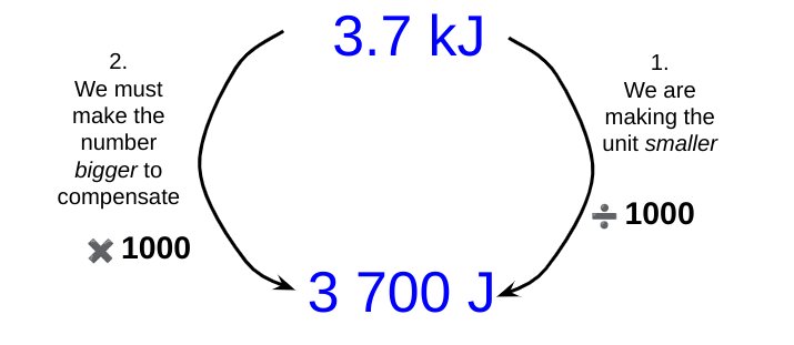
This leads us to the final answer.
Now let’s look if we had to convert 830 microamps into amps:
The strange case of time
Obviously 1 minute is a very small quantity of time compared with a whole week. Indeed, our forefathers considered it small as compared with an hour, and called it “one minùte,” meaning a minute fraction — namely one sixtieth — of an hour. When they came to require still smaller subdivisions of time, they divided each minute into 60 still smaller parts, which, in Queen Elizabeth’s days, they called “second minùtes” (i.e., small quantities of the second order of minuteness).
Silvanus P. Thompson, “Calculus Made Easy” (1914)
It is probable that the division of units of time into sixtieths dates back many thousands of years to the ancient Babylonians(!) Is it any wonder that some students find it hard to convert units of time?
We can use the Porter system to help students with these conversions. For example, what is 7 hours in seconds?
This type of diagram is, I think, very useful for showing students explicitly what we are doing.
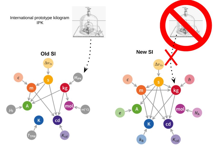
The S.I. System of Units is a thing of beauty: a lean, sinewy and utilitarian beauty that is the work of many committees, true; but in spite of that common saw about ‘a camel being a horse designed by a committee’, the S.I. System is truly a thing of rigorous beauty nonetheless.
Even the pedestrian Wikipedia entry on the 2019 Redefinition of the S.I. System reads like a lost episode from Homer’s Odyssey. As Odysseus tied himself to the mast of his ship to avoid the irresistible lure of the Sirens, so in 2019 the S.I, System tied itself to the values of a select number of universal physical constants to remove the last vestiges of merely human artifacts such as the now obsolete International Prototype Kilogram.
Meet the new (2019) SI, NOT the same as the old SI
However, the austere beauty of the S.I. System is not always recognised by our students at GCSE or A-level. ‘Units, you nit!!!’ is a comment that physics teachers have scrawled on student work from time immemorial with varying degrees of disbelief, rage or despair at errors of omission (e.g. not including the unit with a final answer); errors of imprecision (e.g. writing ‘j’ instead of ‘J’ for ‘joule — unforgivable!); or errors of commission (e.g. changing kilograms into grams when the kilogram is the base unit, not the gram — barbarous!).
The saddest occasion for writing ‘Units, you nit!’ at least in my opinion, is when a student has incorrectly converted a prefix: for example, changing millijoules into joules by multiplying by one thousand rather than dividing by one thousand so that a student writes that 5.6 mJ = 5600 J.
This odd little issue can affect students from across the attainment range, so I have developed a procedure to deal with it which is loosely based on the Singapore Bar Model.
A procedure for illustrating S.I. unit conversions
One millijoule is a teeny tiny amount of energy, so when we convert it joules it is only a small portion of one whole joule. So to convert mJ to J we divide by 1000.
One joule is a much larger quantity of energy than one millijoule, so when we convert joules to millijoules we multiply by one thousand because we need one thousand millijoules for each single joule.
In time, and if needed, you can move to a simplified version to remind students.
A simplified procedure for converting units
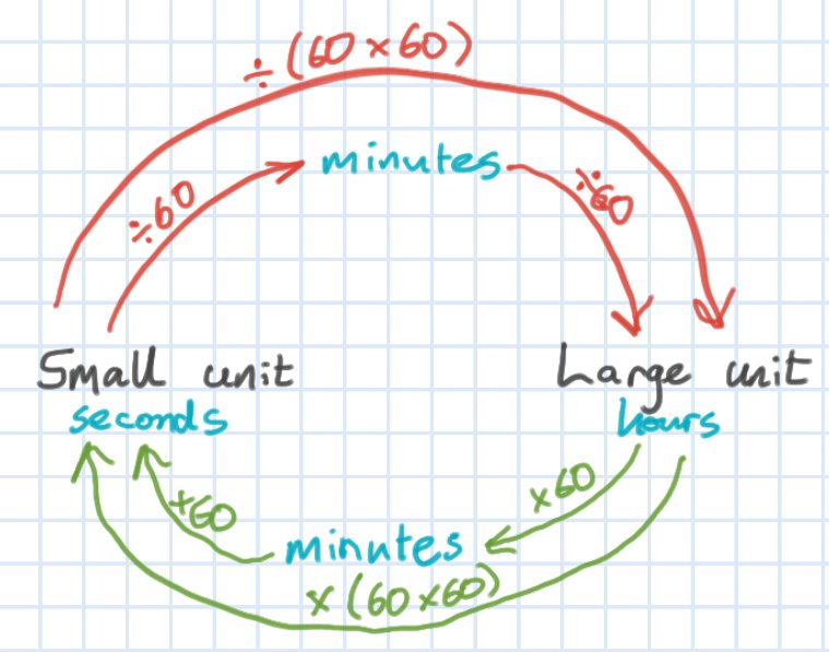
Strangely, one of the unit conversions that some students find most difficult in the context of calculations is time: for example, hours into seconds. A diagram similar to the one below can help students over this ‘hump’.
Helping students with time conversions
These diagrams may seem trivial, but we must beware of ‘the Curse of Knowledge’: just because we find these conversions easy (and, to be fair, so do many students) that does not mean that all students find them so.
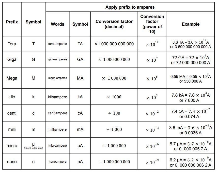
The conversions that students may be asked to do from memory are listed below (in the context of amperes).
A table showing all the SI prefixes that GCSE students need to know
Necessity may well be the mother of invention, but teacher desperation is often the mother of new pedagogy.
For an unconscionably long time, I think that I failed to adequately help students understand the so called ‘equations of motion’ (the mathematical descriptions of uniformly accelerated motion using the standard v, u, a, s and t notation) because I suffered from the ‘curse of knowledge’: I did not find the topic hard, so I naturally assumed that students wouldn’t either. This, sadly, proved not to be the case, even when the equation was printed on the equation sheet!
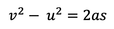
What follows is a summary of a dual coding technique that I have found really helpful in helping students become confident with problems involving the ‘equations of motion’. This is especially true at GCSE, where students encounter formulas such as
for the first time.
A dual coding convention for representing motion
Applying dual coding to an equation of motion problem
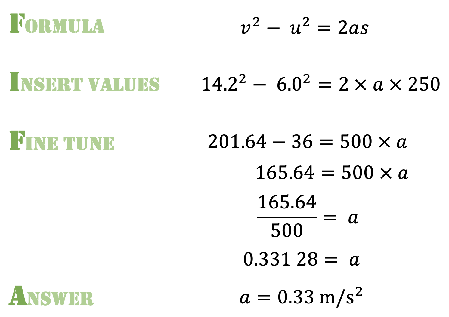
EXAMPLE: A car is travelling at 6.0 m/s. As the car passes a lamp-post it accelerates up to a velocity of 14.2 m/s over a distance of 250 m. Calculate a) the acceleration; and b) the time taken for this change.
The problem can be represented using the dual coding convention as shown below.
Note that the arrow for v is longer than the arrow for u since the car has a positive acceleration; that is to say, the car in this example is speeding up. Also, the convention has a different style of arrow for acceleration, emphasising that it is an entirely different type of quantity from velocity.
We can now answer part (a) using the FIFA calculation system.
Part (b) can be answered as shown below.
Visualising Stopping Distance Questions
These can be challenging for many students, as we often seem to grabbing numbers and manipulating them without rhyme or reason. Dual coding helps make our thinking explicit,
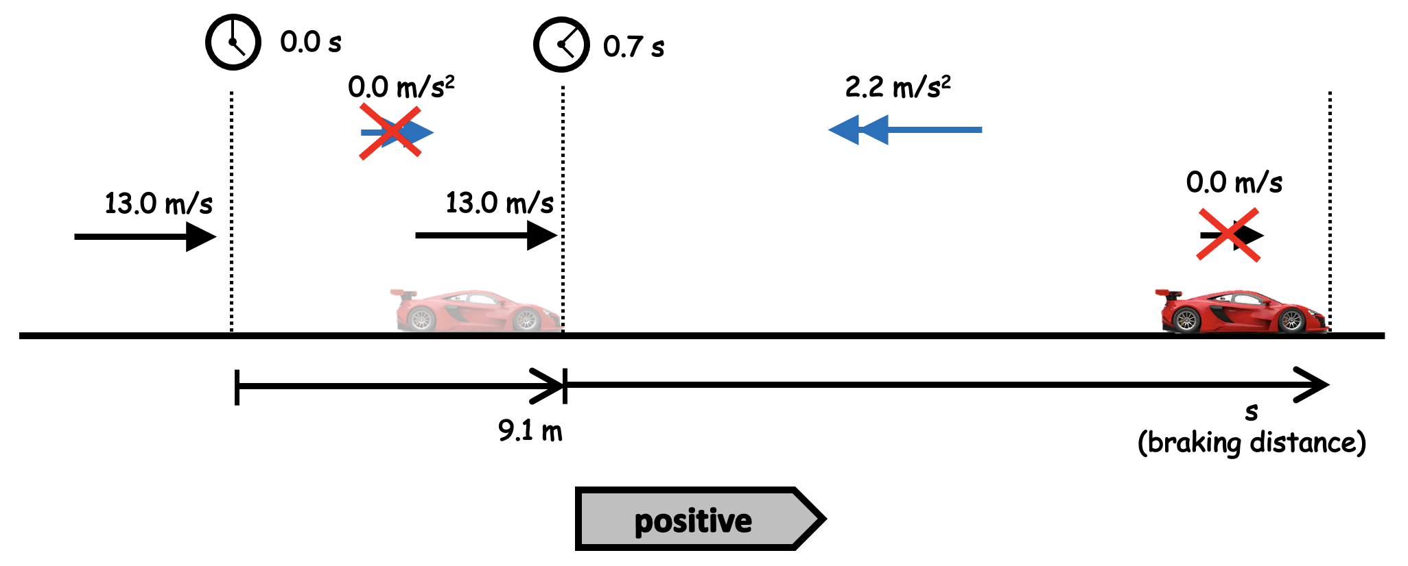
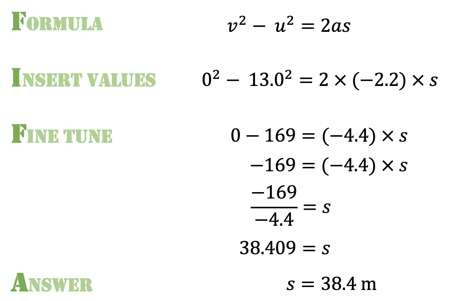
EXAMPLE: A driver has a reaction time of 0.7 seconds. The maximum deceleration of the car is 2.6 metres per second squared. Calculate the overall stopping distance when the car is travelling at 13 m/s.
We need to calculate both the thinking distance and the braking distance to solve this problem
The acceleration of the car is zero during the driver’s reaction time, since the brakes have not been applied yet.
We visualise the first part of the problem like this.
Using s=vt we find that the thinking distance is 9.1 m.
Now let’s look at the second part of the question.
There are three things to note:
Since the car comes to a complete stop, the final velocity v is zero.
The acceleration is negative (shown as a backward pointing arrow) since we are talking about a deceleration: in other words, the velocity gradually decreases in size from the initial velocity value of u as the car traverses the distance s.
Since the second part of the question does not involve any consideration of time we have omitted the ‘clock’ symbols for the second part of the journey.
We can now apply FIFA:
Since the acceleration arrow points in the opposite direction to the positive arrow, we enter it as a negative value. When we get to the third line of the Fine Tune stage, we see that a negative 169 divided by negative 4.4 gives positive 38.408 — in other words, the dual coding convention does the hard work of assigning positive and negative values!
And finally, we can see that the overall stopping distance is 9.1 + 38.4 = 47.5 metres,
Conclusion
I have found this form of dual coding extremely useful in helping students understand the easily-missed subtleties of motion problems, and hope other science teachers will give it a try.
If you have enjoyed this post, you might enjoy these also:
Students undoubtedly find electromagnetism tricky, especially at GCSE.
I have found it helpful to start with the F = BIl formula.
Introducing the “magnetic Bill” formula
This means that we can use the streamlined F-B-I mnemonic — developed by no less a personage than Robert J. Van De Graaff (1901-1967) of Van De Graaff generator fame — instead of the cumbersome “First finger = Field, seCond finger = Current, thuMb = Motion” convention.
Say F, then B, then I ….
Students find the beginning steps of applying Fleming’s Left Hand Rule (FLHR) quite hard to apply, so I print out little 3D “signposts” to help them. You can download file by clicking the link below.
Important tip: it can be really helpful if students label the arrows on both sides, such as in the example shown below. (The required precision in double sided printing defeated me!)
Another example of the FLHR signpost in use
Signposts for Fleming’s Right Hand Rule are included on the template.
‘Transformers’ is one of the trickier topics to teach for GCSE Physics and GCSE Combined Science.
I am not going to dive into the scientific principles underlying electromagnetic induction here (although you could read this post if you wanted to), but just give a brief overview suitable for a GCSE-level understanding of:
The basic principle of a transformer; and
How step down and step up transformers work.
One of the PowerPoints I have used for teaching transformers is here. This is best viewed in presenter mode to access the animations.
The basic principle of a transformer
A GIF showing the basic principle of a transformer. (BTW This can be copied and pasted into a presentation if you wish,)
The primary and secondary coils of a transformer are electrically isolated from each other. There is no charge flow between them.
The coils are also electrically isolated from the core that links them. The material of the core — iron — is chosen not for its electrical properties but rather for its magnetic properties. Iron is roughly 100 times more permeable (or transparent) to magnetic fields than air.
The coils of a transformer are linked, but they are linked magnetically rather than electrically. This is most noticeable when alternating current is supplied to the primary coil (green on the diagram above).
The current flowing in the primary coil sets up a magnetic field as shown by the purple lines on the diagram. Since the current is an alternating current it periodically changes size and direction 50 times per second (in the UK at least; other countries may use different frequencies). This means that the magnetic field also changes size and direction at a frequency of 50 hertz.
The magnetic field lines from the primary coil periodically intersect the secondary coil (red on the diagram). This changes the magnetic flux through the secondary coil and produces an alternating potential difference across its ends. This effect is called electromagnetic induction and was discovered by Michael Faraday in 1831.
Energy is transmitted — magnetically, not electrically — from the primary coil to the secondary coil.
As a matter of fact, a transformer core is carefully engineered so to limit the flow of electrical current. The changing magnetic field can induce circular patterns of current flow (called eddy currents) within the material of the core. These are usually bad news as they heat up the core and make the transformer less efficient. (Eddy currents are good news, however, when they are created in the base of a saucepan on an induction hob.)
Stepping Down
One of the great things about transformers is that they can transform any alternating potential difference. For example, a step down transformer will reduce the potential difference.
A GIF showing the basic principle of a step down transformer. (BTW This can be copied and pasted into a presentation if you wish,)
The secondary coil (red) has half the number of turns of the primary coil (green). This halves the amount of electromagnetic induction happening which produces a reduced output voltage: you put in 10 V but get out 5 V.
And why would you want to do this? One reason might be to step down the potential difference to a safer level. The output potential difference can be adjusted by altering the ratio of secondary turns to primary turns.
One other reason might be to boost the current output: for a perfectly efficient transformer (a reasonable assumption as their efficiencies are typically 90% or better) the output power will equal the input power. We can calculate this using the familiar P=VI formula (you can call this the ‘pervy equation’ if you wish to make it more memorable for your students).
Thus: Vp Ip = Vs Is so if Vs is reduced then Is must be increased. This is a consequence of the Principle of Conservation of Energy.
Stepping up
A GIF showing the basic principle of a step up transformer. (BTW This can be copied and pasted into a presentation if you wish,)
There are more turns on the secondary coil (red) than the primary (green) for a step up transformer. This means that there is an increased amount of electromagnetic induction at the secondary leading to an increased output potential difference.
Remember that the universe rarely gives us something for nothing as a result of that damned inconvenient Principle of Conservation of Energy. Since Vp Ip = Vs Is so if the output Vs is increased then Is must be reduced.
If the potential difference is stepped up then the current is stepped down, and vice versa.
Last nail in the coffin of the formula triangle…
Although many have tried, you cannot construct a formula triangle to help students with transformer calculations.
Now is your chance to introduce students to a far more sensible and versatile procedure like FIFA (more details on the PowerPoint linked to above)
. . . setting storms and billows at defiance, and visiting the remotest parts of the terraqueous globe.
Samuel Johnson, The Rambler, 17 April 1750
That an object in free fall will accelerate towards the centre of our terraqueous globe at a rate of 9.81 metres per second per second is, at best, only a partial and parochial truth. It is 9.81 metres per second per second in the United Kingdom, yes; but the value of both acceleration due to free fall and the gravitational field strength vary from place to place across the globe (and in the SI System of measurement, the two quantities are numerically equal and dimensionally equivalent).
For example, according to Hirt et al. (2013) the lowest value for g on the Earth’s surface is atop Mount Huascarán in Peru where g = 9.7639 m s-2 and the highest is at the surface of the Arctic Ocean where g = 9.8337 m s-2.
Why does g vary?
There are three factors which can affect the local value of g.
Firstly, the distribution of mass within the volume of the Earth. The Earth is not of uniform density and volumes of rock within the crust of especially high or low density could affect g at the surface. The density of the rocks comprising the Earth’s crust varies between 2.6 – 2.9 g/cm3 (according to Jones 2007). This is a variation of 10% but the crust only comprises about 1.6% of the Earth’s mass since the density of material in the mantle and core is far higher so the variation in g due this factor is probably of the order of 0.2%.
Secondly, the Earth is not a perfect sphere but rather an oblate spheroid that bulges at the equator so that the equatorial radius is 6378 km but the polar radius is 6357 km. This is a variation of 0.33% but since the gravitational force is proportional to 1/r2 let’s assume that this accounts for a possible variation of the order of 0.7% in the value of g.
Thirdly, the acceleration due to the rotation of the Earth. We will look in detail at the theory underlying this in a moment, but from our rough and ready calculations above, it would seem that this is the major factor accounting for any variation in g: that is to say, g is a minimum at the equator and a maximum at the poles because of the Earth’s rotation.
The Gnome Experiment
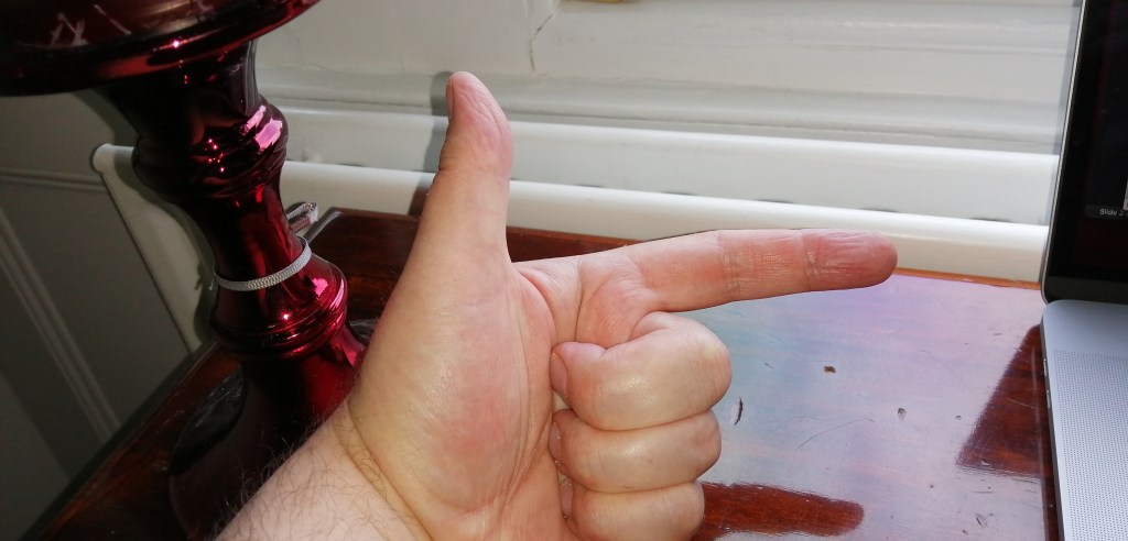
In 2012, precision scale manufacturers Kern and Sohn used this well-known variation in the value of g to embark on a highly successful advertising campaign they called the ‘Gnome Experiment’ (see link 1 and link 2).
Whatever units their lying LCD displays show, electronic scales don’t measure mass or even weight: they actually measure the reaction force the scales exert on the item in their top pan. The reading will be affected if the scales are accelerating.
In diagram A, the apple is not accelerating so the resultant upward force on the apple is exactly 0.981 N. The scales show a reading of 0.981/9.81 = 0.100 000 kg = 100.000 g (assuming, of course, that they are calibrated for use in the UK).
In diagram B, the apple and scales are in an elevator that is accelerating upward at 1.00 metres per second per second. The resultant upward force must therefore be larger than the downward weight as shown in the free body diagram. The scales show a reading of 1.081/9.81 – 0.110 194 kg = 110.194 g.
In diagram C, the the apple and scales are in an elevator that is accelerating downwards at 1.00 metres per second per second. The resultant upward force must therefore be smaller than the downward weight as shown in the free body diagram. The scales show a reading of 0.881/9.81 – 0.089 806 kg = 89.806 g.
Never mind the weight, feel the acceleration
Now let’s look at the situation the Kern gnome mentioned above. The gnome was measured to have a ‘mass’ (or ‘reaction force’ calibrated in grams, really) of 309.82 g at the South Pole.
Showing this situation on a diagram:
Looking at the free body diagram for Kern the Gnome at the equator, we see that his reaction force must be less than his weight in order to produce the required centripetal acceleration towards the centre of the Earth. Assuming the scales are calibrated for the UK this would predict a reading on the scales of 3.029/9.81= 0.30875 kg = 308.75 g.
The actual value recorded at the equator during the Gnome Experiment was 307.86 g, a discrepancy of 0.3% which would suggest a contribution from one or both of the first two factors affecting g as discussed at the beginning of this post.
Although the work of Hirt et al. (2013) may seem the definitive scientific word on the gravitational environment close to the Earth’s surface, there is great value in taking measurements that are perhaps more directly understandable to check our comprehension: and that I think explains the emotional resonance that many felt in response to the Kern Gnome Experiment. There is a role for the ‘artificer’ as well as the ‘philosopher’ in the scientific enterprise on which humanity has embarked, but perhaps Samuel Johnson put it more eloquently:
The philosopher may very justly be delighted with the extent of his views, the artificer with the readiness of his hands; but let the one remember, that, without mechanical performances, refined speculation is an empty dream, and the other, that, without theoretical reasoning, dexterity is little more than a brute instinct.
Aristotle memorably said that Nature abhors a vacuum: in other words. he thought that a region of space entirely devoid of matter, including air, was logically impossible.
Aristotle turned out to be wrong in that regard, as he was in numerous others (but not quite as many as we – secure and perhaps a little complacent and arrogant as we look down our noses at him from our modern scientific perspective – often like to pretend).
An amusing version which is perhaps more consistent with our current scientific understanding was penned by D. J. Griffiths (2013) when he wrote: Nature abhors a change in flux.
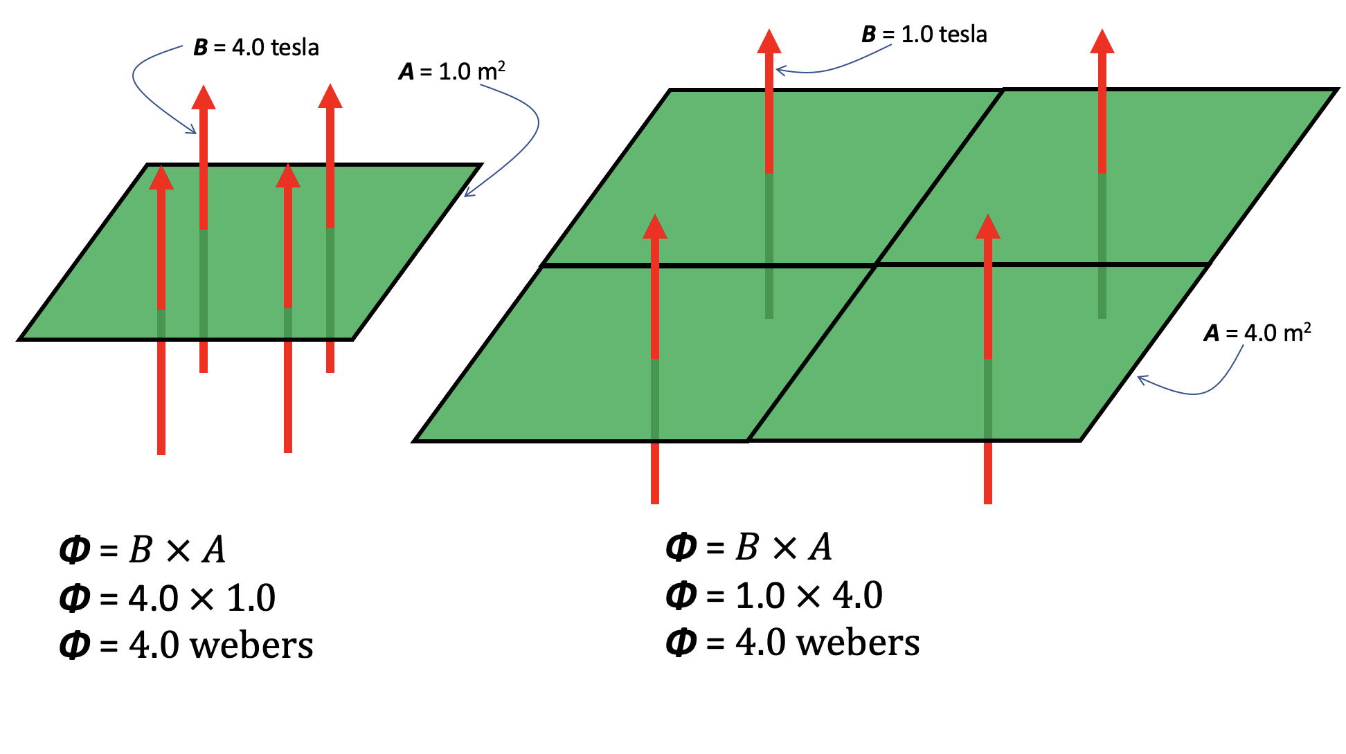
Magnetic flux (represented by the Greek letter phi, Φ) is a useful quantity that takes account of both the strength of the magnetic field and its extent. It is the total ‘magnetic flow’ passing through a given area. You can also think of it as the number of magnetic field lines multiplied by the area they pass through so a strong magnetic field confined to a small area might have the same flux (or ‘effect’) as weaker field spread out over a large area.
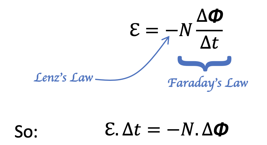
Lenz’s Law
Emil Lenz formulated an earlier statement of the Nature abhors a change of flux principle when he stated what I think is the most consistently underrated laws of electromagnetism, at least in terms of developing students’ understanding:
The current induced in a circuit due to a change in a magnetic field is directed to oppose the change in flux and to exert a mechanical force which opposes the motion.
Lenz’s Law (1834)
This is a qualitative rather than a quantitive law since it is about the direction, not the magnitude, of an induced current. Let’s look at its application in the familiar A-level Physics context of dropping a bar magnet through a coil of wire.
Dropping a magnet through a coil in pictures
Picture 1
In picture 1 above, the magnet is approaching the coil with a small velocity v. The magnet is too far away from the coil to produce any magnetic flux in the centre of the coil. (For more on the handy convention I have used to draw the coils and show the current flow, please click on this link.) Since there is no magnetic flux, or more to the point, no change in magnetic flux, then by Faraday’s Law of Electromagnetic Induction there is no induced current in the coil.
Picture 2
in picture 2, the magnet has accelerated to a higher velocity v due to the effect of gravitational force. The magnet is now close enough so that it produces a magnetic flux inside the coil. More to the point, there is an increase in the magnetic flux as the magnet gets closer to the coil: by Faraday’s Law, this produces an induced current in the coil (shown using the dot and cross convention).
To ascertain the direction of the current flow in the coil we can use Lenz’s Law which states that the current will flow in such a way so as to oppose the change in flux producing it. The red circles show the magnetic field lines produced by the induced current. These are in the opposite direction to the purple field lines produced by the bar magnet (highlighted yellow on diagram 2): in effect, they are attempting to cancel out the magnetic flux which produce them!
The direction of current flow in the coil will produce a temporary north magnetic pole at the top of the coil which, of course, will attempt to repel the falling magnet; this is ‘mechanical force which opposes the motion’ mentioned in Lenz’s Law. The upward magnetic force on the falling magnet will make it accelerate downward at a rate less than g as it approaches the coil.
Picture 3
In picture 3, the purple magnetic field lines within the volume of the coil are approximately parallel so that there will be no change of flux while the magnet is in this approximate position. In other words, the number of field lines passing through the cross-sectional area of the coil will be approximately constant. Using Faraday’s Law, there will be no flow of induced current. Since there is no change in flux to oppose, Lenz’s Law does not apply. The magnet will be accelerating downwards at g.
Picture 4
As the magnet emerges from the bottom of the coil, the magnetic flux through the coil decreases. This results in a flow of induced current as per Faraday’s Law. The direction of induced current flow will be as shown so that the red field lines are in the same direction as the purple field lines; Lenz’s Law is now working to oppose the reduction of magnetic flux through the coil!
A temporary north magnetic pole is generated by the induced current at the lower end of the coil. This will produce an upward magnetic force on the falling magnet so that it accelerates downward at a rate less than g. This, again, is the ‘mechanical force which opposes the motion’ mentioned in Lenz’s Law.
Dropping a magnet through a coil in graphical form
This would be one of my desert island graphs since it is such a powerfully concise summary of some beautiful physics.
The graph shows the reversal in the direction of the current as discussed above. Also, the maximum induced emf in region 2 (blue line) is less than that in region 4 (red line) since the magnet is moving more slowly.
What is more, from Faraday’s Law (where ℇ is the induced emf and N is total number of turns of the coil), the blue area is equal to the red area since:
and N and ∆Φ are fixed values for a given coil and bar magnet.
As I said previously, there is so much fascinating physics in this graph that I think it worth exploring in depth with your A level Physics students 🙂
Other news
If you have enjoyed this post, then you may be interested to know that I’ve written a book! Cracking Key Concepts in Secondary Science (co-authored with Adam Boxer and Heena Dave) is due to be published by Corwin in July 2021.
References
Lenz, E. (1834), “Ueber die Bestimmung der Richtung der durch elektodynamische Vertheilung erregten galvanischen Ströme”, Annalen der Physik und Chemie, 107 (31), pp. 483–494
Griffiths, David (2013). Introduction to Electrodynamics. p. 315.
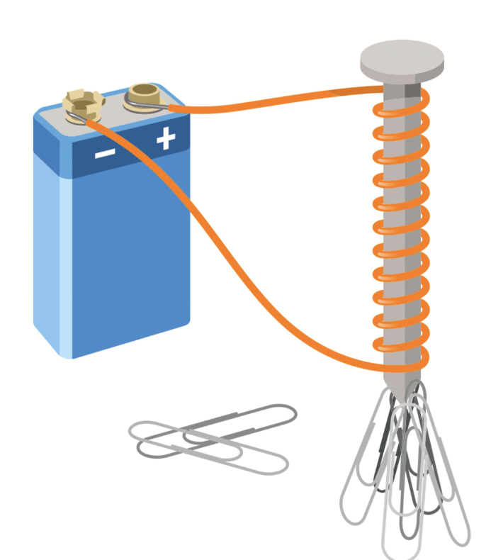
A solenoid is an electromagnet made of a wire in the form of a spiral whose length is larger than its diameter.
A solenoid
The word solenoid literally means ‘pipe-thing‘ since it comes from the Greek word ‘solen‘ for ‘pipe’ and ‘-oid‘ for ‘thing’.
An alternate universe version of the Troggs’ famous 1966 hit record
And they are such an all-embracingly useful bit of kit that one might imagine an alternate universe where The Troggs might have sang:
Pipe-thing! You make my heart sing!
You make everything groovy, pipe-thing!
And pipe-things do indeed make everything groovy: solenoids are at the heart of the magnetic pickups that capture the magnificent guitar riffs of The Troggs at their finest.
The Butterfly Field
Very few minerals are naturally magnetised. Lodestones are pieces of the ore magnetite that can attract iron. (The origin of the name is probably not what you think — it’s named after the region, Magnesia, where it was first found). In ancient times, lodestones were so rare and precious that they were worth more than their weight in gold.
Over many centuries, by patient trial-and-error, humans learned how to magnetise a piece of iron to make a permanent magnet. Permanent magnets now became as cheap as chips.
A permanent bar magnet is wrapped in an invisible evanescent magnetic field that, given sufficient poetic license, can remind one of the soft gossamery wings of a butterfly…
Orient a bar magnet vertically so that students can see the ‘butterfly field’ analogy…
The field lines seem to begin at the north pole and end at the south pole. ‘Seem to’ because magnetic field lines always form closed loops.
This is a consequence of Maxwell’s second equation of Electromagnetism (one of a system of four equations developed by James Clark Maxwell in 1873 that summarise our current understanding of electromagnetism).
Using the elegant differential notation, Maxwell’s second equation is written like this:
Maxwell’s second equation of electromagnetism.
It could be read aloud as ‘del dot B equals zero’ where B is the magnetic field and del (the inverted delta symbol) does not represent a quantity but is the differential operator which describes how the field lines curl in three dimensional space.
This also tells us that magnetic monopoles (that is to say, isolated N and S poles) are impossible. A north-seeking pole is always paired with a south-seeking pole.
Magnetising a solenoid
A current-carrying coil will create a magnetic field as shown below.
The magnetic field of a solenoid.(Note that the field lines in the centre are truncated to save space, but would form very large loops as mentioned above.)
The wire is usually insulated (often with a tough, transparent and nearly invisible enamel coating for commercial solenoids), but doesn’t have to be. Insulation prevents annoying ‘short circuits’ if the coils touch. At first sight, we see the familiar ‘butterfly field’ pattern, but we also see a very intense magnetic field in the centre of the solenoid,
For a typical air-cored solenoid used in a school laboratory carrying one ampere of current, the magnetic field in the centre would have a strength of about 84 microtesla. This is of the same order as the Earth’s magnetic field (which has a typical value of about 50 microtesla). This is just strong enough to deflect the needle of a magnetic compass placed a few centimetres away and (probably) make iron filings align to show the magnetic field pattern around the solenoid, but not strong enough to attract even a small steel paper clip. For reference, the strength of a typical school bar magnet is about 10 000 microtesla, so our solenoid is over one hundred times weaker than a bar magnet.
However, we can ‘boost’ the magnetic field by adding an iron core. The relative permeability of a material is a measurement of how ‘transparent’ it is to magnetic field lines. The relative permeability of pure iron is about 1500 (no units since it’s relative permeability and we are comparing its magnetic properties with that of empty space). However, the core material used in the school laboratory is more likely to be steel rather than iron, which has a much more modest relative permeability of 100.
So placing a steel nail in the centre of a solenoid boosts its magnetic field strength by a factor of 100 — which would make the solenoid roughly as strong as a typical bar magnet.
But which end is north…?
The N and S-poles of a solenoid can change depending on the direction of current flow and the geometry of the loops.
The typical methods used to identify the N and S poles are shown below.
Methods of locating N and S pole of a solenoid that you should NOT use…
To go in reverse order for no particular reason, I don’t like using the second method because it involves a tricky mental rotation of the plane of view by 90 degrees to imagine the current direction as viewed when looking directly at the ends of the magnet. Most students, understandably in my opinion, find this hard.
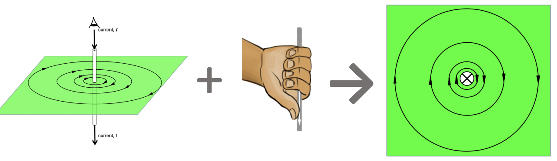
The first method I dislike because it creates confusion with the ‘proper’ right hand grip rule which tells us the direction of the magnetic field lines around a long straight conductor and which I’ve written about before . . .
The right hand grip rule illustrated: the field line curl in the same direction as the finger when the thumb is pointed in the direction of the current.
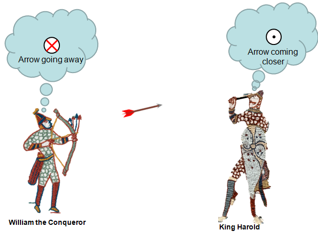
The direction of the current in the last diagram is shown using the ‘dot and cross’ convention which, by a strange coincidence, I have also written about before . . .
If King Harold had been more familiar with the dot and cross notation, history could have turned out very differently…
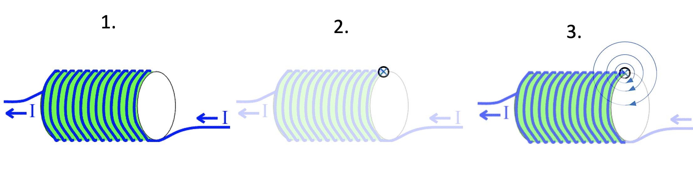
How a solenoid ‘makes’ its magnetic field . . .
To begin the analysis we imagine the solenoid cut in half: what biologists would call a longitudinal section. Then we show the current directions of each element using the dot and cross convention. Then we consider just two elements, say A and B as shown below.
Continuing this analysis below:
The region inside the solenoid has a very strong and nearly uniform magnetic field. By ‘uniform’ we mean that the field lines are nearly straight and equally spaced meaning that the magnetic field has the same strength at any point.
The region outside the solenoid has a magnetic field which gradually weakens as you move away from the solenoid (indicated by the increased spacing between the field lines); its shape is also nearly identical to the ‘butterfly field’ of a bar magnet as mentioned above.
Since the field lines are emerging from X, we can confidently assert that this is a north-seeking pole, while Y is a south-seeking pole.
Which end is north, using only the ‘proper’ right hand grip rule…
First, look very carefully at the geometry of current flow (1).
Secondly, isolate one current element, such as the one shown in picture (2) above.
Thirdly, establish the direction of the field lines using the standard right hand grip rule (3).
Since the field lines are heading into this end of the solenoid, we can conclude that the right hand side of this solenoid is, in fact, a south-seeking pole.
In my opinion, this is easier and more reliable than using any of the other alternative methods. I hope that readers that have read this far will (eventually) come to agree.
You can read Part 1 which introduces the idea of free body force diagrams here.
Essentially the technique we will use is as follows:
Draw a situation diagram with NO FORCE ARROWS.
‘Now let’s look at the forces acting on just object 1’ and draw a separate free body diagram (i.e. a diagram showing just object 1 and the forces acting on it)
Repeat step 2 for some or all of the other objects at your discretion.
(Optional) Link all the diagrams with dotted lines to emphasise that they are facets of a more complex, nuanced whole
The Wheel Thing
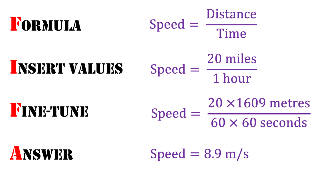
Let’s consider a car travelling at a constant velocity of 20 miles per hour.
NOT a force diagram. (Note: whilst force arrows on situation diagrams should be discouraged, there is no equivalent argument for speed arrows)
’20 m.p.h.’ is such an uncivilised unit so let’s use the FIFA system to change it into more civilised scientific S.I. units:
NOT a force diagram! (Note: it is fine to draw speed/velocity/acceleration arrows on a situation diagram, but not force arrows.)
Note that point A on the car tyre is moving at 8.9 m/s due to the rotation of the wheel, as well as moving at 8.9 m/s with the rest of the car. This means that point A is moving at 8.9 + 8.9 = 17.8 m/s relative to the ground.
More strangely, point B on the car tyre is moving backwards at speed of 8.9 m/s due to the rotation of the wheel, as well as moving forwards at 8.9 m/s with the rest of the car. Point B is therefore momentarily stationary with respect to the ground.
The tyres can therefore ‘grip’ the road surface because the contact points on each tyre are stationary with respect to the road surface for the moment that they are in position B. If this was not the case, then the car would be difficult to control as it would be in a skid.
(Apologies for emphasising this point — I personally find it incredibly counterintuitive! Who says wheels are not technologically advanced!)
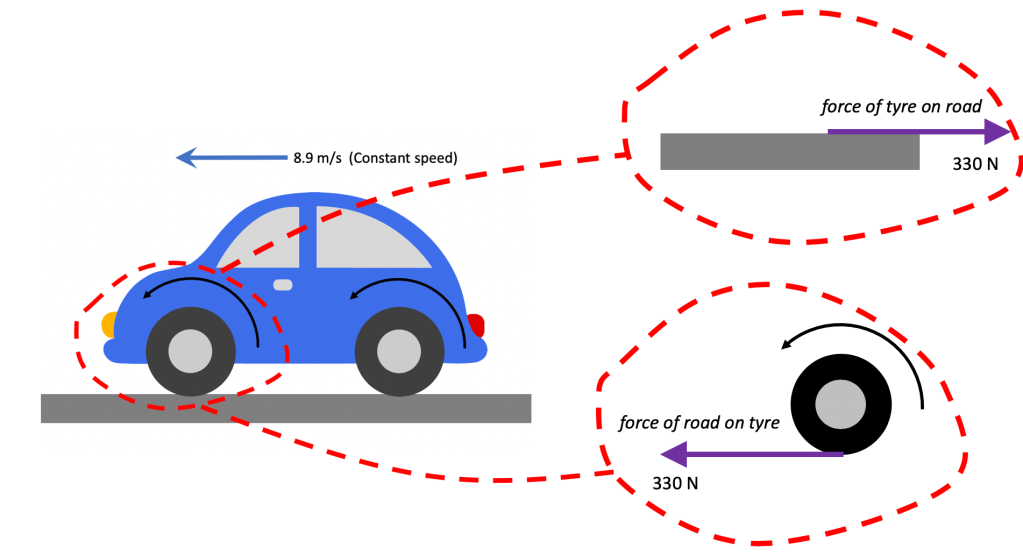
Forces on a tyre
Situation diagram (note: no force arrows) and free body diagrams for road and tyre. Note also different style of arrow for speed and force.
Assuming the car in the diagram is a four wheel drive, the total force driving it forward would be 4 x 330 N = 1320 N. Since it is travelling at a constant speed, this means that there is zero resultant force (or total force). We can therefore infer that the total resistive force acting on the car is 1320 N.
It is can also be slightly disconcerting that the force driving the car forward is a frictional force because we usually speak of frictional forces having a tendency to ‘oppose motion’.
And so they are in this case also. The movement they are opposing is the relative motion between the tyre surface and the road. Reduce the frictional force between the road with oil or mud, and the tyre would not ‘lock’ on the surface and instead would ‘spin’ in place. It’s worth bearing in mind (and communicating to students) that the tread pattern on the tyre is designed to maximise the frictional force between the tyre surface and the road
And then a step to the right…
It’s just a jump to the left
And then a step to the right
The Time Warp, Rocky Horror Picture Show
Situation diagram for a person taking a step to the right; and free body diagrams for the person and the floor
We can see how important friction is for taking a step forward in the above diagrams. Again, it is worth pointing out to students how much effort goes into designing the ‘tread’ on certain types of footwear so as to maximise the frictional force. On climbing boots, the ‘tread’ extends on to the upper surface of the boot for that very reason.
A climbing boot
One step beyond
Let’s apply a similar analysis to the case of a person stepping off a boat that happens not be tied to the mooring.
Situation diagram for a person stepping off an unmoored boat; and free body force diagrams for the person and the boat. Note different style of arrow for forces and acceleration.
The person pushes back on the boat (gripping the boat with friction as above). By Newton’s Third Law, this generates an equal an opposite force on the boat. There is no horizontal force to the right due to the tension in the rope, since there is no rope(!) This means that there is a resultant force on the boat to the left so the boat accelerates to the left.
The forces on the person and the boat will be equal in magnitude, but the acceleration will depend on the mass of each object from F = ma.
Since the boat (e.g. a rowing boat) is likely to have a smaller mass than the person, its acceleration to the left will be higher in magnitude than the acceleration of the person to the right — which will lead to the unfortunate consequence shown below.
The effect of stepping off an unmoored boat
The acceleration of the person and the boat happens only when the person and boat are in contact with each other, since this is the only time when there will be a resultant force in the horizontal direction.
Note that although force arrows on a situation diagram should be discouraged for the sake of clarity, there is an argument for drawing velocity and acceleration arrows on the situation diagram as a form of dual coding. Further details can be found here, and an explanation of why acceleration is shown as a double headed arrow.
The velocity to the left built up by the boat in this short instant will be greater than the velocity to the right built up by the person, because the acceleration of the boat is greater, as argued above.
The outcome, of course, is that the person falls in the water, which has been the subject of countless You’ve Been Framed clips.
Next post…
In the next post, I will try to move beyond horizontal forces and take account of the normal reaction force when an object rests on both horizontal surfaces and inclined surfaces.
Why do so many students hold pernicious and persistent misconceptions about forces?
Partly, I think, because of the apparent clash between our intuitive, gut-level knowledge of real world physics. For example, a typical student might find the statement ‘If I push this box, it will stop moving shortly after I stop pushingbecause force is needed to move things‘ entirely unobjectionable; whilst in the theoretical, rarefied world of the physicist the statement ‘The box will keep moving at a constant velocity after I stop pushing it, unless it is acted on by a resultant force such as friction‘ would get a tick whereas the former would get a big angry X and and a darkly muttered comment about ‘bloody Aristotleans.’
After all, ‘pernicious’ is in the eye of the beholder. Physics teachers have to remember that they suffer mightily under the ‘curse of knowledge’ and have forgotten what it’s like to look at the world through anything than the lens of Newtonian mechanics.
We learn about the world through the power of example. Human beings are ‘inference engines’: we strive to make sense of the world by constructing general rules based on the examples presented to us.
Many of the examples of forces in action presented to students are in the form of force diagrams; and in my experience, all too many force diagrams add to students’ confusion.
A bad force diagram
Force Diagram 1: version 1 (really bad)
Over the years, I have seen many versions of this diagram. To my own chagrin, I must admit that I, personally, have drawn versions of this diagram in the past. But I now recognise it has one major, irredeemable flaw: the arrows are drawn hanging in mid-air.
OK, let’s address this. Is this better?
Force Diagram 1: version 2 (still bad)
No, it isn’t because it is still unclear which forces are acting on which object. Is the blue 75 N arrow the person pushing the cart forward or the cart pulling the person forward? Is the red 75 N arrow the cart pushing back on the person or the person pulling back on the cart?
From both versions of this diagram shown above: we simply cannot tell.
As a consequence, I think the explanatory value of this diagram is limited.
Free Body Diagrams to the Rescue!
A free body diagram is simply one where we consider the forces on each object in the situation in turn.
Force Diagram 1: version 3 (much better!)
We begin with a situation diagram. This shows the relationship between the objects we are considering. Next, we draw a free body diagram for each object; that is, we draw each object involved and consider the forces acting on it.
From version 3 of Force Diagram 1, we can see that it was an attempt to illustrate Newton’s Third Law i.e. that if body A exerts a force on body B then body B exerts an equal and opposite force on body A.
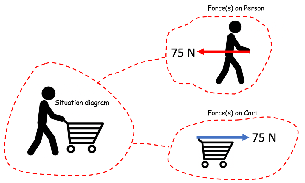
Another bad force diagram
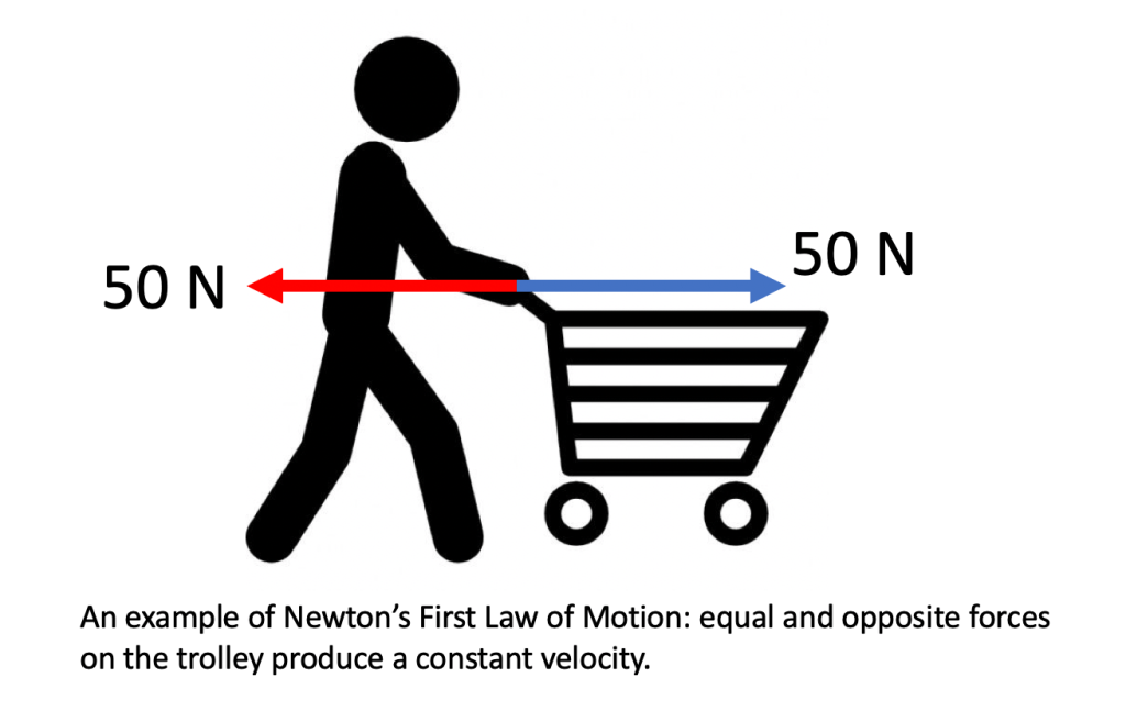
Force Diagram 2: version 1 (very bad)
This is a bad force diagram because it is unclear which forces are acting on the cart and which are acting on the person. Apart from a very general ‘Well, 50 N minus 50 N means zero resultant force so zero acceleration’, there is not a lot of information that can be extracted from this diagram.
Also, the most likely mechanism to produce the red retarding force of 50 N is friction between the wheels of the cart and the ground (and note that since the cart is being pushed by an external body and the wheels are not powered like those of a car, the frictional force opposes the motion). Showing this force acting on the handle of the cart is not helpful, in my opinion.
Free body diagrams to the rescue (again)!
The Newton 3 pairs are colour coded. For example, the orange 50 N forward force on the person (object A) is produced as a direct result of Newton’s 3rd Law because the person’s foot is using friction to grip the floor surface (object B) and push backwards on it (the orange arrow in the bottom diagram).
This diagram shows a complete free body diagram body analysis for all three objects (cart, person, floor) involved in this simple interaction.
I’m not suggesting that all three free body diagrams always need to be discussed. For example, at KS3 the discussion might be limited at the teacher’s discretion to the top ‘Forces on Cart’ diagram as an example of Newton’s First Law in action. Or equally, the teacher may wish to extend the analysis to include the second and third diagrams, depending on their own judgement of their students’ understanding. The Key Stage ticks and crosses on the diagram are indicative suggestions only.
At KS3 and KS4, there is not a pressing need to explicitly label this technique as ‘free body force diagrams’. Instead, what I suggest (perhaps after drawing the situation diagram without any force arrows on it) is the simple statement that ‘OK, let’s look at the forces acting on just the cart’ before drawing the top diagram. Further diagrams can be introduced with a similar statements such as ‘Next, let’s look at the forces acting on just the person’ and so on. Linking the diagrams with dotted lines as shown is, I think, useful in not losing sight of the fact that we are dealing piecemeal with a complex and nuanced whole.
Conclusion
The free body force diagram technique (whether or not the teacher decides to explicitly call it that) offers a useful tool that will allow us all to (fingers crossed!) draw better force diagrams.
Draw a situation diagram with NO FORCE ARROWS.
‘Now let’s look at the forces acting on just object 1’ and draw a separate free body diagram (i.e. a diagram showing just object 1 and the forces acting on it)
Repeat step 2 for some or all of the other objects at your discretion.
(Optional) Link all the diagrams with dotted lines to emphasise that they are facets of a more complex, nuanced whole
In the next post, I hope to show how the technique can be used to explain common problems such as how a car tyre interacts with the ground to drive a car forward.


:format(jpeg):mode_rgb():quality(40)/discogs-images/R-7900735-1451266037-4913.jpeg.jpg)