After a fascinating discussion led by the excellent Alex Weatherall (click here to participate in his Google doc Physics-fest — and follow @A_Weatherall on Twitter for more), I was thinking on possible teaching approaches for energy.
Although I think the IoP‘s (the UK’s Institute of Physics) approach is conceptually sound (see previous post here) and addresses many of the shortcomings in the traditional and time-hallowed “forms of energy” approach, many Physics teachers (myself included) are struggling to find direct and simple ways of communicating the highly nuanced content to students.
For example, to describe a filament bulb:
A (filament) light bulb is a device that takes energy in (input) through an electrical pathway (the current) to the thermal energy store of the filament (the metal is getting hotter) which transfers the energy through the radiation pathways of light (visible and IR). There is an increase in the thermal store of the room due to transfer via the heating pathway. The less energy transferred by heating compared to visible light the more efficient the light bulb.
I think this is in accordance with the letter and spirit of the “IoP Energy Newspeak” approach; but sadly, I can picture many students struggling to understand this, even though it was written by many hands (including mine) with the best of intentions.
But then I began to think of adopting a diagrammatic “enoji” approach. (See here for suggested energy icons, or energy + emoji = enoji)
Diagrams for Stores and Pathways
An energy store is represented by a “watertight” container. For example, the gravity store of a ball at the top of a slope could be represented thus:

Because it is an energy store, the amount of energy (represented by the level of orange liquid) in the store remains constant. Energy will not spontaneously leave the store. Energy stores don’t have holes. The unit we use with energy stores is the joule.
However, energy pathways do have holes. In contrast to an energy store, the energy level in a pathway will spontaneously decrease as the energy is shifted to another store.
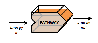
To keep the energy level constant in a pathway, it needs to be constantly “topped up” by the energy from an energy store.
Since a pathway represents a “flow” of energy, the unit we use with an energy pathway is the watt (one joule per second). The “orange liquid level” in the pathway icon could therefore represent the amount of energy flowing through in one second (although I concede that this idea, though promising, needs more thought).
“Enoji Energy Shift” Diagrams
Adopting this convention, the “enoji energy shift” diagram for a ball rolling down a slope might look like this:

An energy store does not have any holes — unless it is linked to a pathway, like the gravity store above. Energy will move in the direction indicated by the energy pathway icon.
Simplified in a student exercise book, it could be represented like this:
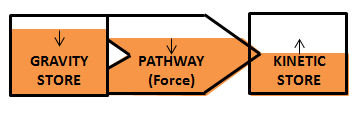
The small upward and downward arrows are an attempt to indicate what happens to the energy level over time.
The Filament Lightbulb “Enoji Energy Shift” Diagram
This could be represented in a student exercise book like this:
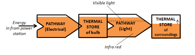
Since there are no small up and down arrows on the pathway or thermal store enojis, this indicates that the energy levels are relatively stable (provided we have a constant input of energy from the power station). However, the energy level of the thermal store of the surroundings just keeps on going up…
And finally…
Please note this is a work in progress.
I fully expect many teachers will think that the suggested set of conventions may well prove more confusing for students.
However, what I am attempting to do is to give students a set of simple, coherent yet serviceable analogies. In other words, this might provide a conceptual “tool kit” of physical representations of very abstract processes involving energy.
I hope readers will agree that it offers some scope for further development. Comments, criticisms and suggestions would be most welcome.

Yay for emojis! Enojis…haha! May Gerri and Inxompose them?
You and Gerri may do anything you wish — but only after you’ve addressed the ball!
*…I compose…* D’oh!
Reblogged this on The Echo Chamber.
Graphic design lost a master when you took up.teaching, much better than the convoluted text. But I just can’t get past small boxes filling with orange fluid and worrying what happens when they’re full? Is it just me?
Thanks, Steve! I guess we could dispense with the orange liquid for a clean, minimalist look: maybe just have boxes for stores and the pathway arrow icons. No danger of orange liquid spills then! However we could also add a “Thermal Store of the Universe” box at the end. That have to be would be a large bloody box though…
Not sure you can “dispense with the orange liquid”. Your pic from July here (https://emc2andallthat.files.wordpress.com/2016/06/wp-1465681501482.png) has value showing less energy for various configurations.
Besides the resemblance to a local popular Scottish drink (IrnBru) is too good a hook for the students to give up.
I wouldn’t want to get rid of the orange liquid — as you point out, it gives a quantitative aspect to the model. I was actually thinking of dispensing with the IrnBru only for the simplified student diagrams. M’mmmm…IrnBru… hard to get it here down sarf…
Bravo! Next step is to create a kit of boxes, valves and pipes to show the flows. Didn’t the science museum once have a physical model simulation of the UK economy working on that basis?
Timstar here we come! Might be really nice to demo it using a siphon arrangement…? 🙂
This is a really interesting post, and thank you to you (and the others involved) for getting stuck into this. I’m sending the link to my IOP colleagues so they can see what’s being tried out.
I like the idea of the stores being ‘sealed’ boxes showing that the energy remains constant until processes change what’s happening. The energy is literally stored! The orange liquid model works well in the lab, although it does reinforce the idea of ‘energy’ as ‘stuff’ with a tangible, physical existence. Pouring slowly or quickly between beakers demonstrates low or high power processes/pathways.
I’m not sure that students will be able to focus on the meaningful aspects when challenged with drawing the diagrams. This is something we’ve seen, after all, with Sankey diagrams for years! I would say that rather than having partially full arrows, it would be clearer to have multiple arrows in parallel rather than series. Returning to Sankey diagrams – something which was flagged up in one of my recent posts on this topic – the width of the arrow would be proportional to power of the process, while the area of the boxes would be proportional to energy in the store.
Thanks for the comment. I’m glad you like some of the ideas. Can clarify what you mean by having “multiple arrows in parallel rather than series.”
You might be interested in this: http://iopscience.iop.org/article/10.1088/0031-9120/38/2/307/meta
A really interesting article, and from 2003! I think some of the icons are better than the modern IoP ones. I guess there really is nothing new under the Sun…
My reason for pointing this out is that I am Gary Williams and I work for IOP and we have been down this energy chains route, It works really well in the classroom because you can keep it tight and well structured. The reason we dropped it is that it reinforces the caloric idea and there’s no way round that with chains, The idea of snapshots is much stronger. You can also make it structured and keep it tight. It was very pleasing to develop the diagrams but also pleasing to ditch it when we worked out something better,
Thanks for commenting! It all becomes clear…
I am trying to be consistent with the new IoP approach (at least as far as I’ve grasped it). My approach might be a bit of mishmash of old and new approaches, but it does preserve (or tries to) the underlying idea (and in my opinion, a valuable step forward) of energy being the same “thing” which is held temporarily in “stores” rather than being “transformed”. You mention that it reinforces the “caloric” idea, but don’t the IoP energy icons filled with “orange fluid” do this also? As I said, this is merely a work in progress and suggestions and comments — and criticisms! — are welcome.
I would also ditch the orange fluid, but the crucial bit is that you aren’t seen pouring it from one place to the other. The orange fluid is there to get across the idea of conservation of energy. You have the same amount before and after. I would prefer something you can count, like blocks or orange lentils. Or maybe just stick with numbers.
I agree the orange liquid is an imperfect model, but it is the one suggested on the Iop website:
Therefore, we have chosen the orange fluid to stand in place of the quantity. We hope this will engage the imagination. Although it does not have much predictive power, the model does have considerable value as a tool to think with. We think you’ll need to use one like this, if not this one.
From: http://www.supportingphysicsteaching.net/En02PN.html
That’s the only reason I started using it…
Yes, but there is a subtle difference in the way it’s depicted there. It isn’t intentionally depicted as the same “stuff” being moved across. The orange arrows might have been better in a different colour, but they don’t themselves imply that the stuff that is enery is being transferred. But personally I’d ditch it all together. Blocks and snapshots work much better. The original work on which SPT and my paper were based is here: https://www.stem.org.uk/elibrary/collection/3624
I remember reading Boohan and Ogborn back in the day! A really interesting perspective which I remember really influencing my practice.
But back to IoP, I don’t mean to keep banging on, but the language on Supporting Physics seems to strongly suggest a direct transfer. For example:
“From the energy perspective, this event is seen in the following way: Energy is shifted from the chemical store of your muscles to the gravitational store of the ornament in the Earth’s gravitational field”
(En02PNnugget08) or so it seems to me…
The nuggets later on explain how shifted is being used. I think it’s 11 and 12: http://supportingphysicsteaching.net/En02PNnugget11.html
It says there about trying to portray it as something abstract rather than tangible.
Absolutely! “The second approach refers simply to energy moving from one store to another. We like this because we see energy as identical, wherever it turns up it’s still the same thing. Energy is a unified abstract idea and it does not make sense to talk about different kinds or forms of energy.” To my mind, the orange liquid is simply an analogy intended as an introduction to the idea of energy for 14/15 year olds (and possibly younger students).
I know you think that the approach I suggest is just warmed-over “energy transfer” diagrams, but that is not my intention. I am just thinking of visual aids and approaches that will make the content “teachable” to a wide range of student abilities.
Why not do something with simple numbers then? The pathways are rates of change. Hence you can show numerically that the first stores rate of change is equal to the pathway and that the sum of this in the second store gives it’s content. But it can be done much more simply than that with some numbers and snapshots. I have a ppt where I took this to the logical conclusion that the “chain” became a string of equations (mgh=1/2mv^2 and so forth). I think that’s a good outcome, but getting to it without reinforcing the caloric idea is the tricky bit.
Is there any chance of seeing the ppt? I am very much in favour of “simpler” if it works…
Yes, you can download it and other related resources in the talkphysics group: http://www.talkphysics.org/groups/energy-e3/forum/topic/powerpoint/
You’ll need to be registered and a group member perhaps, but it’s all free.
This is worth looking at too: https://www.researchgate.net/publication/225557043_A_Philosophically_Informed_Teaching_Proposal_on_the_Topic_of_Energy_for_Students_Aged_11-14
Again, this looks fascinating. Rest assured that it’s on my reading list.
I’ve trialled this approach to teaching Energy and it seems to work well for my students. Currently hoping to embed it properly in our (under development) new KS3 curriculum. I’m not convinced we’ll ever find an entirely satisfactory conceptual model for energy, however that won’t stop me trying! [as an aside Mr Jones you may find this of interest http://www.bbc.co.uk/programmes/b08cqqr7, listen from 18 mins]
Hi, Thank you for presenting this view of the new way to view energy. I has some interesting ideas. However your concept does not follow that presented by the IOP as you are still thinking in terms of energy ladders, i.e. this form of energy goes to that and to that, etc. In the new way of thinking energy is always energy, it is just held in different stores. You should look at an “energy transfer” as two pictures stating the situation at the start and then at the end. The start and end points are chosen by the observer and one event, like your light bulb, could have many different start and end points. Consider all of the relevant stores at the start and the same stores at the end and work out what has happened to the energy. For example a ball rolling down a hill. Start point, the ball is stationary at the top, end point the ball is stationary at the bottom. The relevant stores here are gravitational and thermal. At the start there is a lot of energy in the gravitational store and very little in the thermal store. At the end there is more in the thermal store and none in the gravitational store. Simple. Examining how this happens lies in the physics of forces and motion. This part is the PROCESS. Do not confuse the process with the transfer of energy. The best way to represent this is in the form of a simple two column table, before, after. with the stores represented down the side.
Make sure the students have a good handle on the before/after scenarios, each physical action, car moving, collision etc will have several possible start and end points and it is useful to let the students choose their own. You might want to use the pathways, but it is more important to be able then to explain the physical processes taking place, not in terms of energy transfer but in the actual physics causing the change. A ball rolls down a hill because of the force of gravity on it. It stops at the bottom because of friction. Friction causes the heating up of the surroundings. Ok, the temperature increase of the surroundings may be small but that is due to the large mass of the surroundings compared to the ball.
I hope this helps, if you are still puzzled contact the Institute of Physics on Talk Physics : https://www.talkphysics.org/
Many thanks for the comment. The model I present is intended to be consistent with the IoP approach. Energy is modelled as an “orange liquid” that is the same “basic stuff” in all the situations discussed, but may sometimes be labelled as being in the “gravity store” or the “kinetic store” for our convenience. The difficulty…TBC
The difficulty I was trying to address was the distinction the IoP model draws between “stores” and “pathways” and present a possible workable teaching approach to use with students. The “enoji” store icons are part of the IoP approach and the designs are modelled on those presented on the website you reference. My only adaptation is rejigging the IoP’s “pathway arrows” design to provide a teaching analogy.
And can you clarify how the pathways in the IoP scheme link to the idea of a process as you outline in your comment?
I think it would be fair to say that although the IoP were this model’s originators, now that this is examinable it is only the exam boards’ interpretations that matter.
Given that the early material from the boards has been rather unconvincing (if anyone knows of definitive statements from the boards please let us all know), I’m not sure they are going to go full IoP and nothing else.
Meanwhile we as teachers have to find a logical way of presenting energy that covers all likelihoods, until such a time as we have a bank of questions that make the boards’ intentions clear. I’d say this and Alex’s work are trying to do that.
However, the more I look at the approach of the new GCSEs the more it reminds me of CIE’s. Energy questions in CIE’s papers are almost never about the language, they are about the maths. I was reminded the other evening that Energy is really all about the numbers, so maybe we shouldn’t be worrying about the language, but whether the kids can cope with the maths.
I agree wholeheartedly that the exam boards’ interpretations will be crucial, and that so far we have little to go. CIE energy questions, as I recall, tended to be extremely carefully written so that there would be no scope for disagreement if (say) a form of energy such as GPE was required, but they also very often featured calculations as you say. One possible downside of the IoP approach has been to make “straightforward” efficiency calculations (e.g. for a filament bulb) less straightforward because we can’t go straight to ” light energy output / electrical energy input”.
You a a brilliant physicist and I admire how you are continually seeking improved illustrations to help your students better comprehend these concepts.
Perhaps you could even include a few additional enoji combos for the more physics failing minds like my own:
🌋➡️📦💡 = thermal store of bulb
🛣🔌= pathway (electrical)
🛣💡= pathway (light)
🌋🔌💡⤵️🚽= energy lost
You haven’t addressed the ball yet, Gerri! And I do not consider myself worthy to match icons with the Emoji Queen of the Americas.
🖐🏈
🌋🔌💡⤵️🚽‼️
👦🏻👦🏻👦🏻👦🏻👦🏻👦🏻👦🏻👦🏻👦🏻🅰🆙‼️🌭👦🏻👦🏻👦🏻👦🏻👦🏻✋🏼🏈‼️